Selected
Work
07 projects
Portfolio — 2024 / 2026
Designing with feeling and intention — a multidisciplinary practice rooted in personal observation, natural systems, and the quiet beauty of everyday life.
ScrollAbout
Zahra Jagani is a multidisciplinary designer whose work spans information design, print publication, interaction design, and illustration. Each project begins with close observation — of a route driven, a season tasted, a body mapped — and becomes something felt as much as seen. She designs with intention, letting the subject determine the form.
Discipline
Multidisciplinary Design
Focus
Information Design · Print · Interaction · Illustration
Location
Brampton / Toronto, Canada
Currently
Open to opportunities
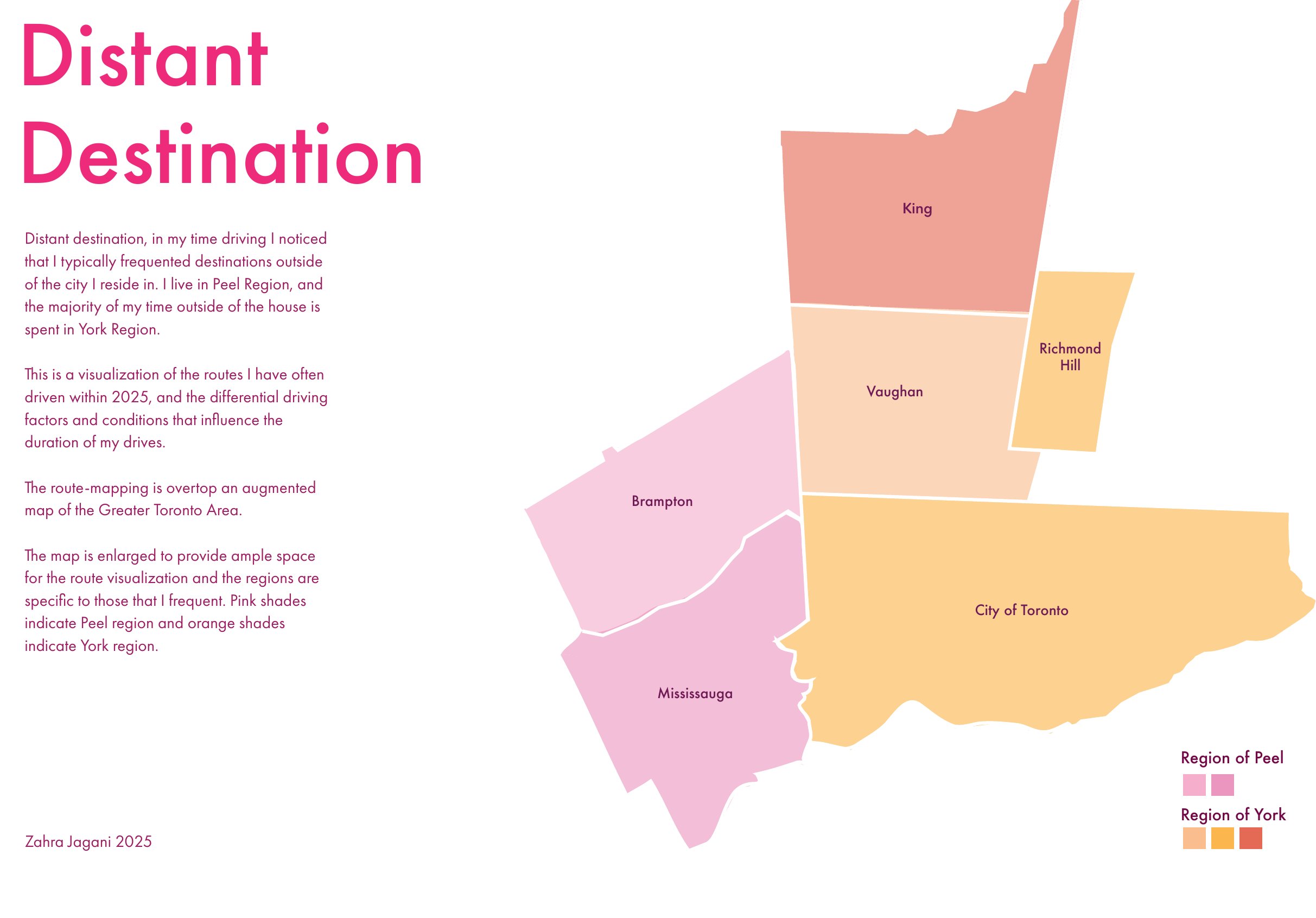
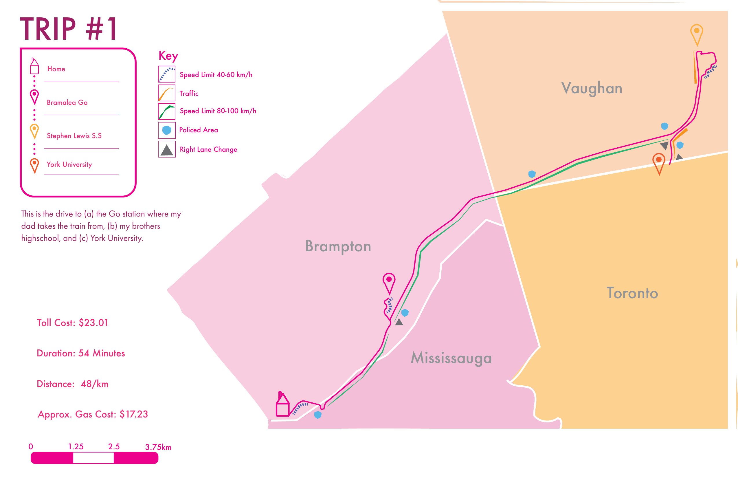
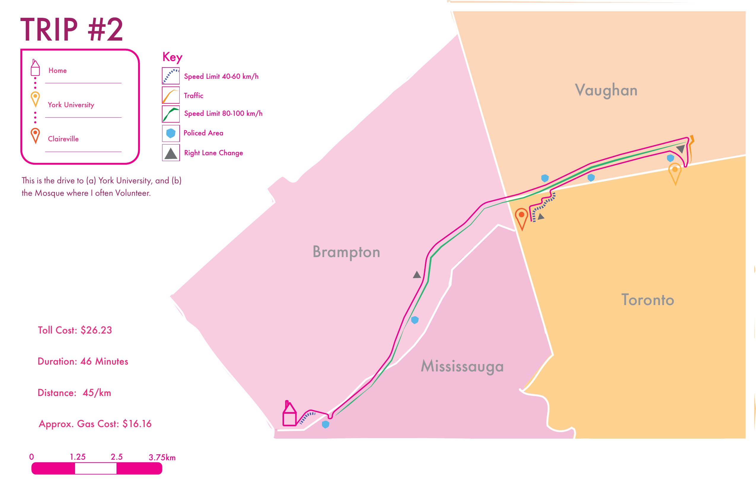
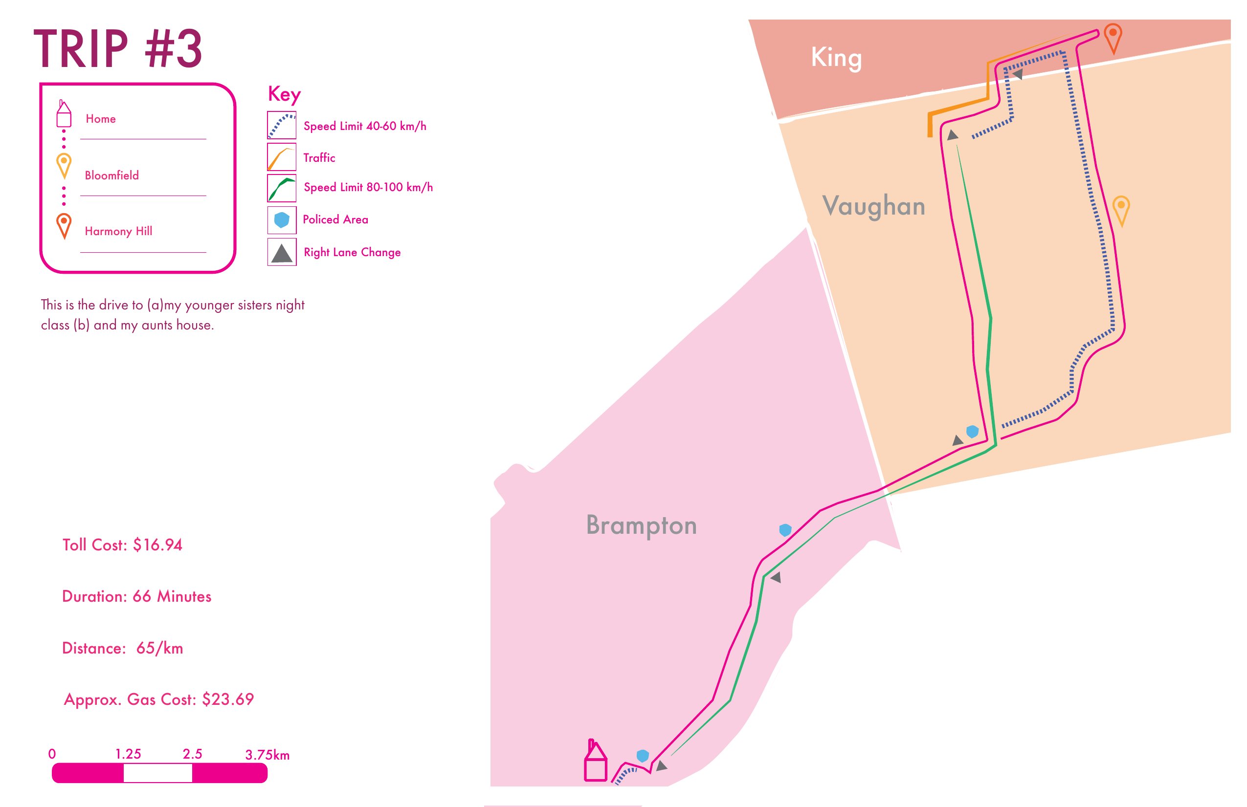
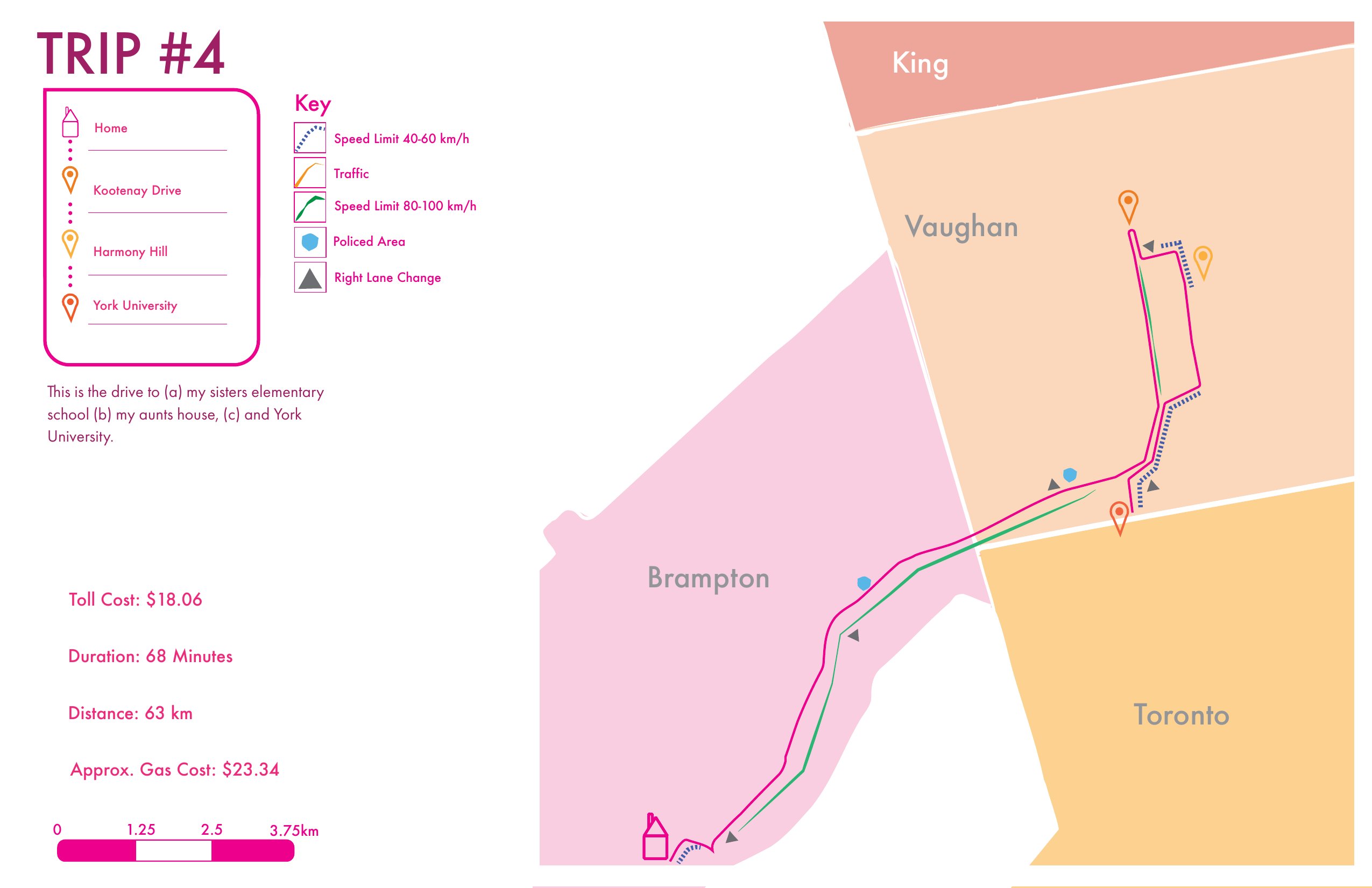
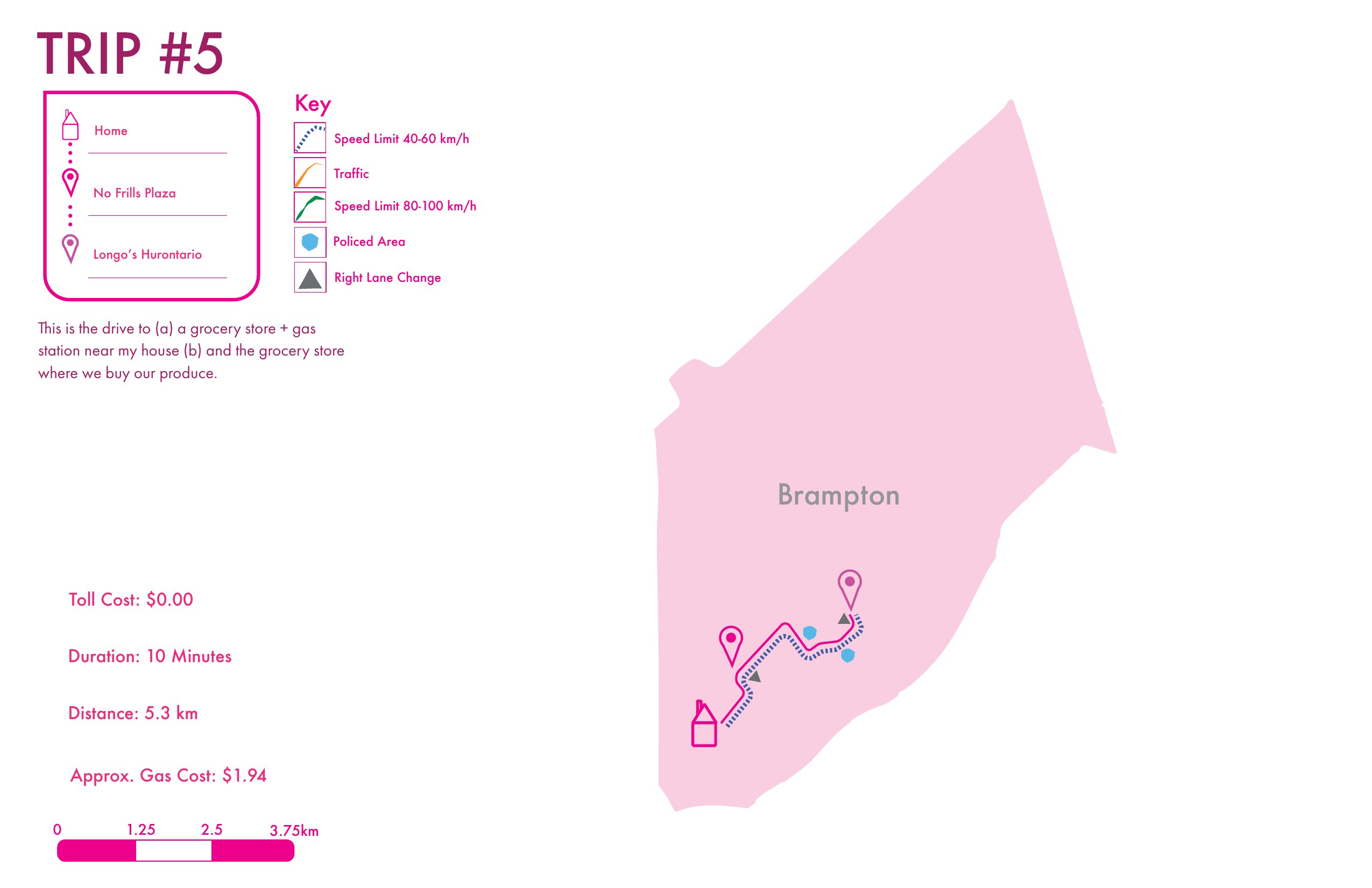
Information Design · March 2025 · 2 Weeks
A visualization of the routes I have often driven within 2025, and the differential driving factors and conditions that influence the duration of my drives. Living in Peel Region, the majority of my time outside the house is spent in York Region. The route-mapping is overlaid on an augmented map of the Greater Toronto Area.
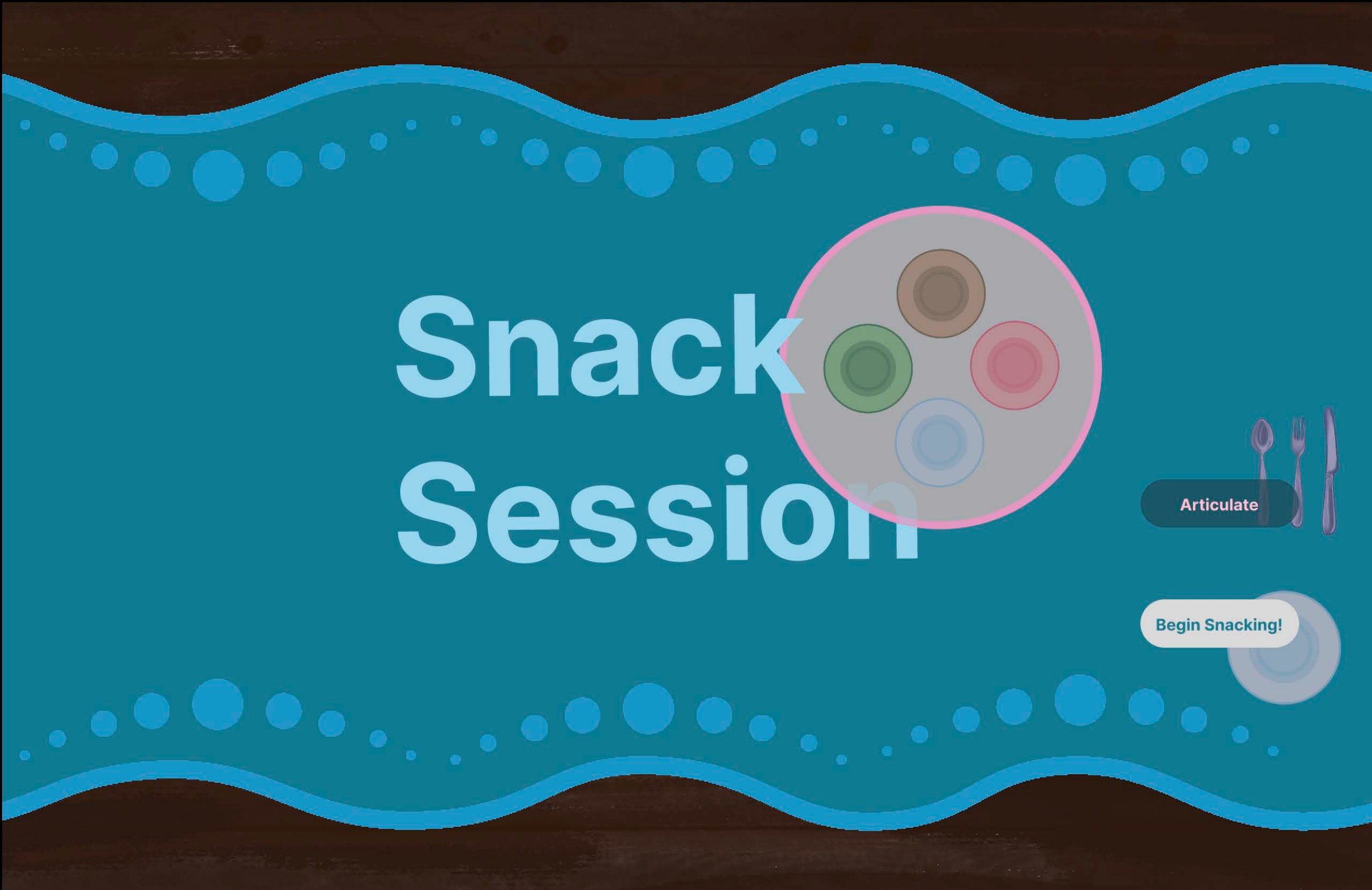
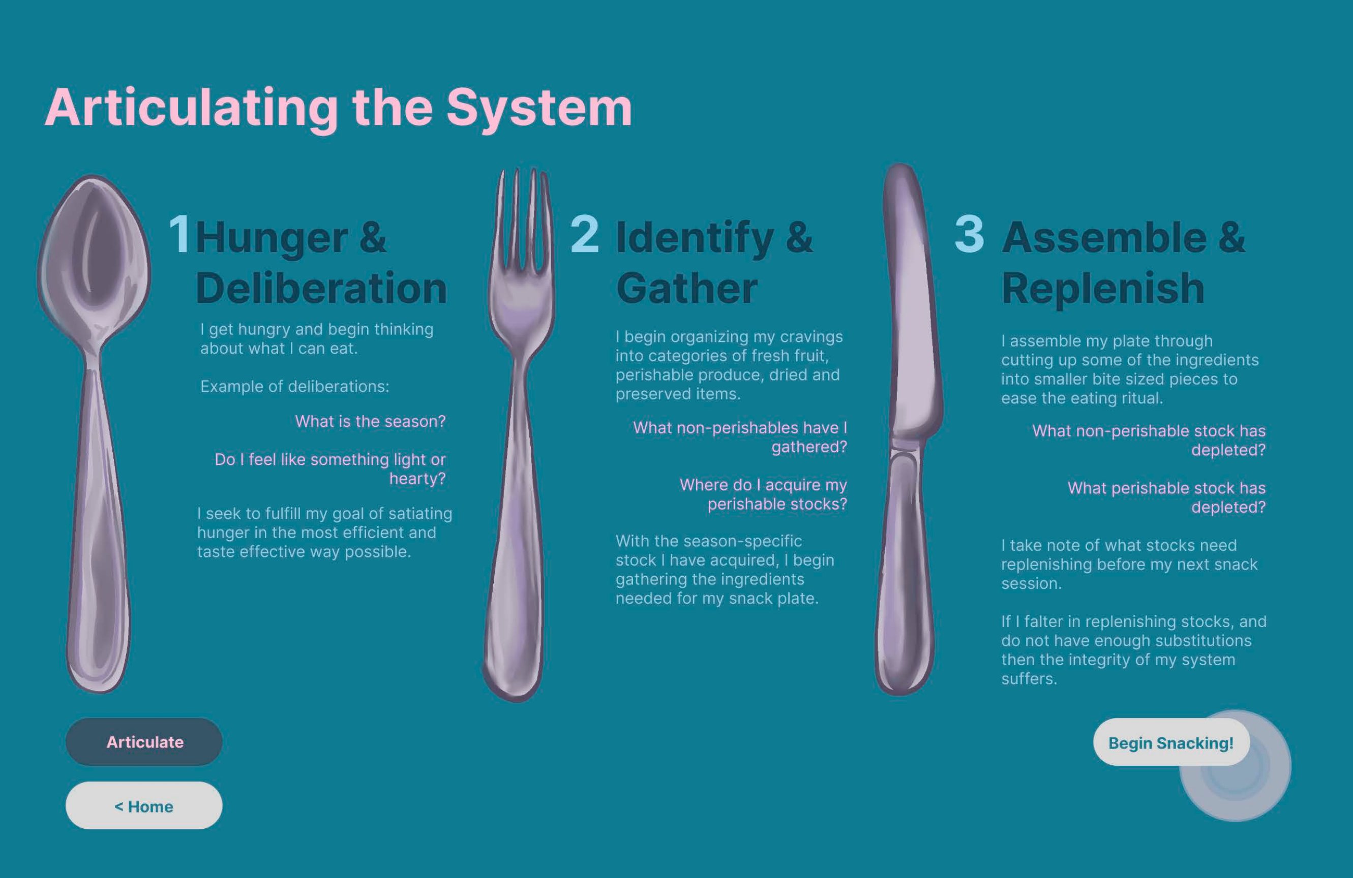
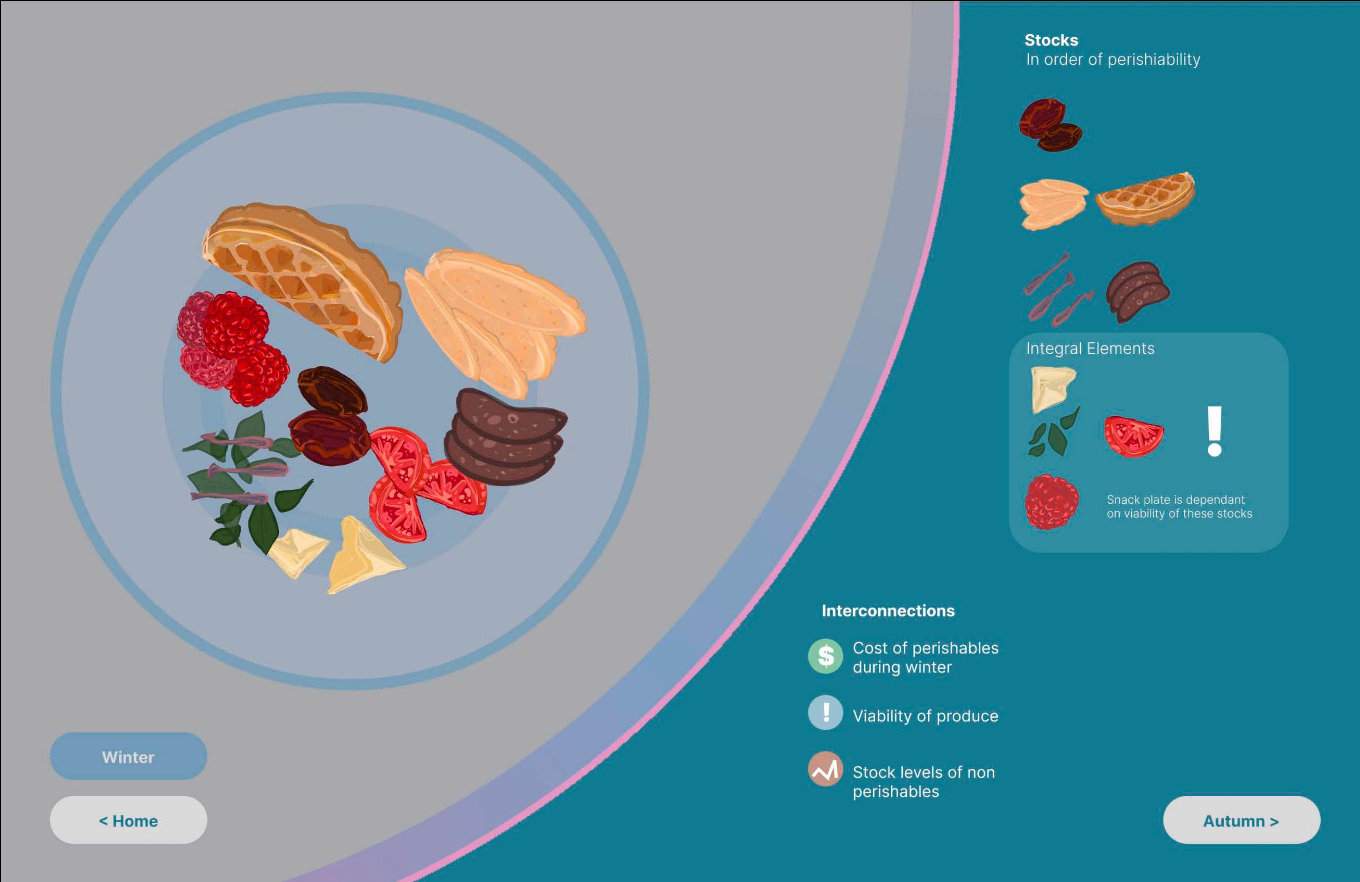
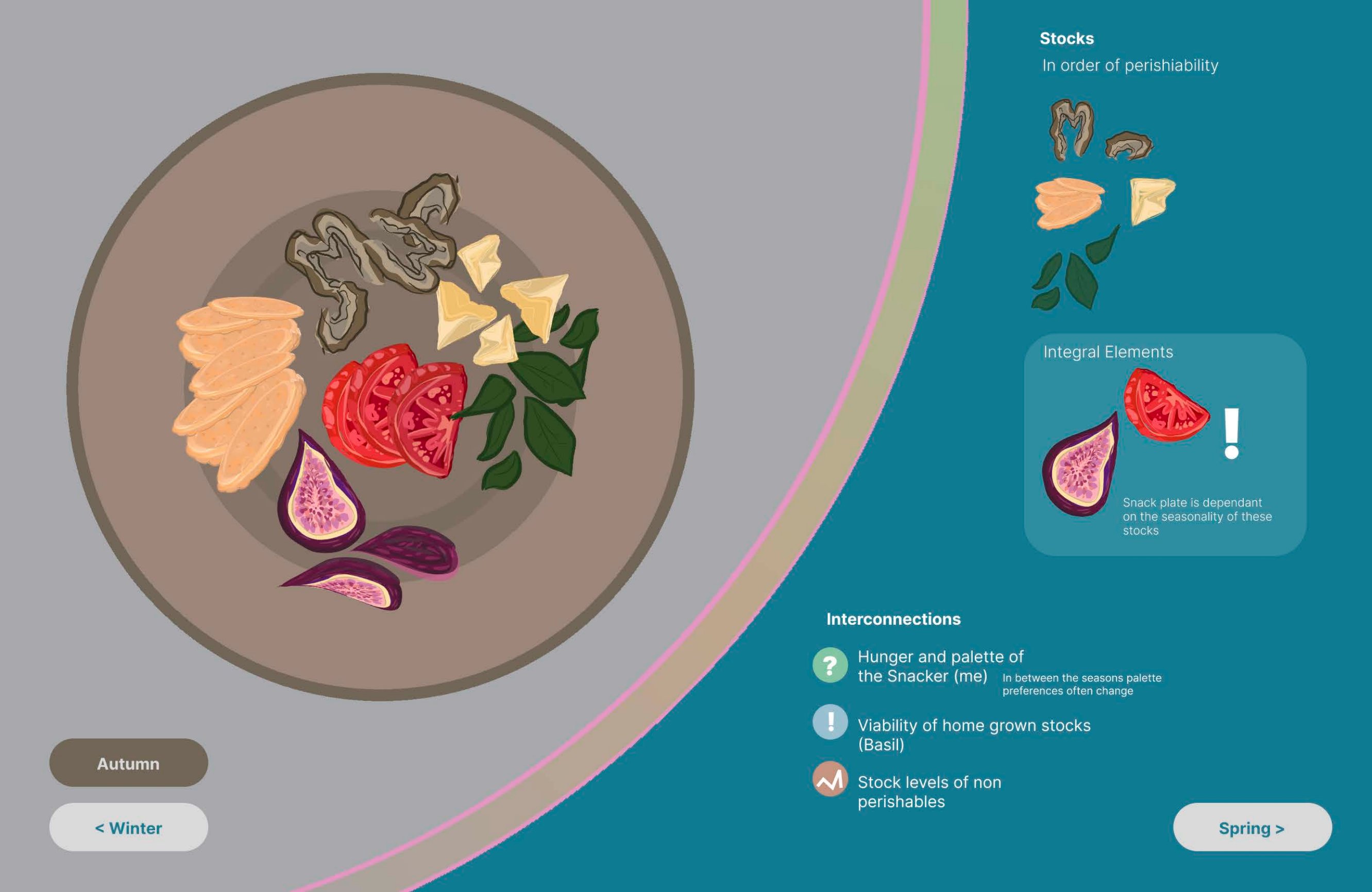
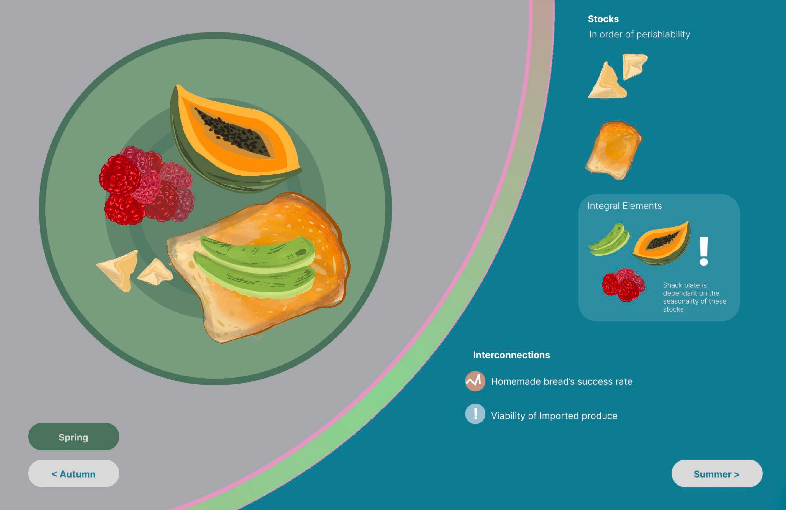
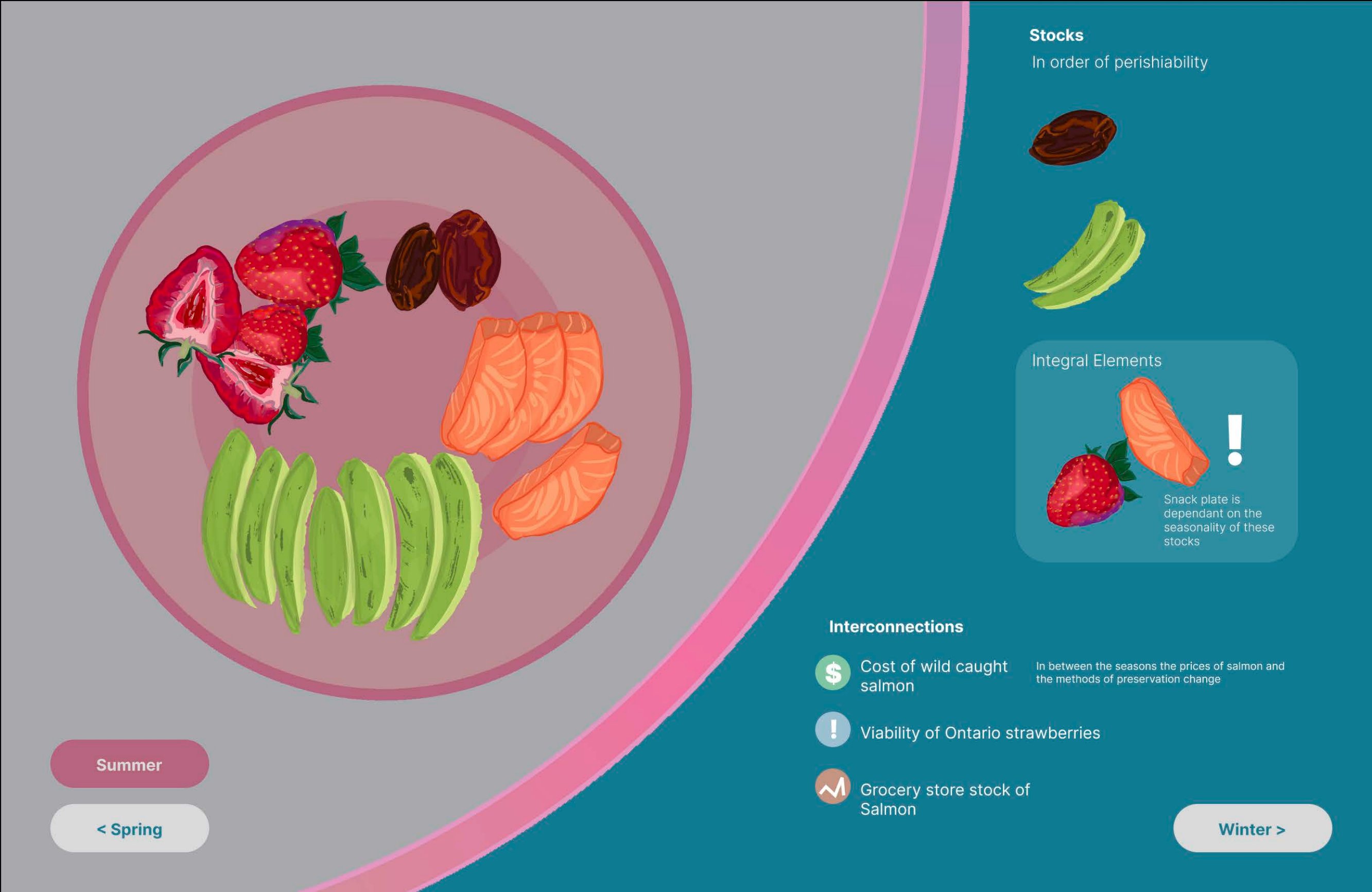
Information Design · Illustration · Interaction Design · October 2025 · 2 Weeks
A visualization of my snacking systems throughout the four seasons — exploring how hunger, availability, seasonality, and pantry stocks shape what ends up on my plate. An interactive system built around the rituals of deliberation, gathering, and replenishment.
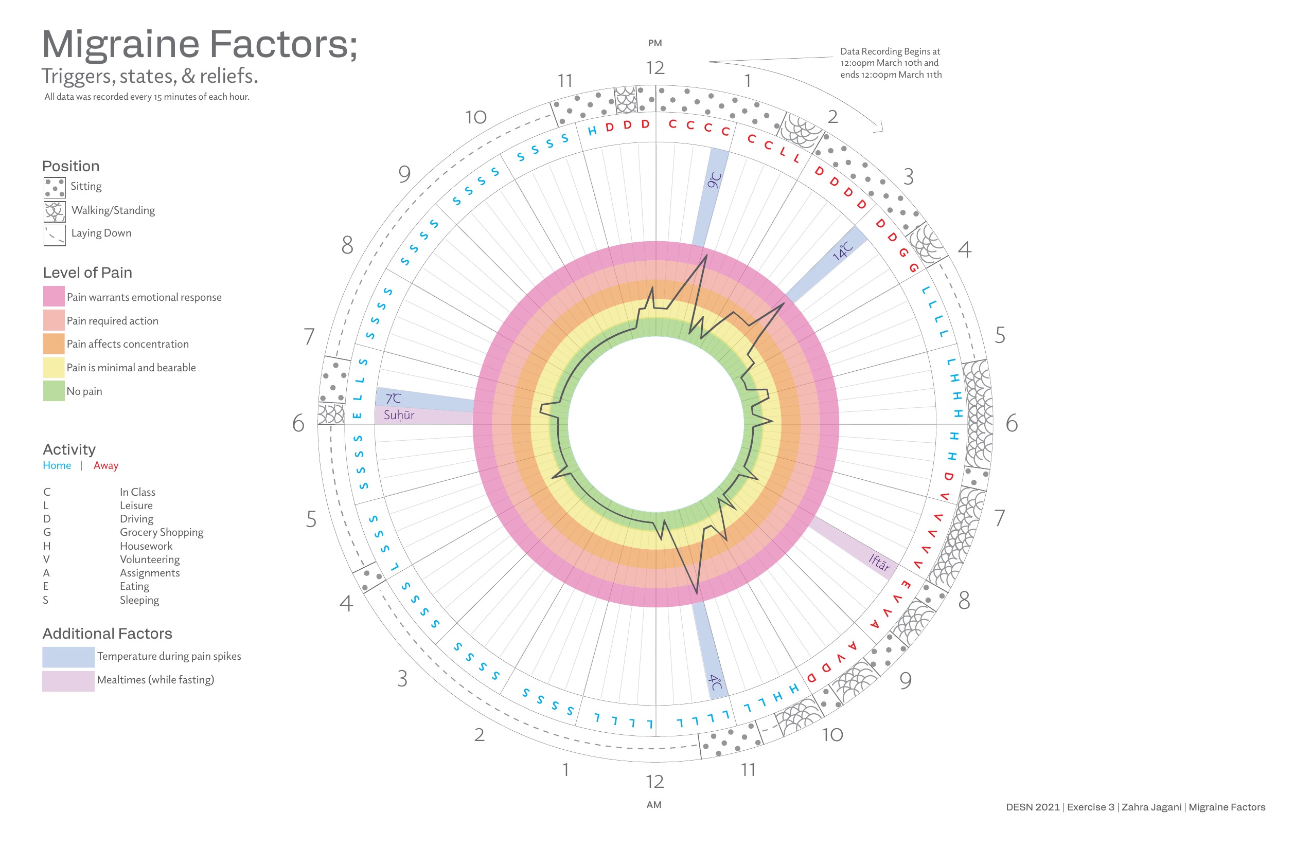
Information Design · March 2024 · 24 Hours
A 24-hour radial visualization of migraine triggers, pain levels, activities, and relief factors recorded every 15 minutes over the course of a fasting day in Ramadan (March 10–11). Layers of data — body position, activity, temperature, mealtimes — are mapped against a clock to reveal patterns invisible to the moment.
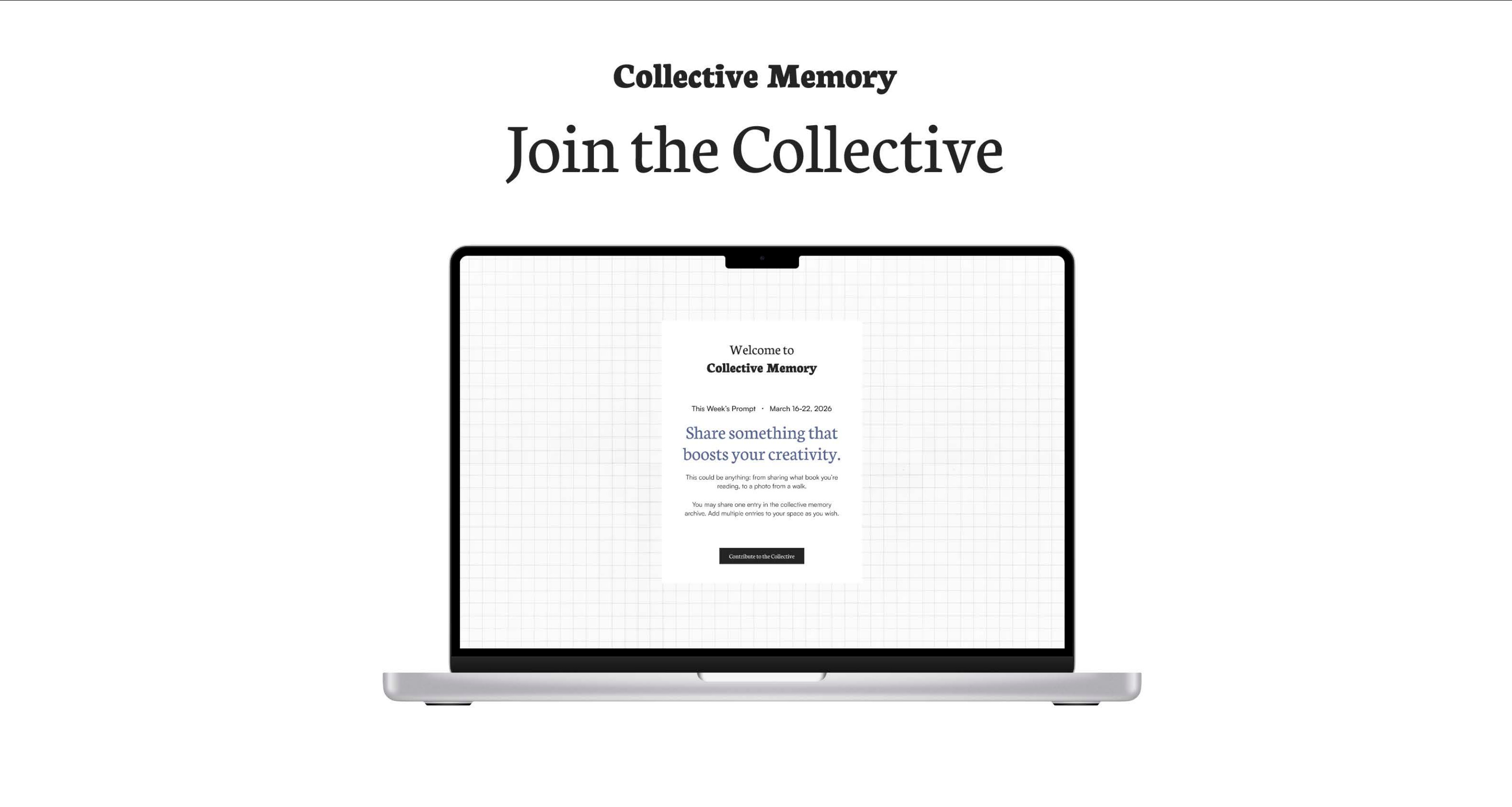
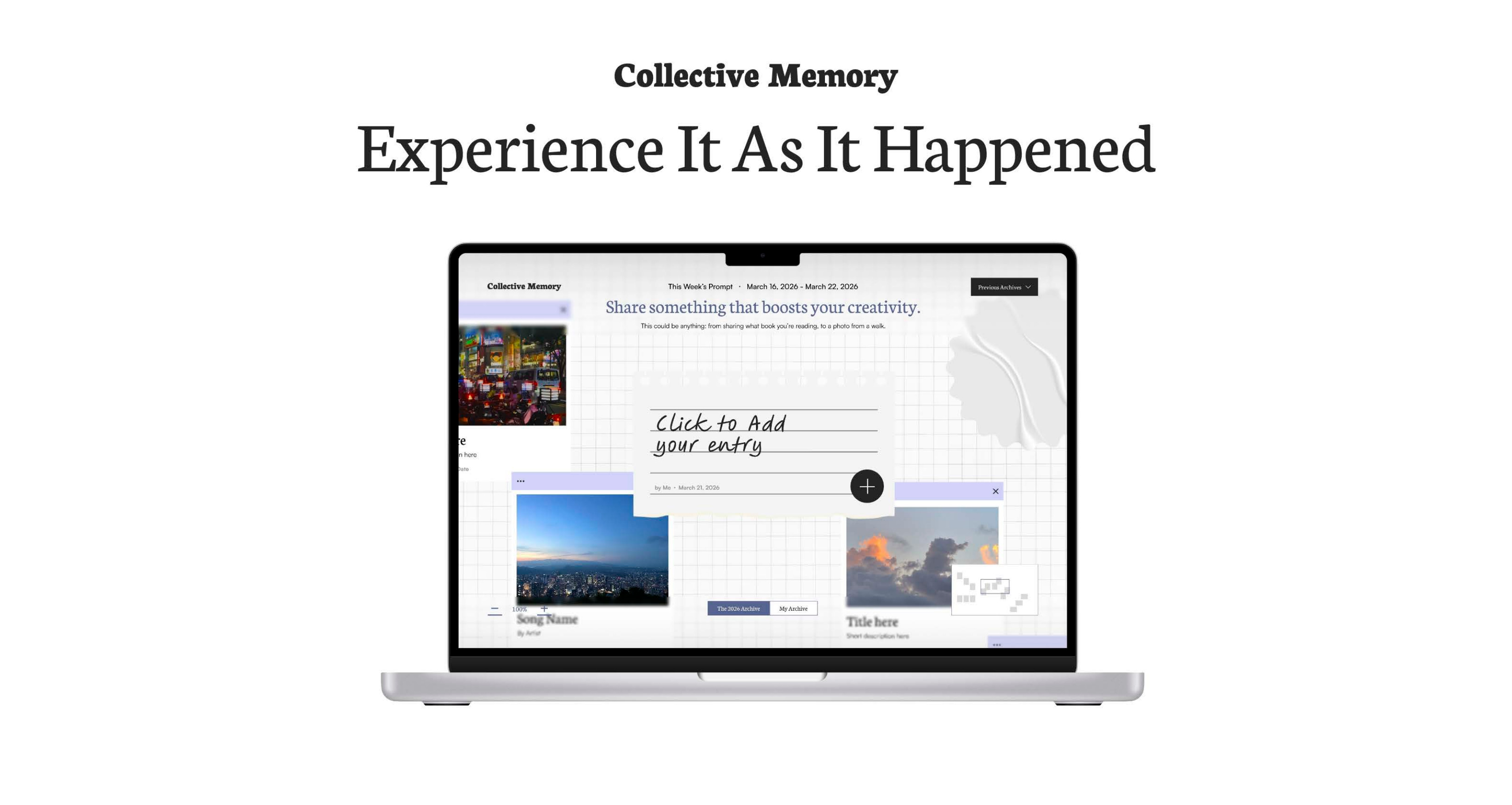
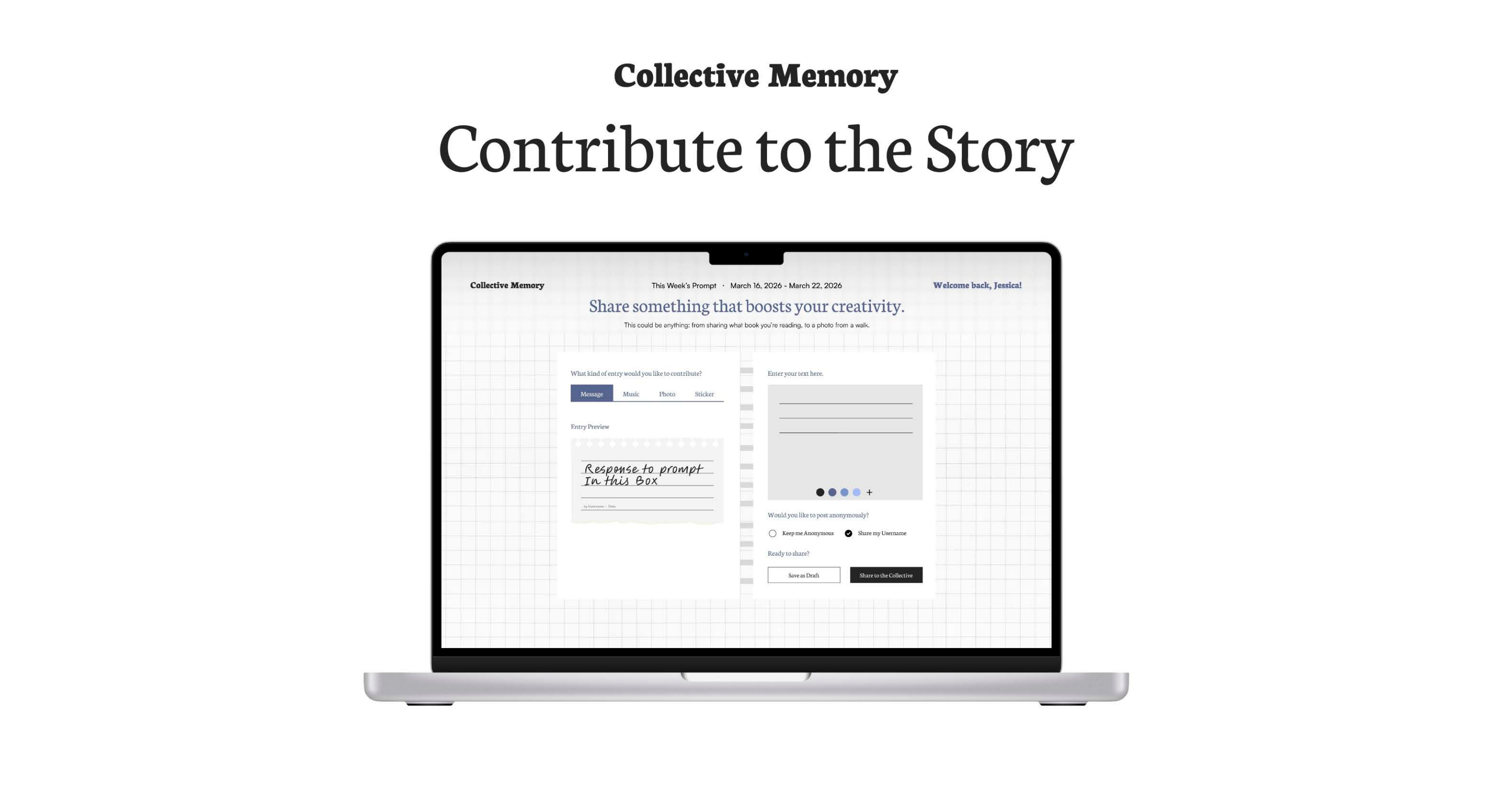
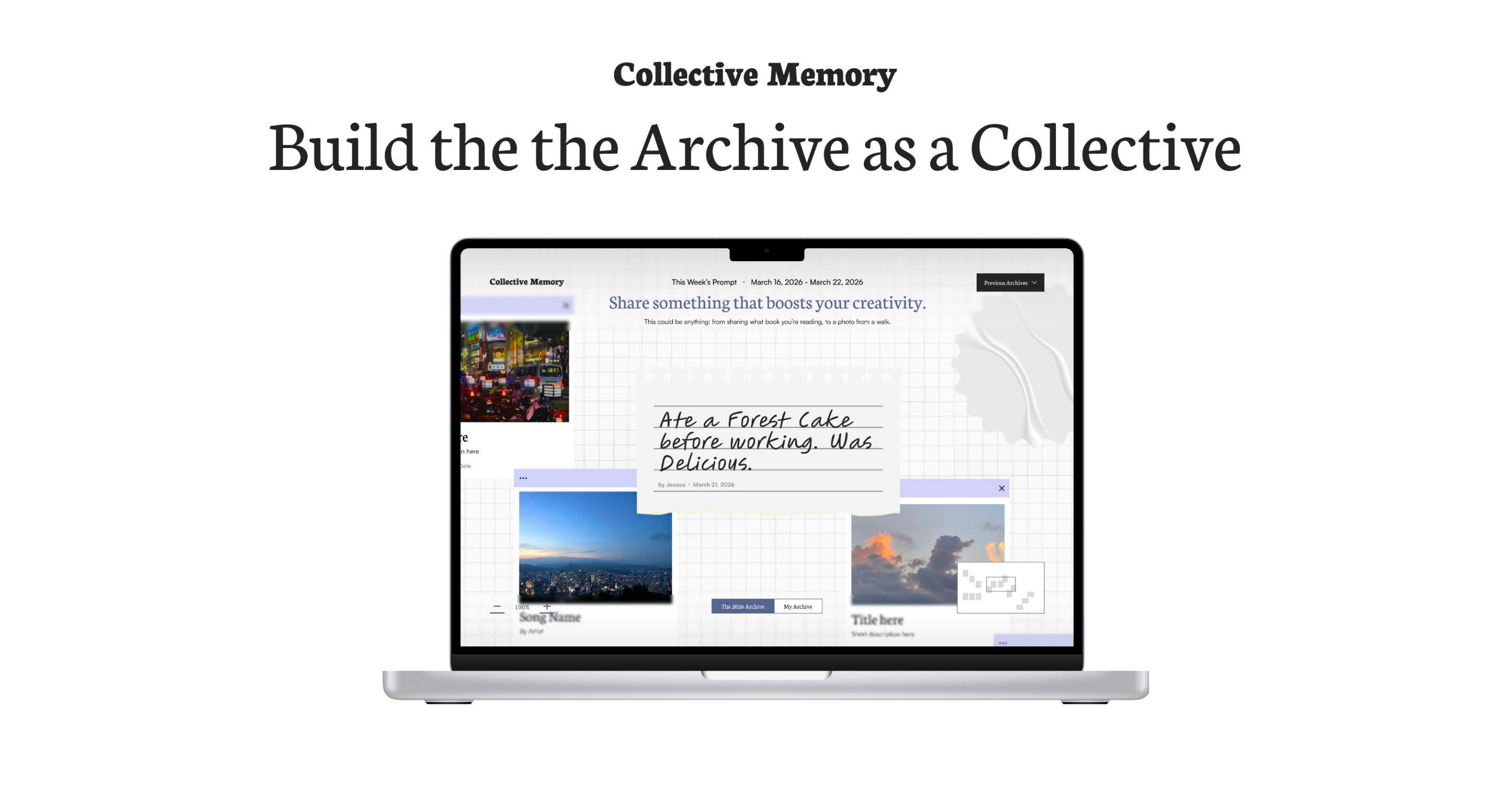
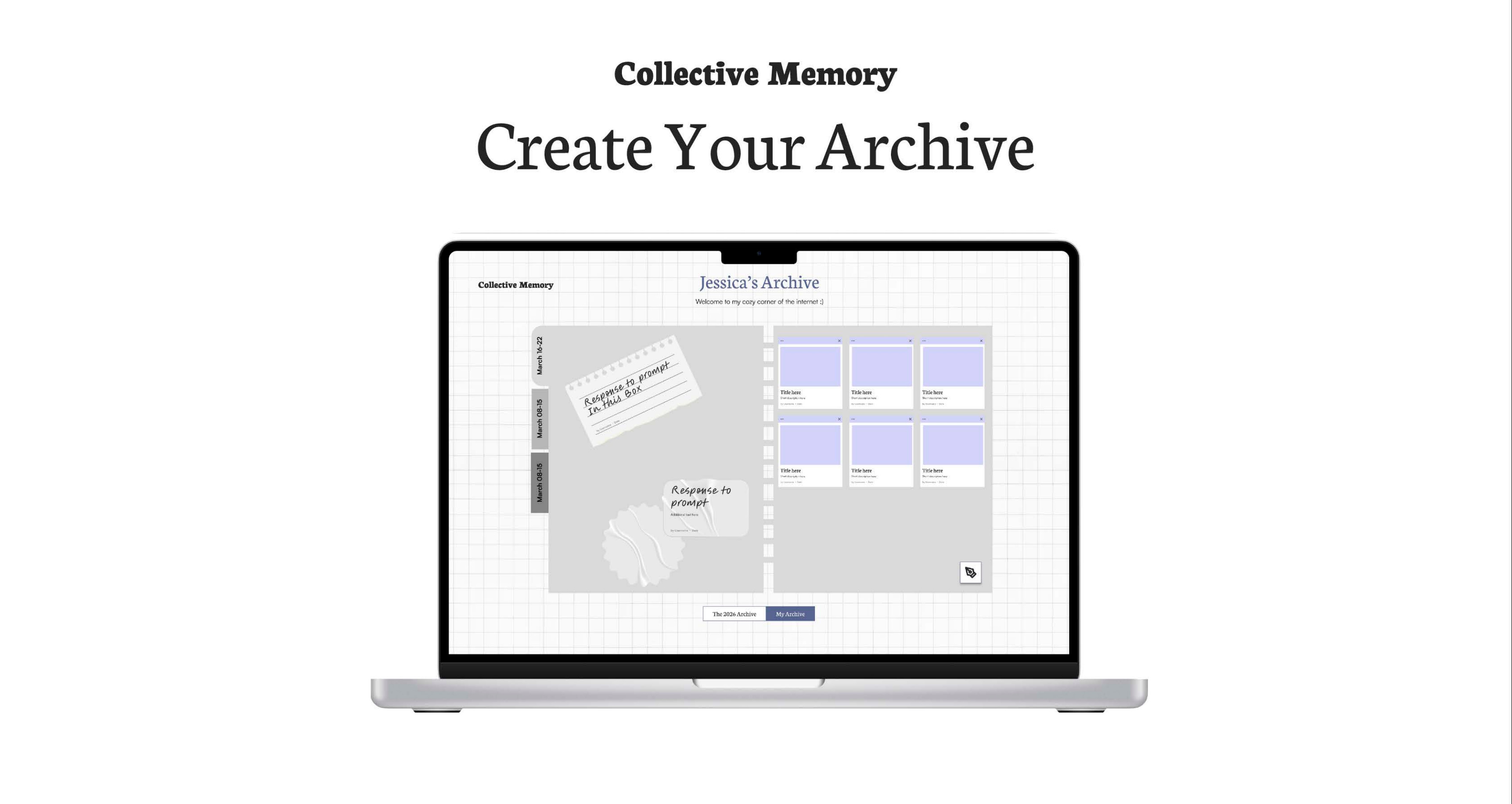
Product Design · March 2026 · 24 Hours
A collaborative digital archive where users respond to weekly prompts and contribute messages, photos, music, and stickers to a shared collective space. Each user builds their own personal archive alongside the community's — an intimate coexistence of private and public memory.
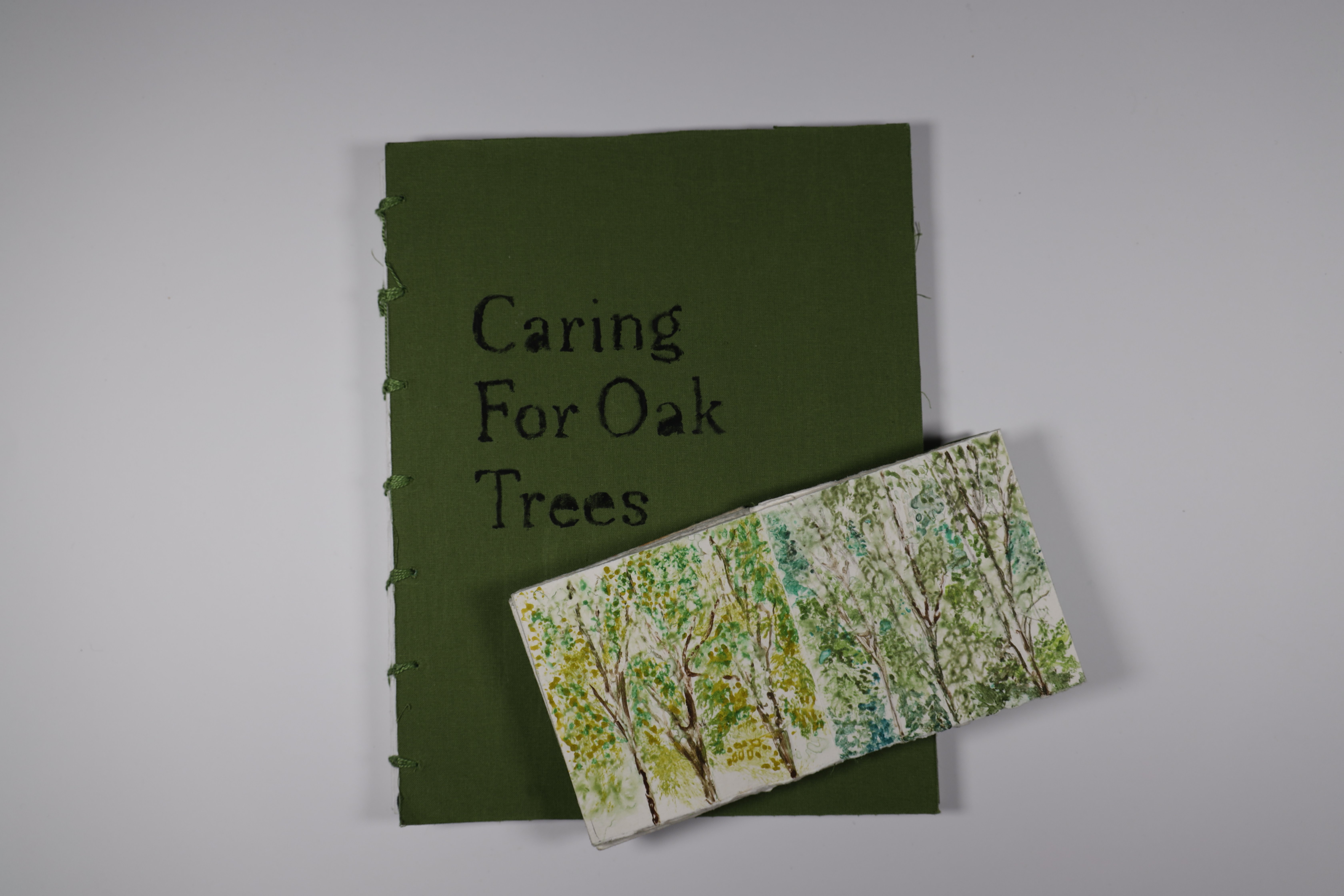
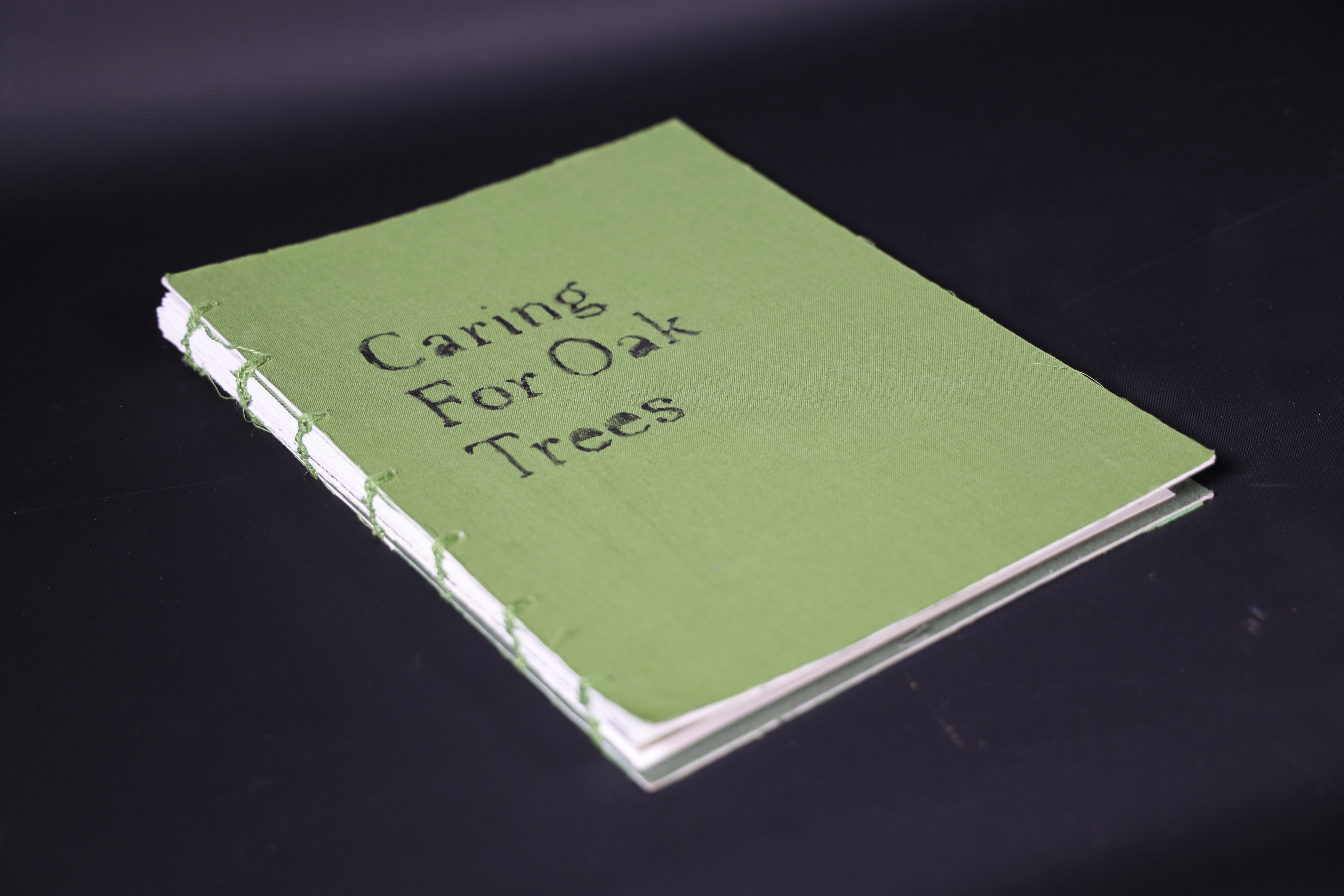
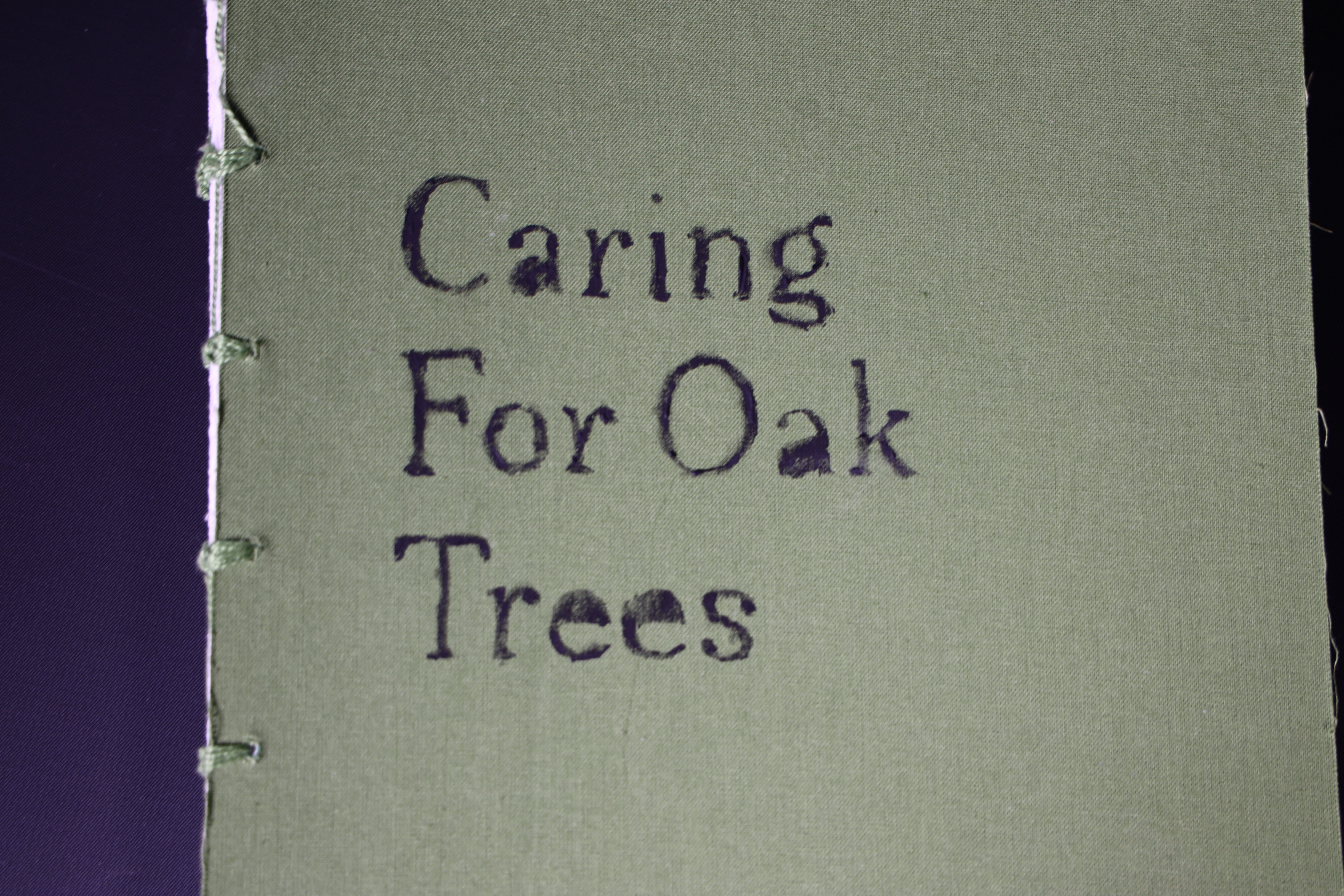
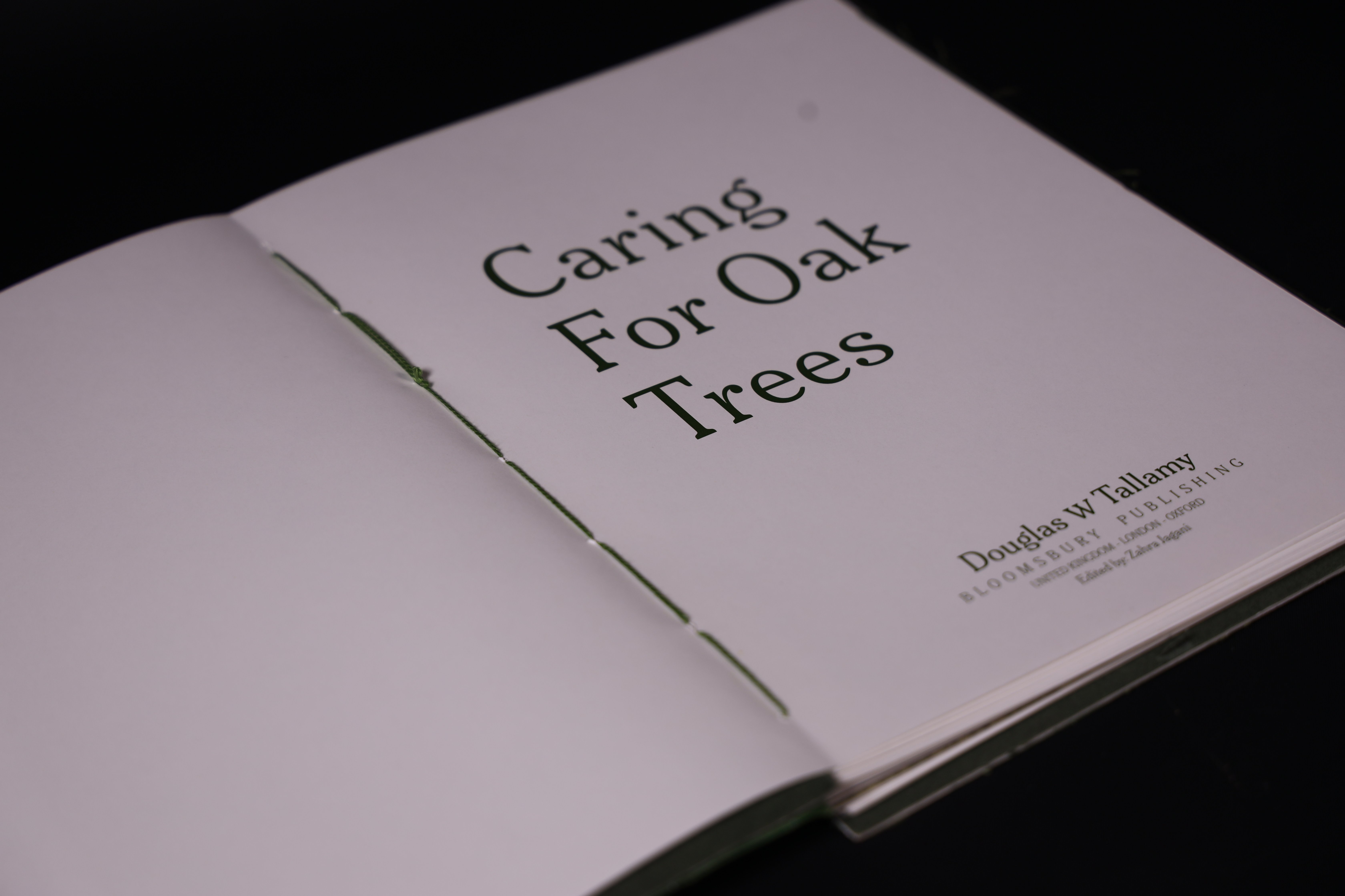
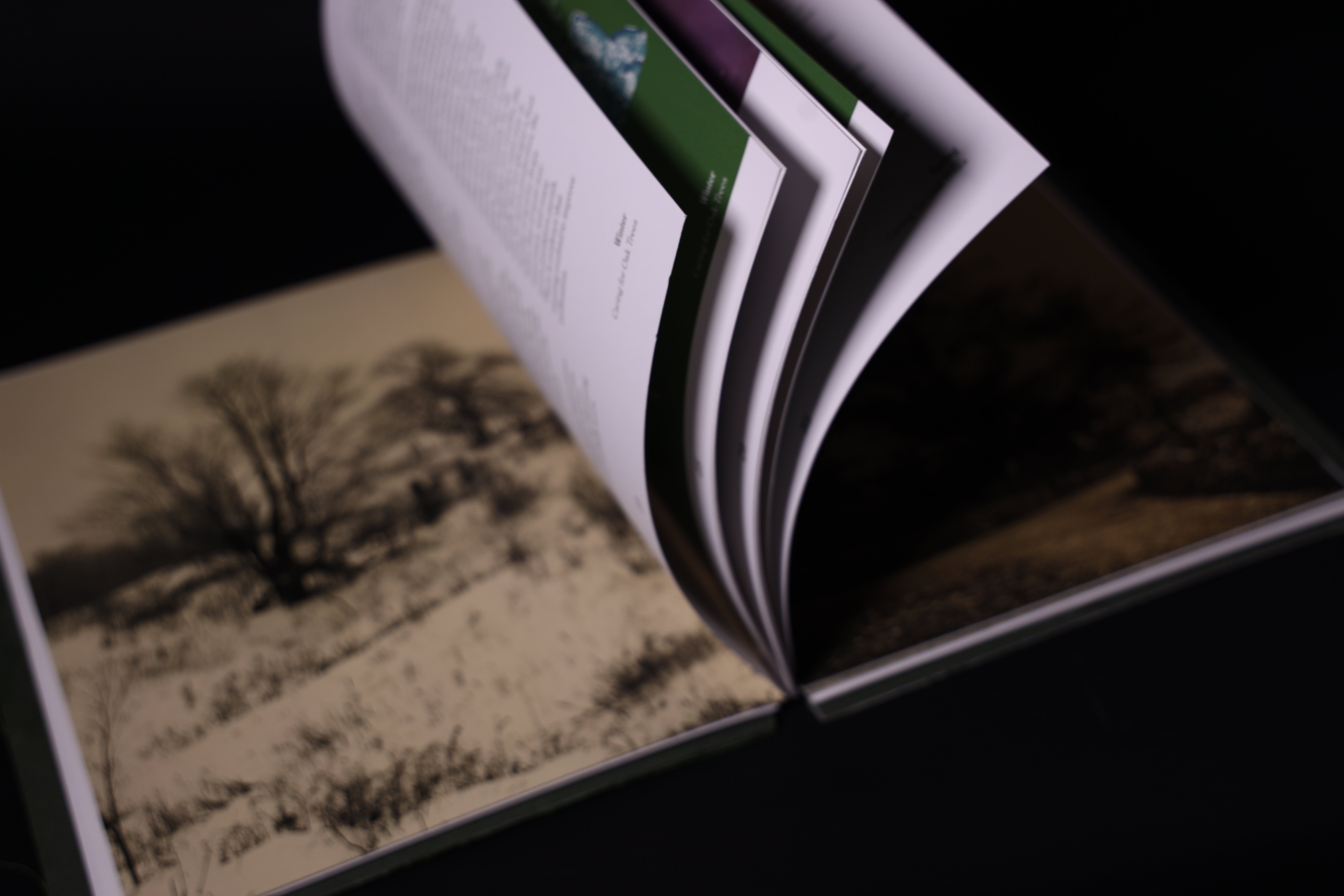
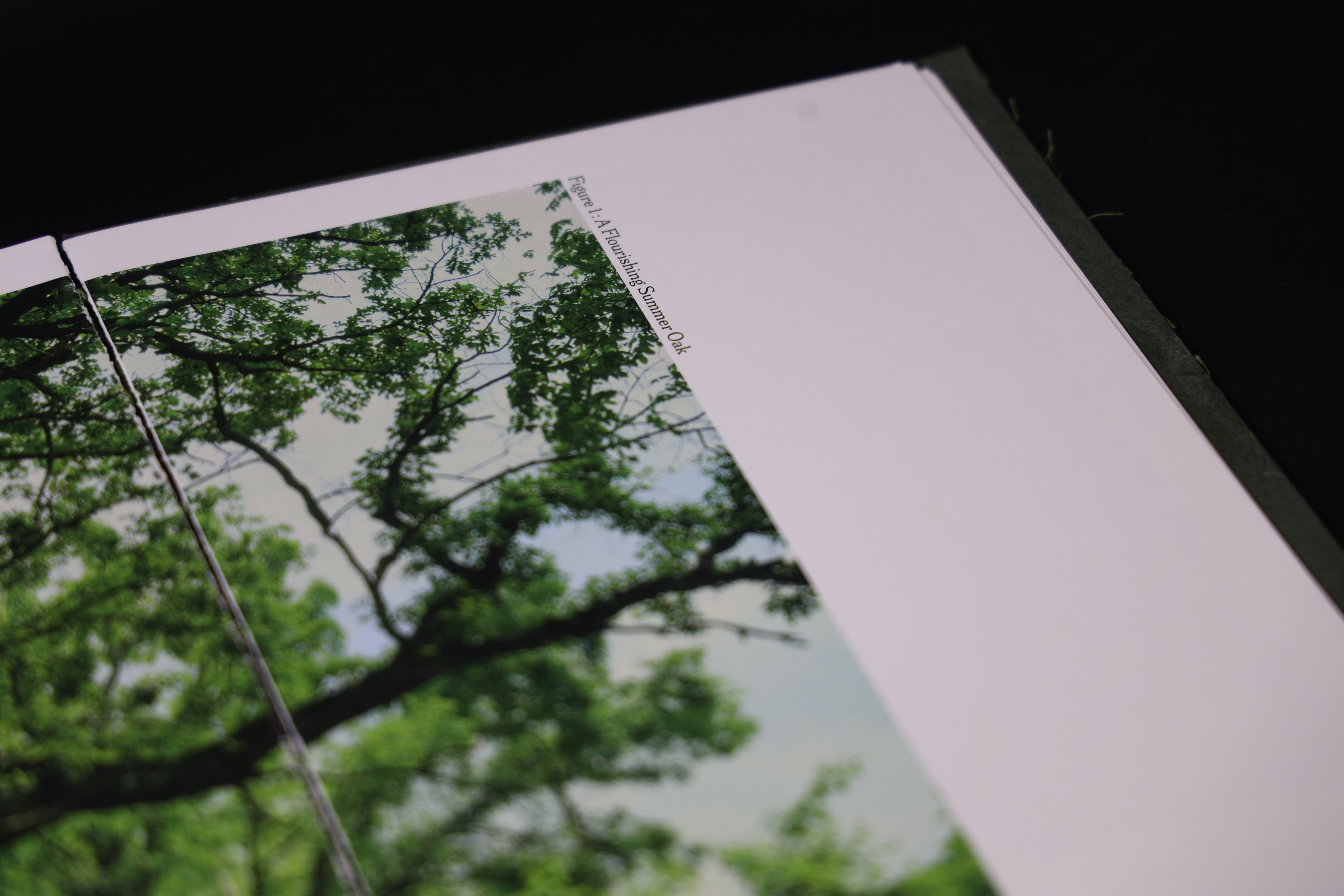
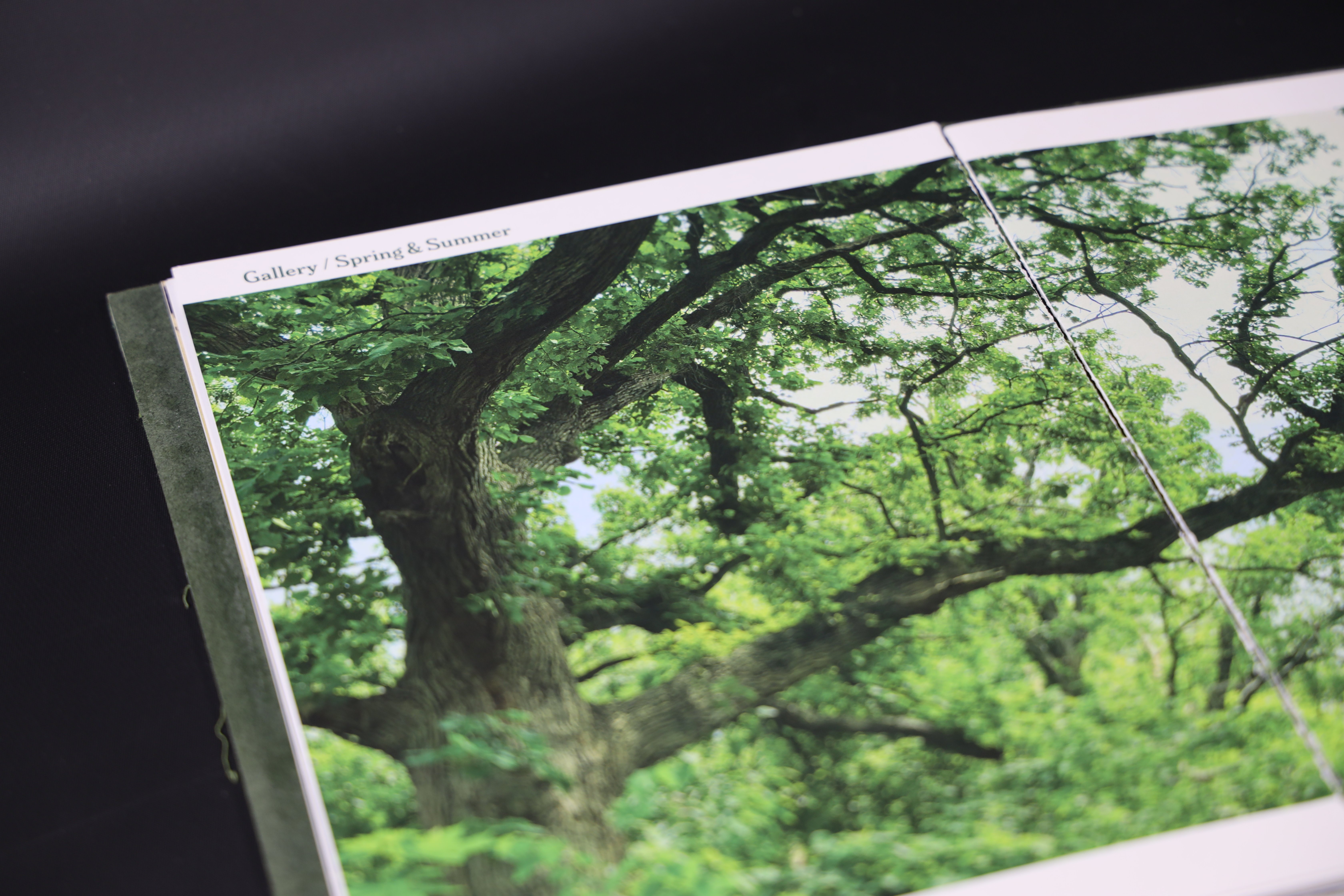
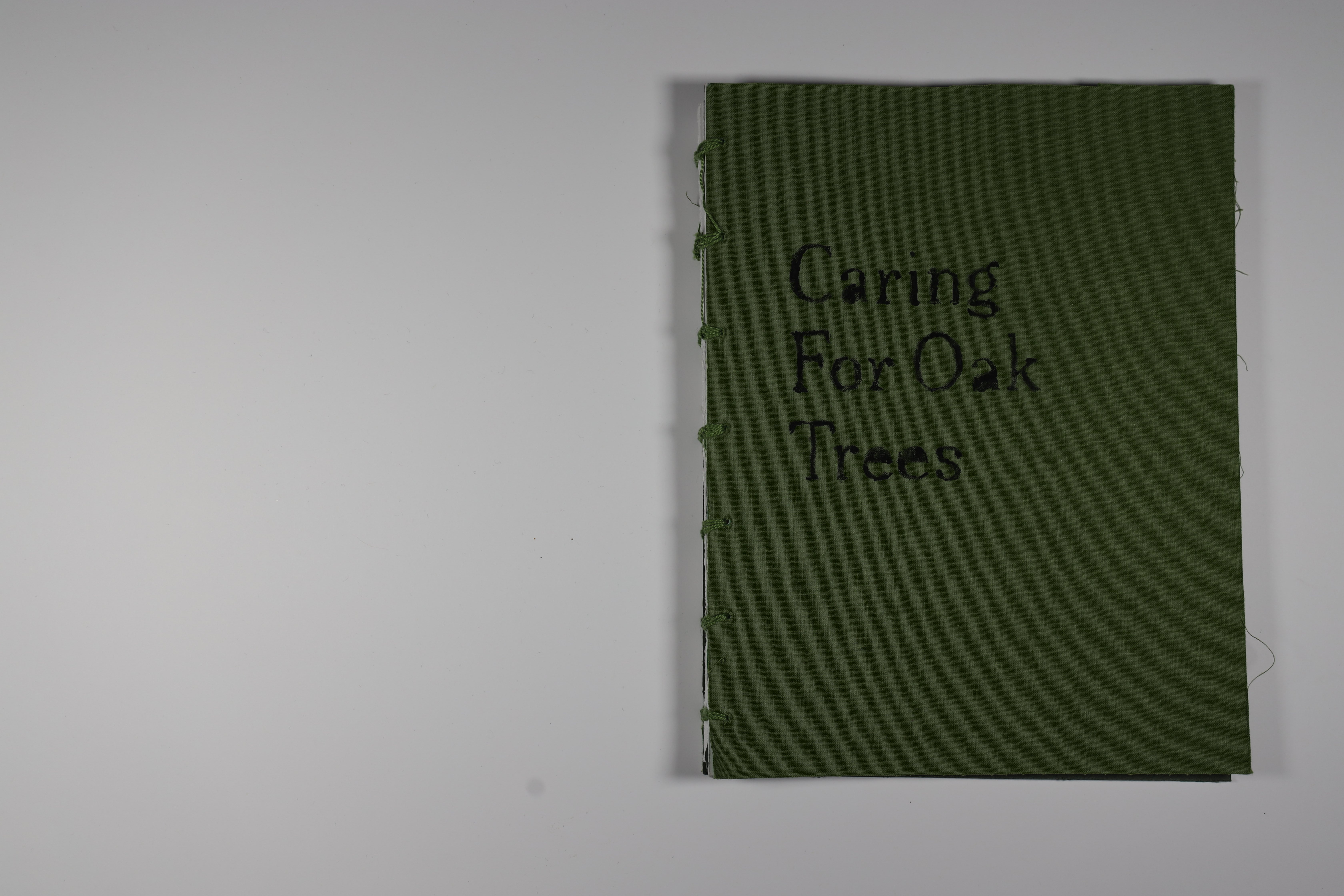
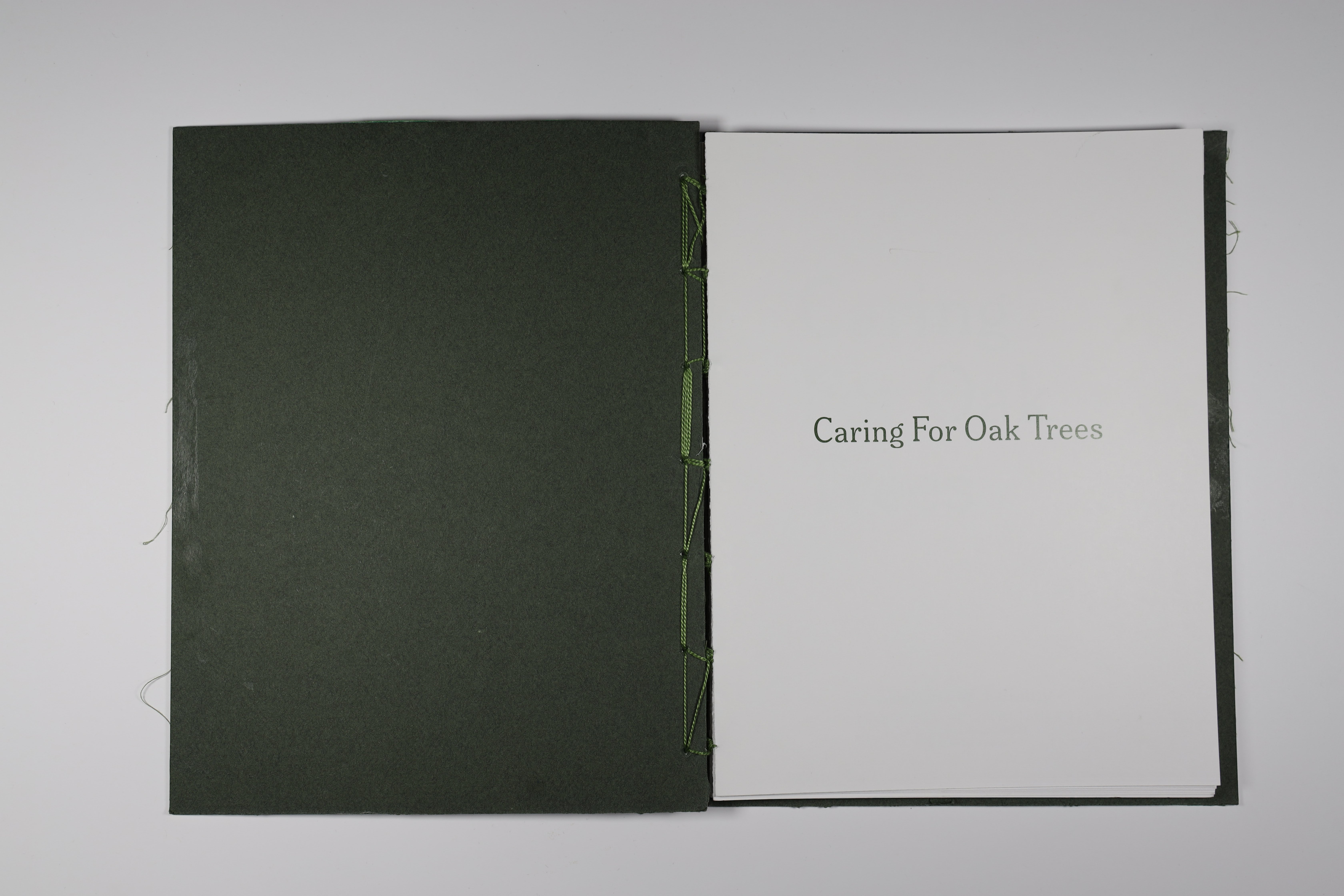
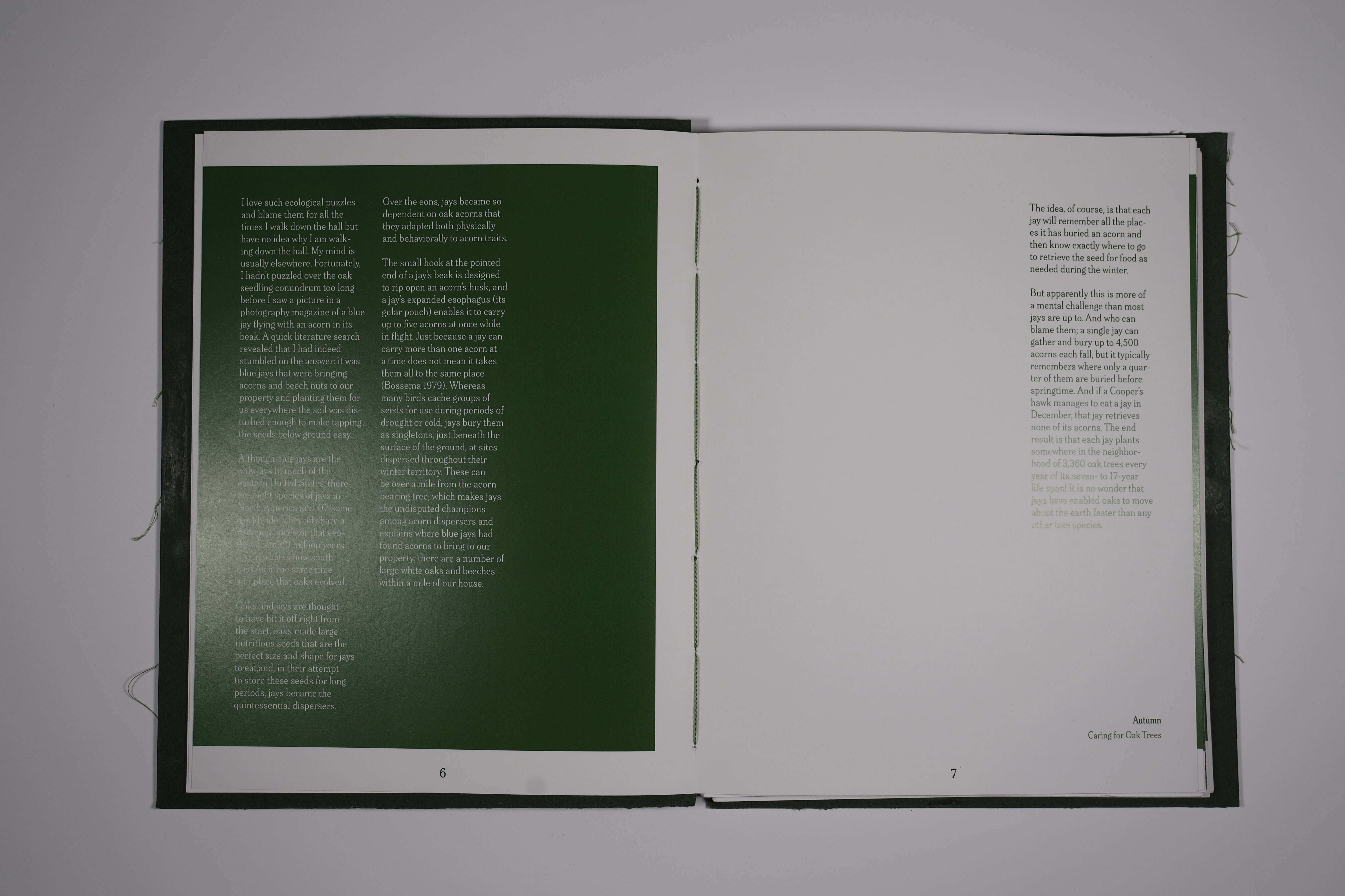
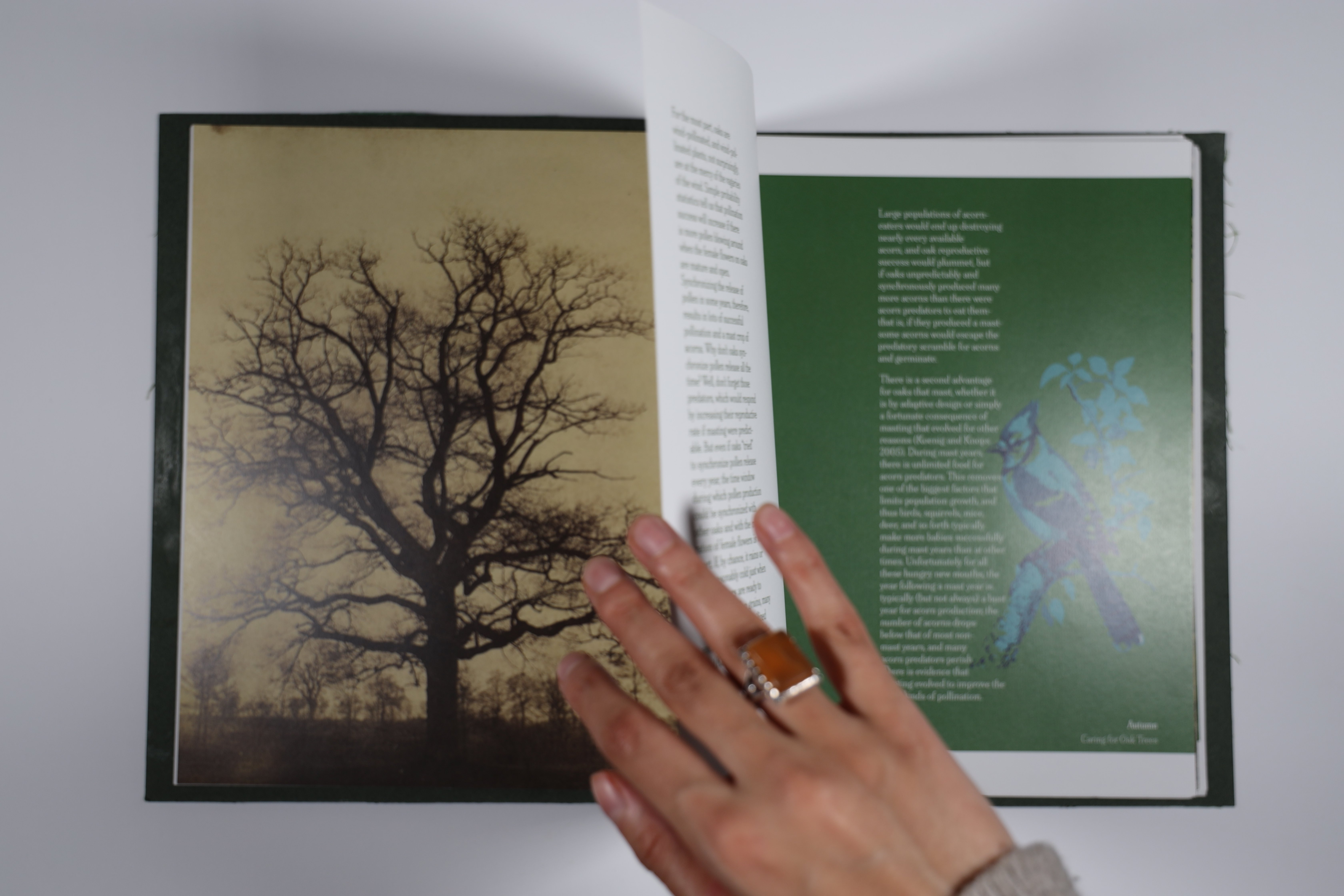
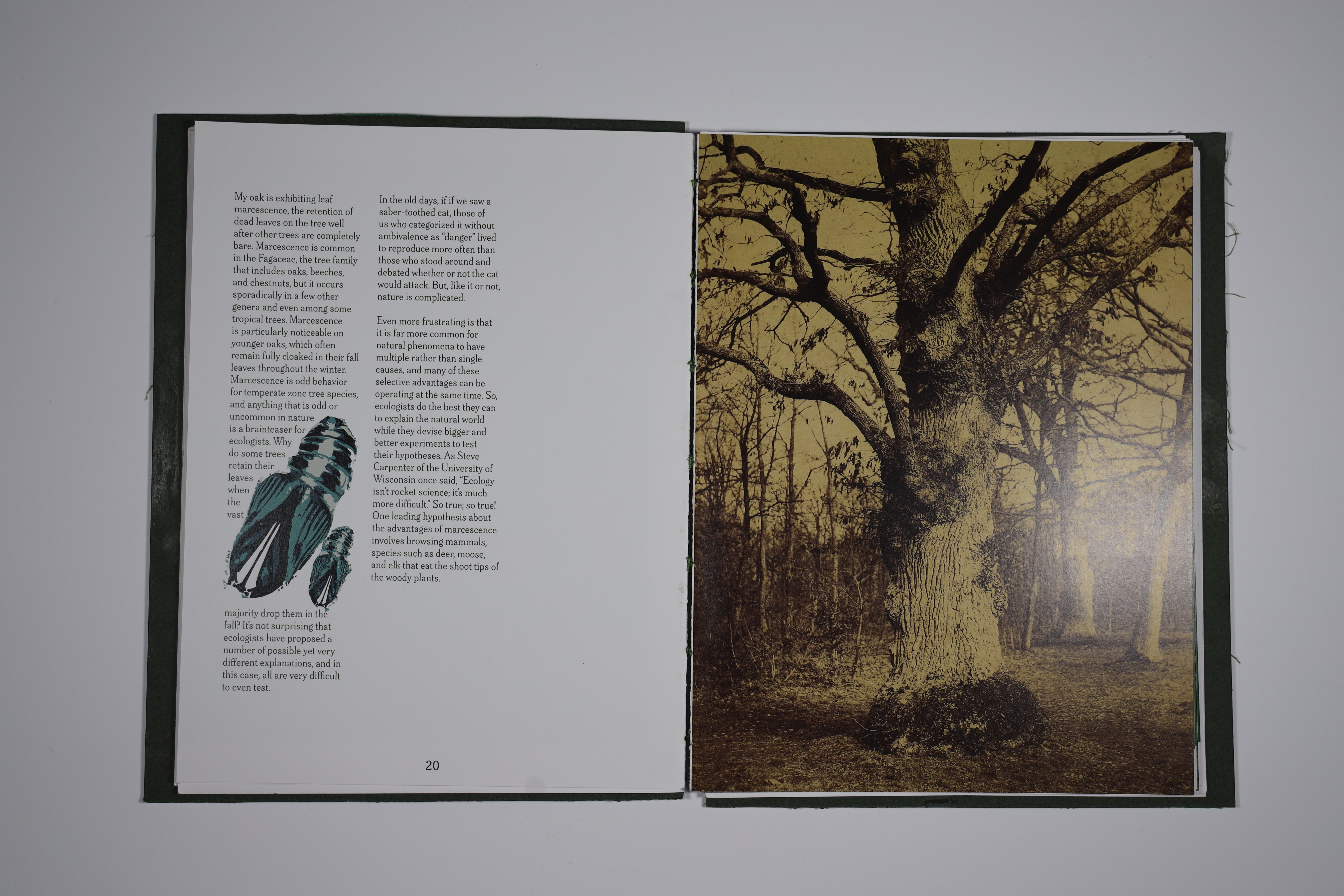
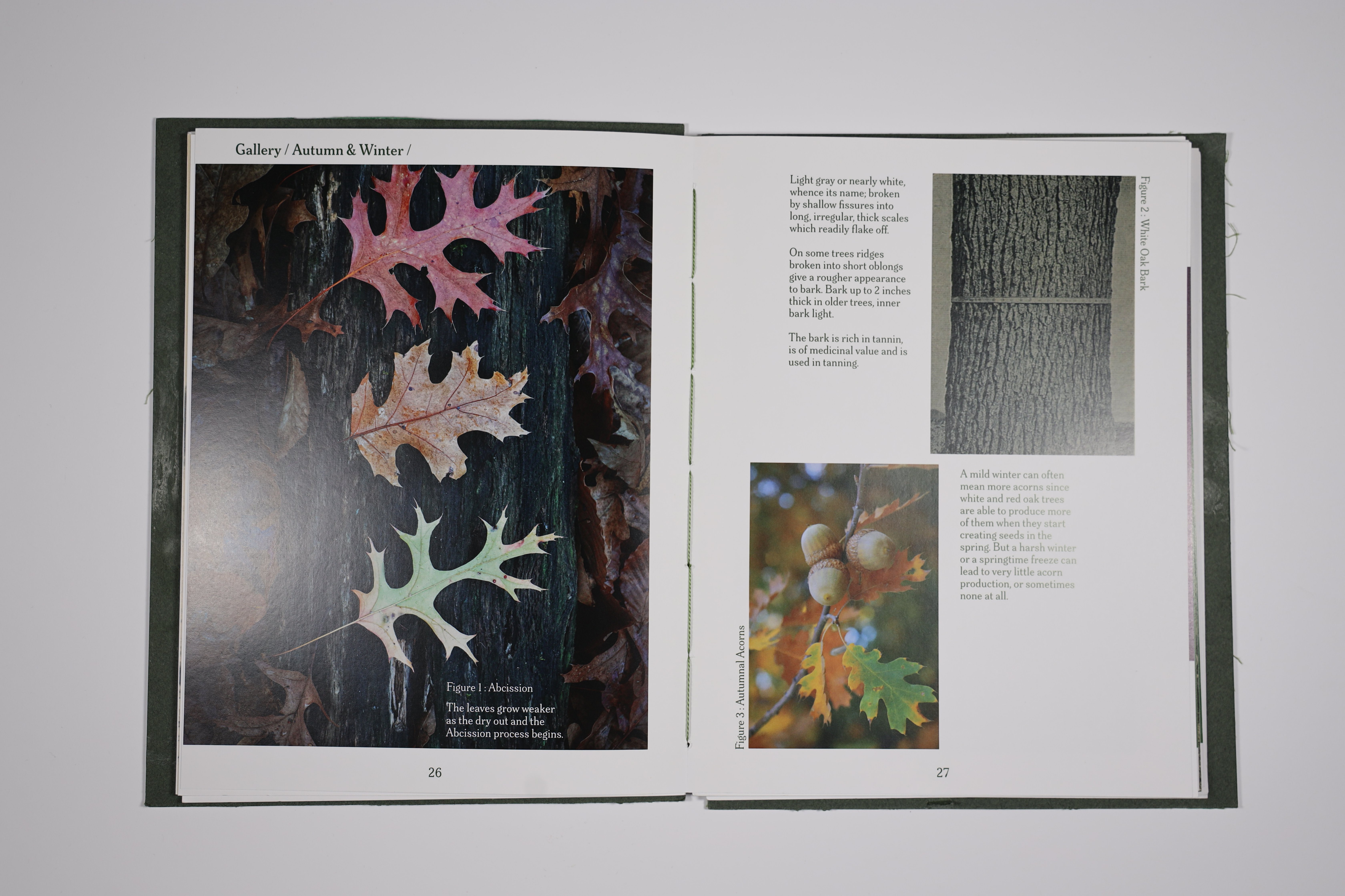
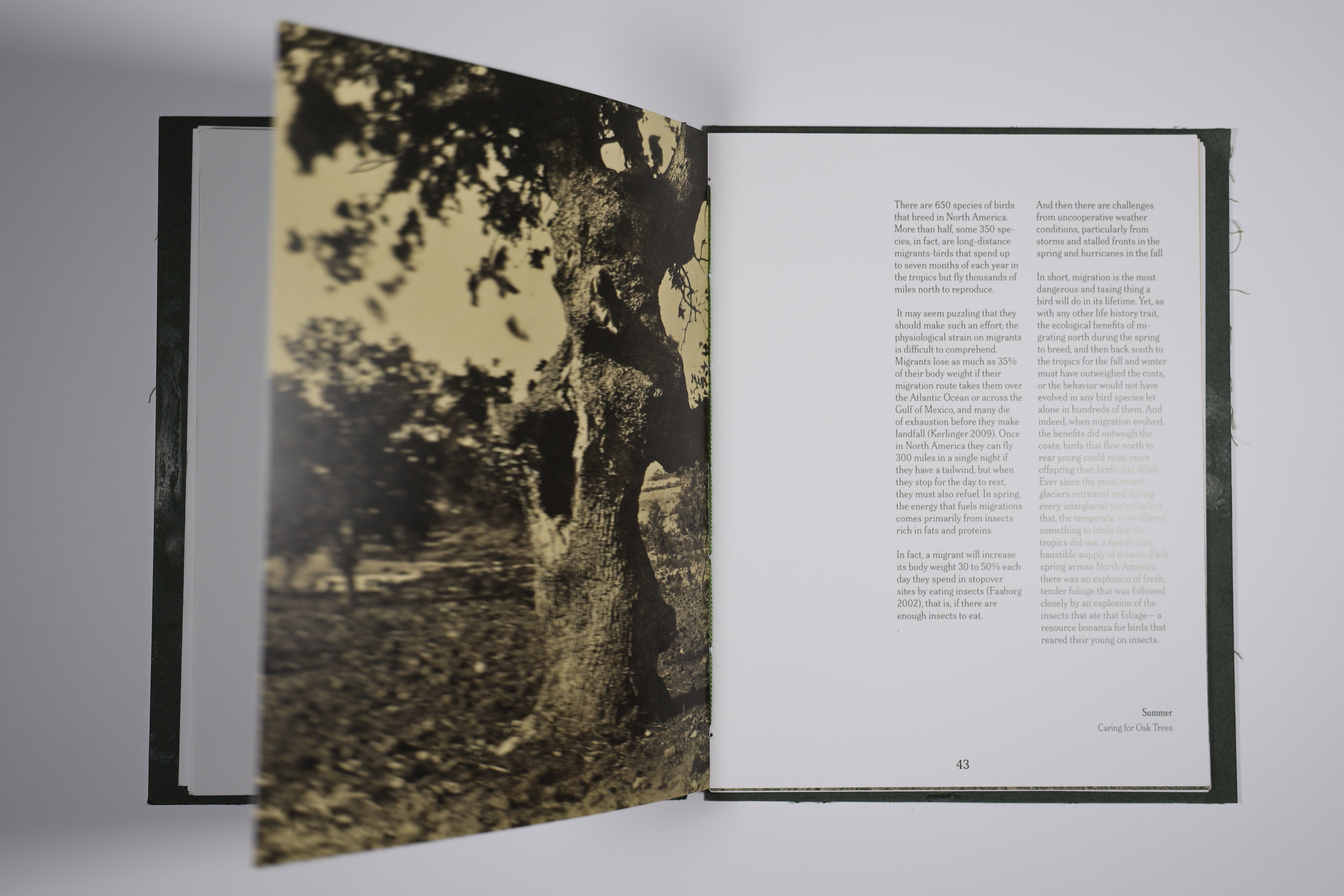
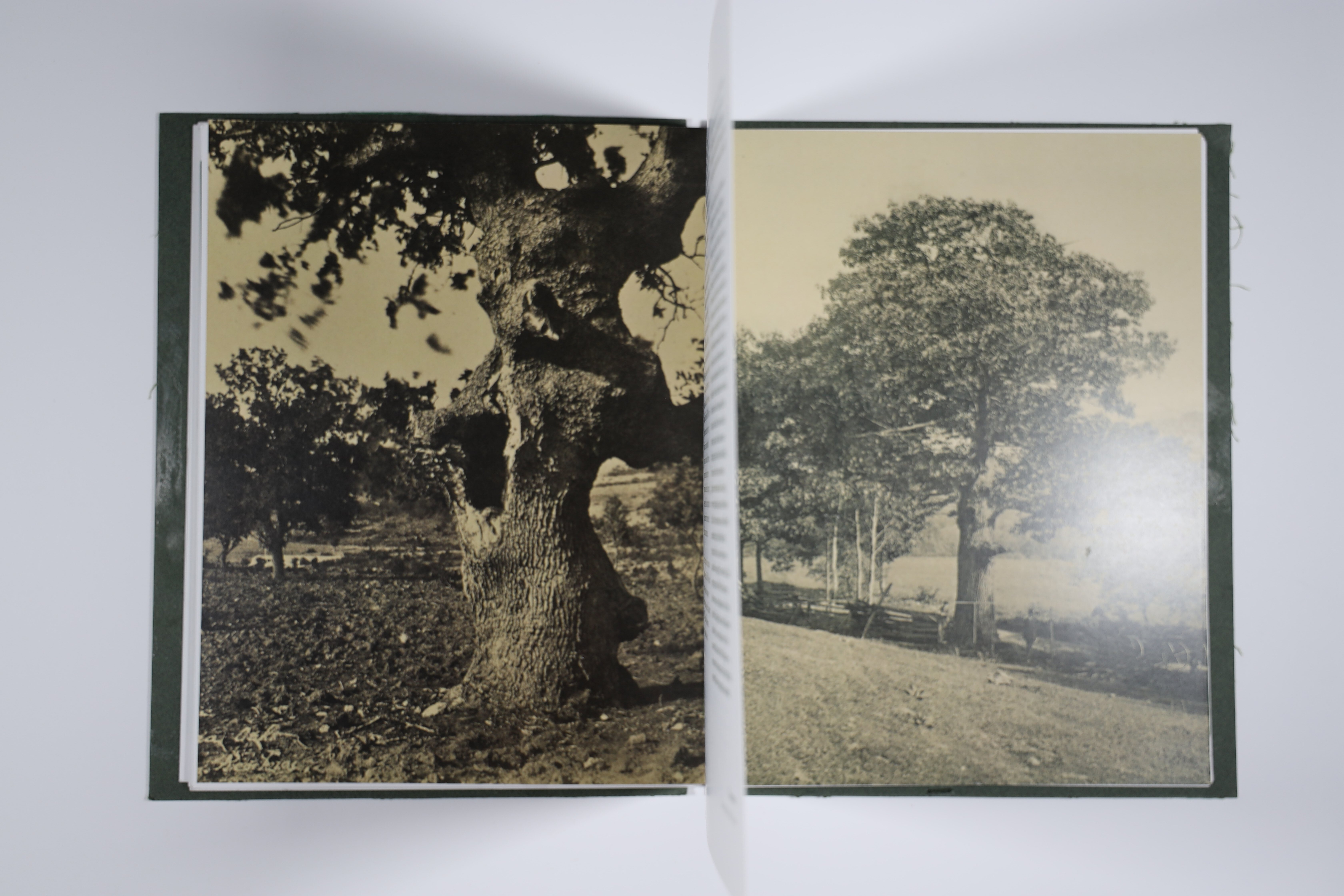
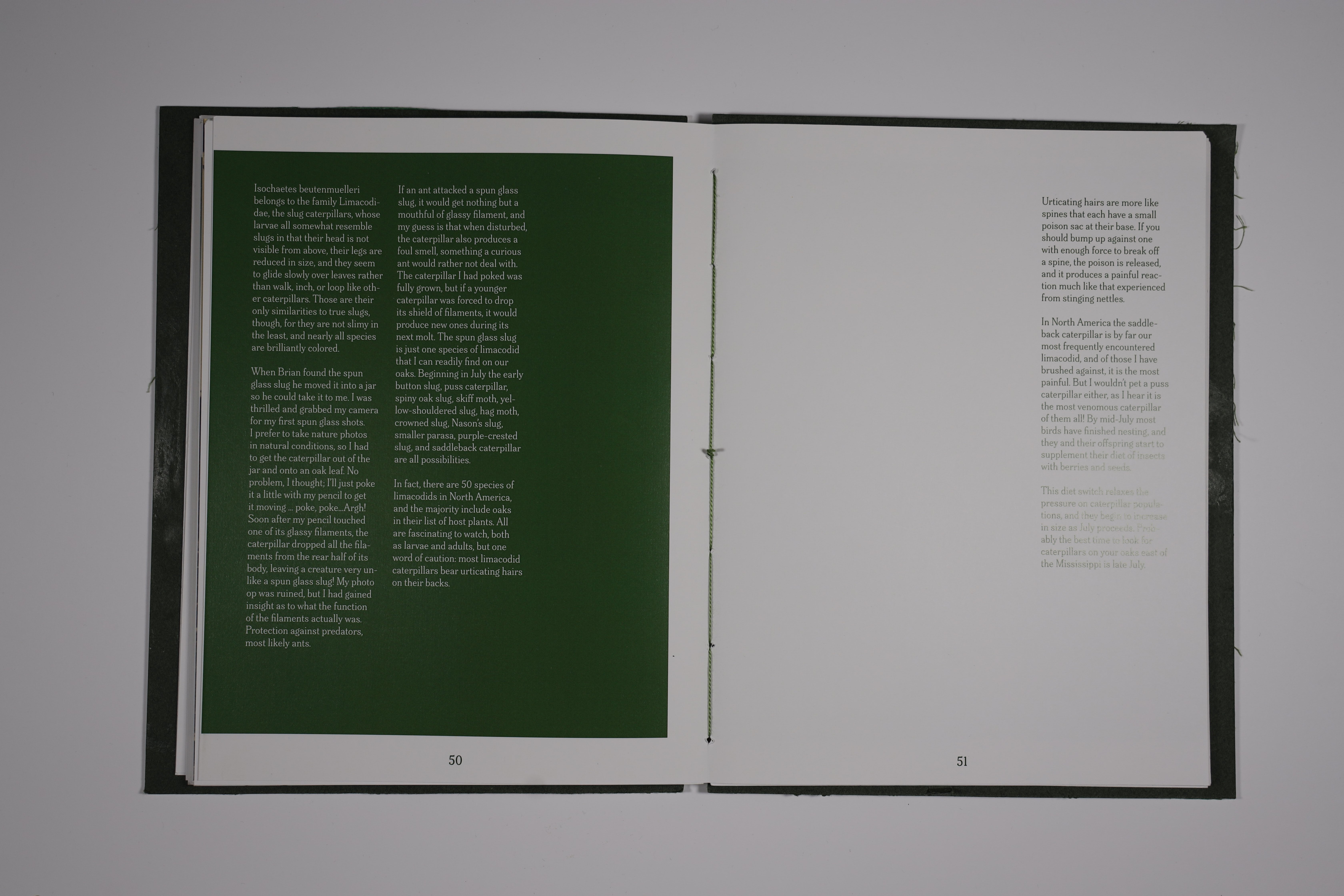
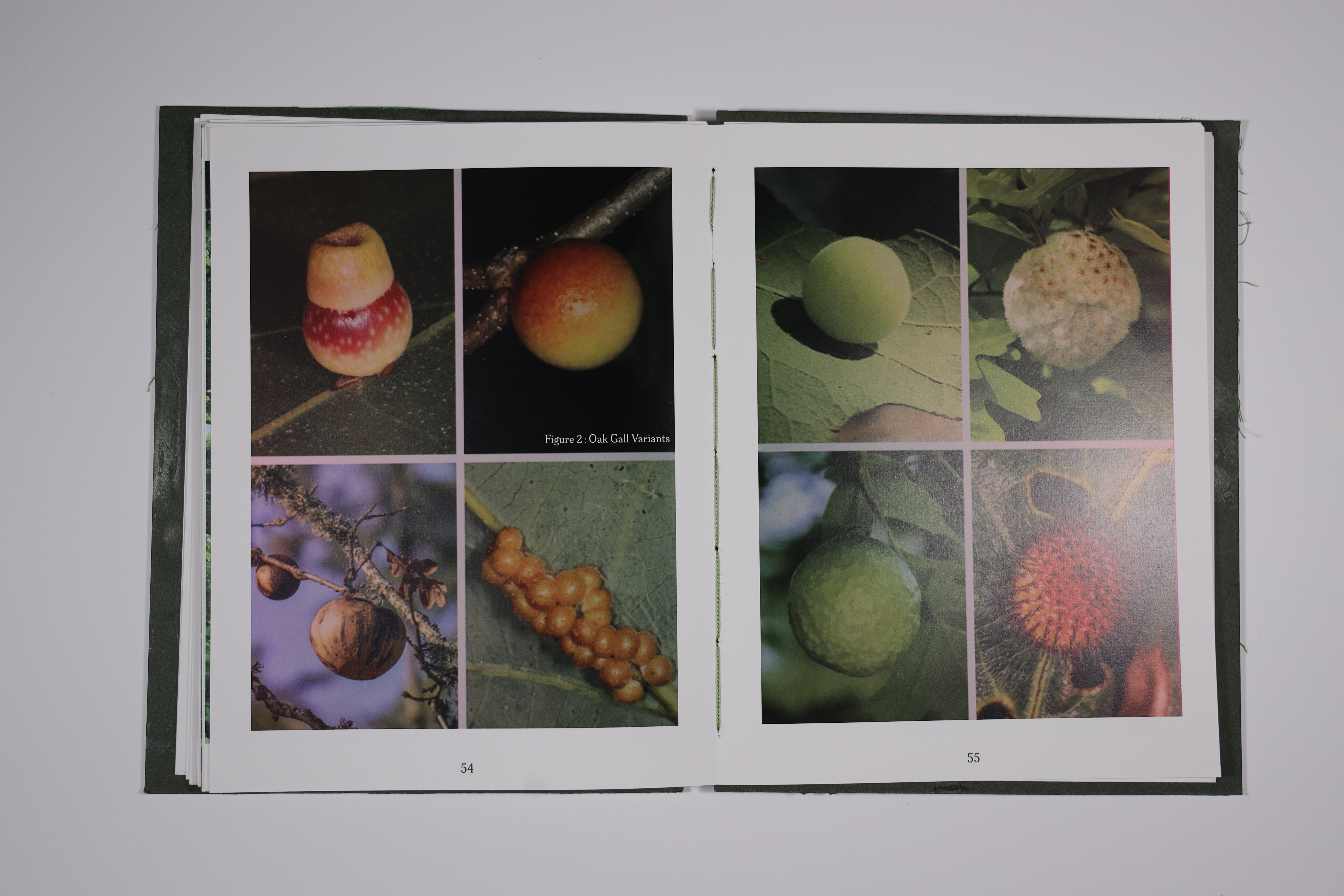
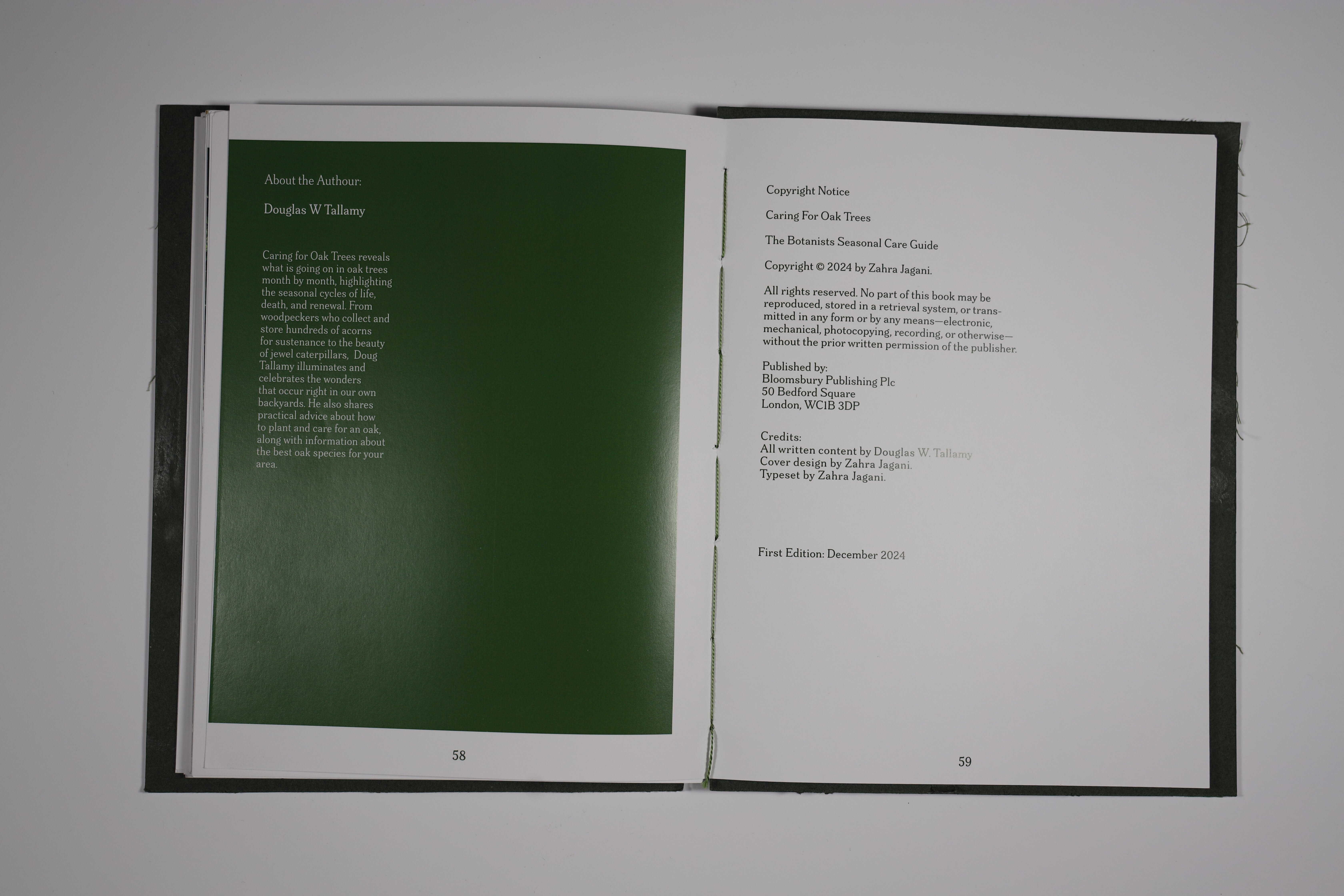
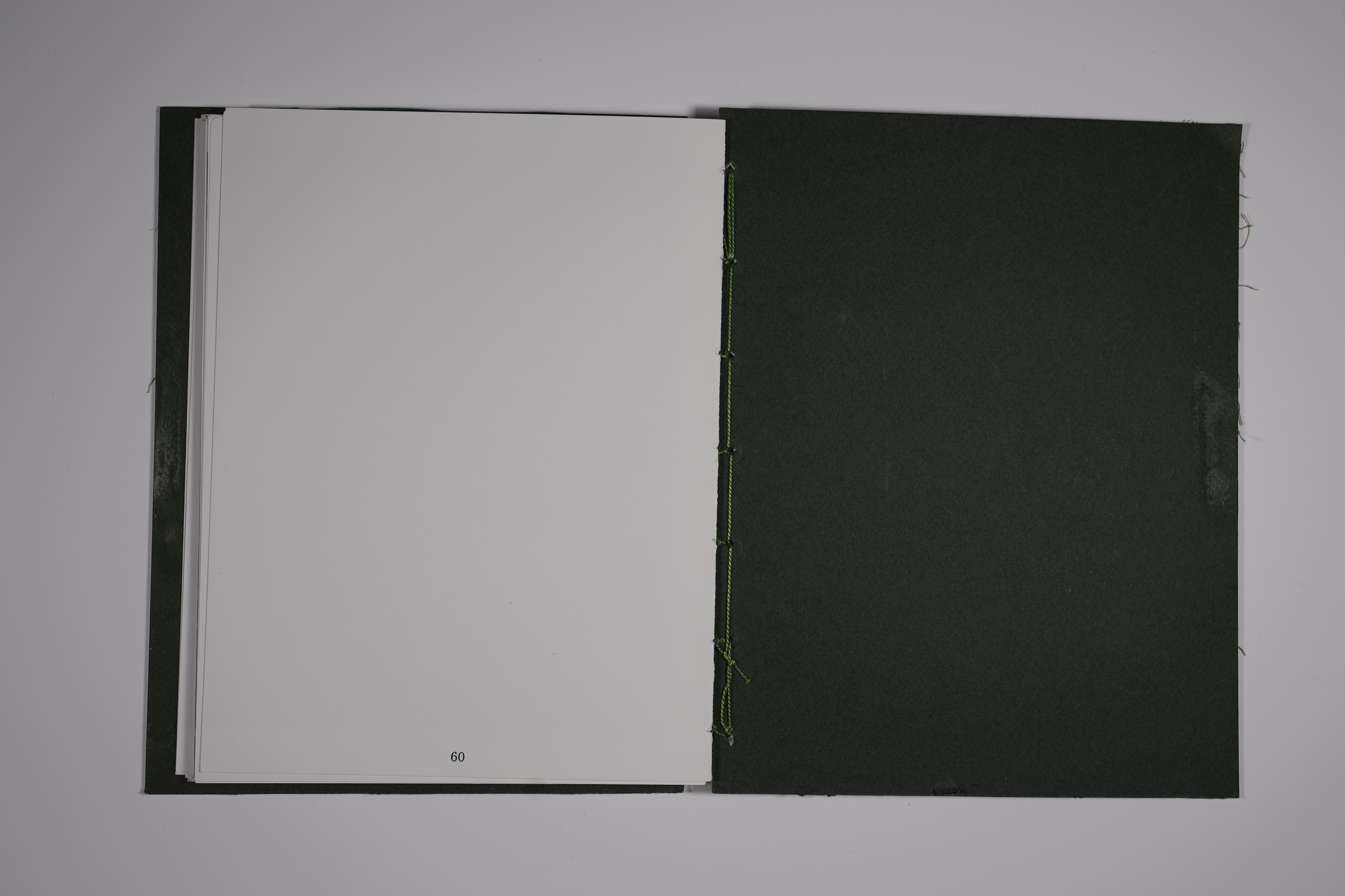
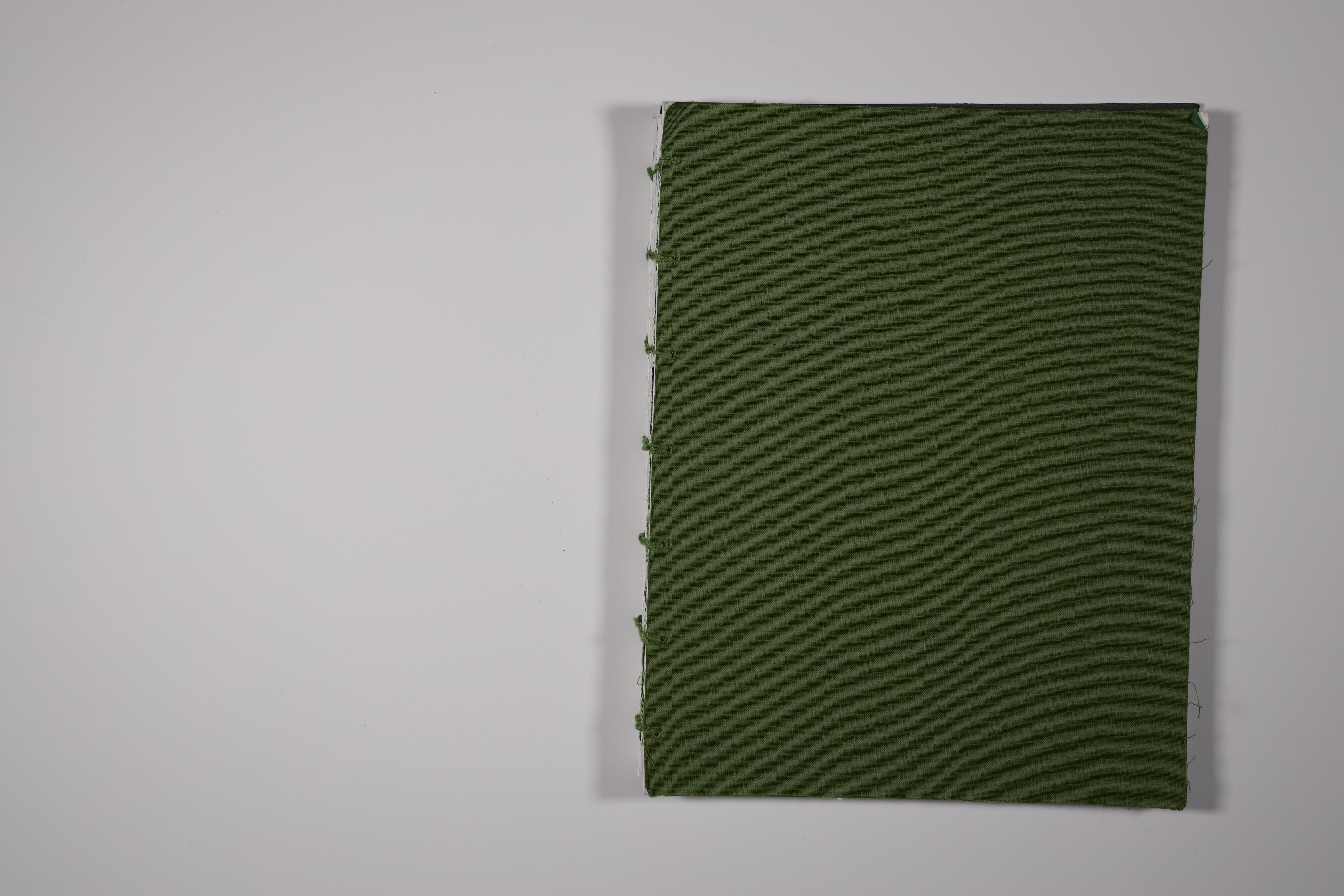
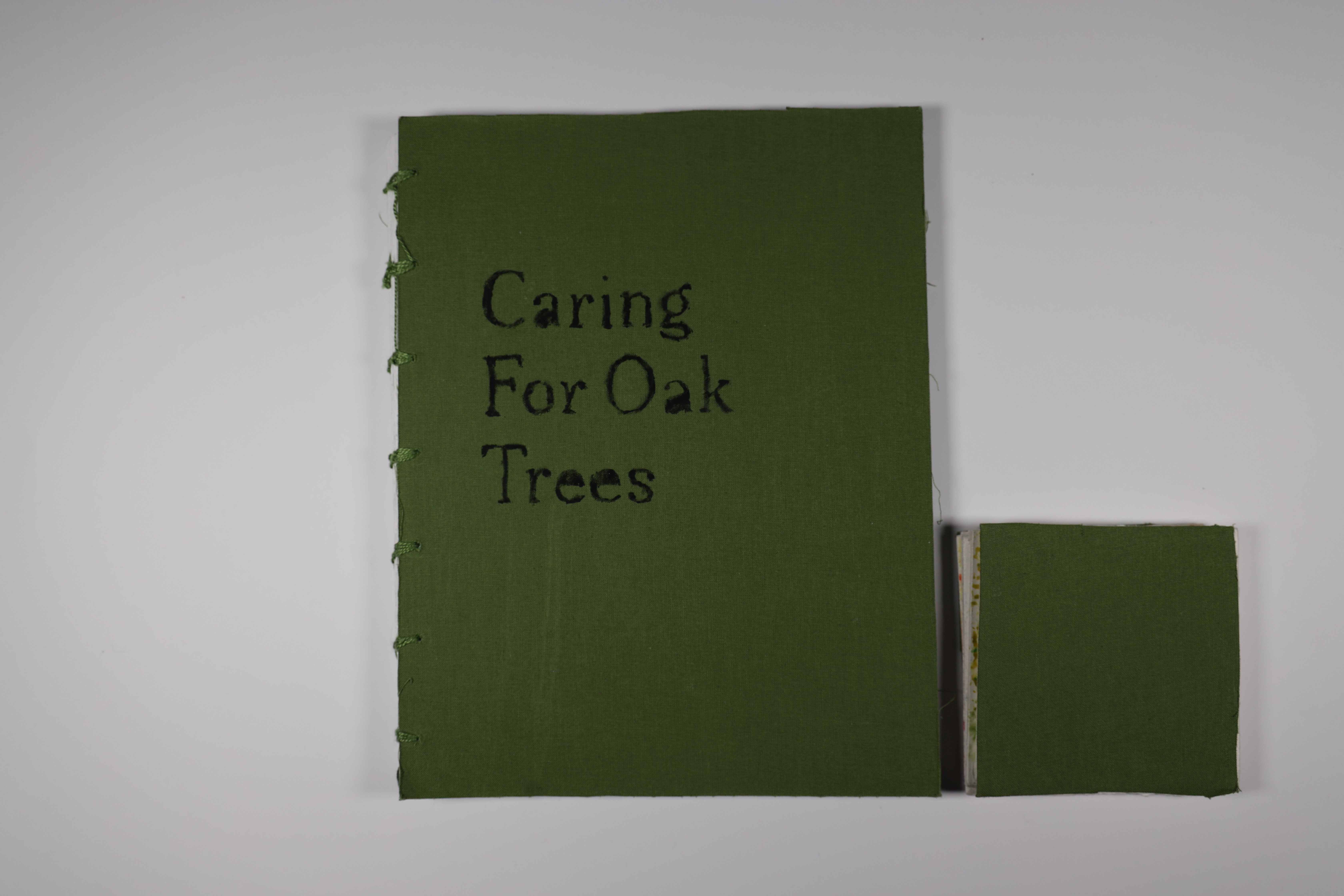
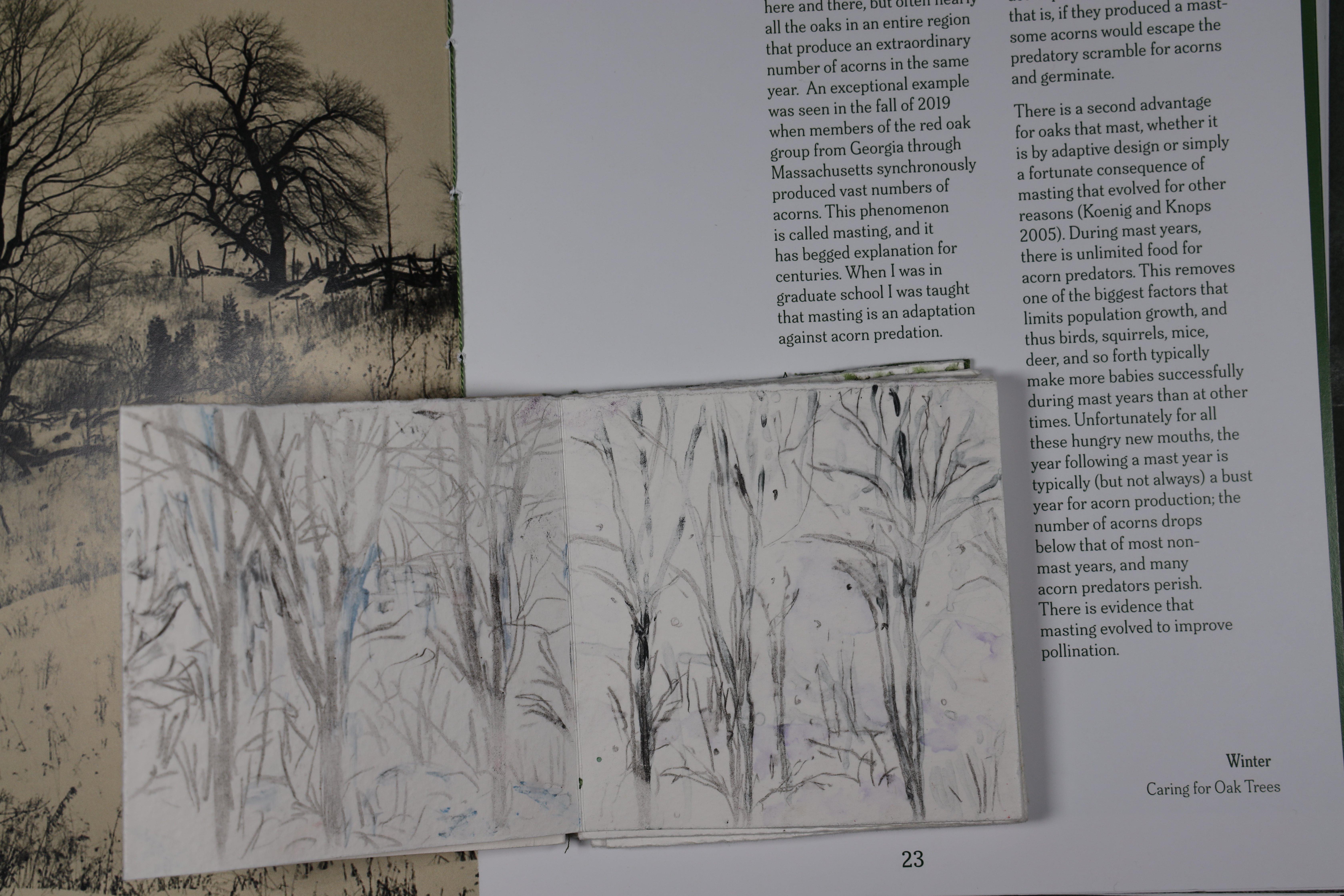
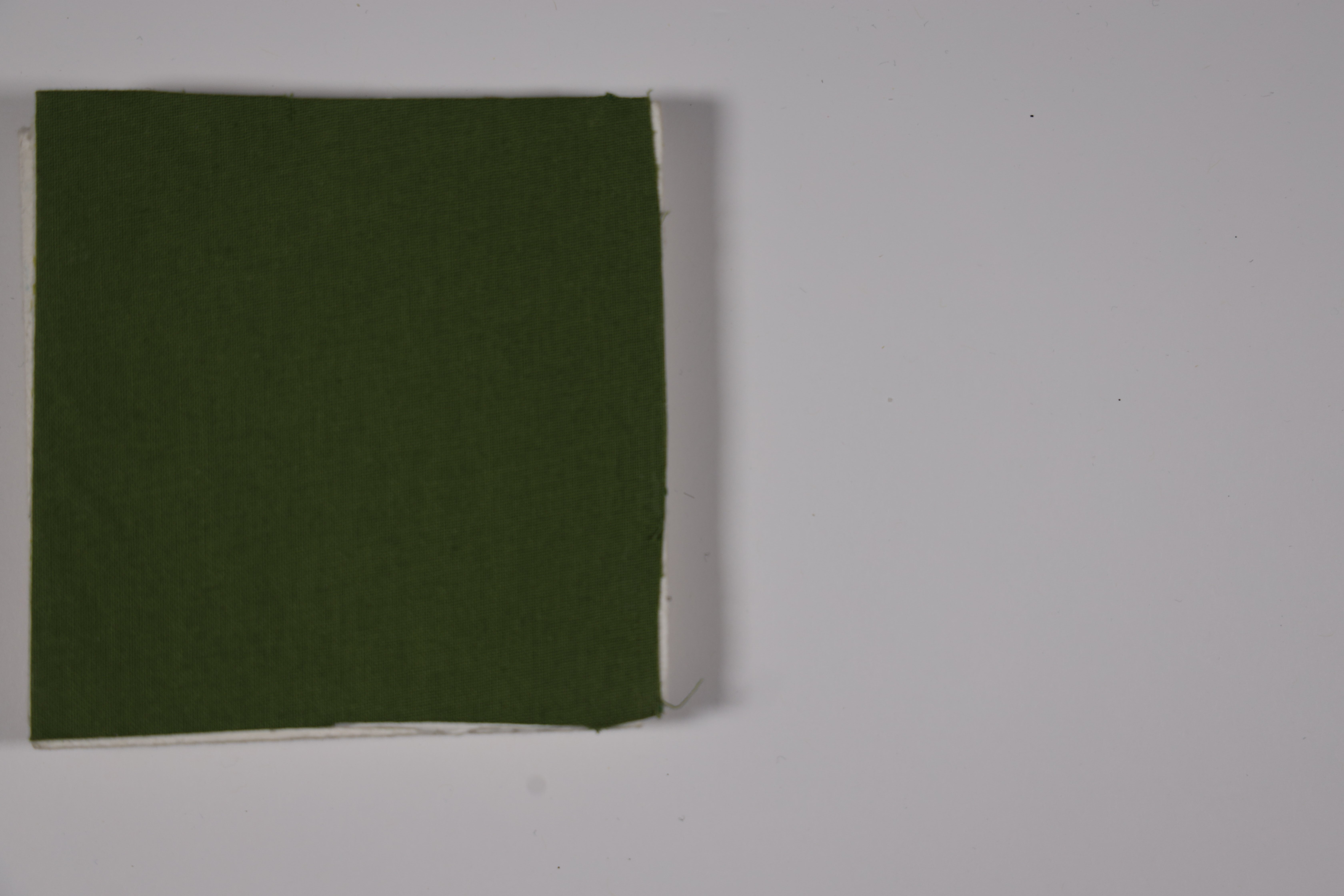
Print Publication · November 2024 · 1 Month
A book layout project designed cover to cover around the seasonal life of oak trees, based on the writing of Douglas W. Tallamy. Featuring coptic-stitched binding for a seamless lie-flat experience, a fabric hardcover, and a hand-lettered title stamped directly onto the cloth. Typography, image selection, and layout all serve the content's quiet reverence for the natural world.
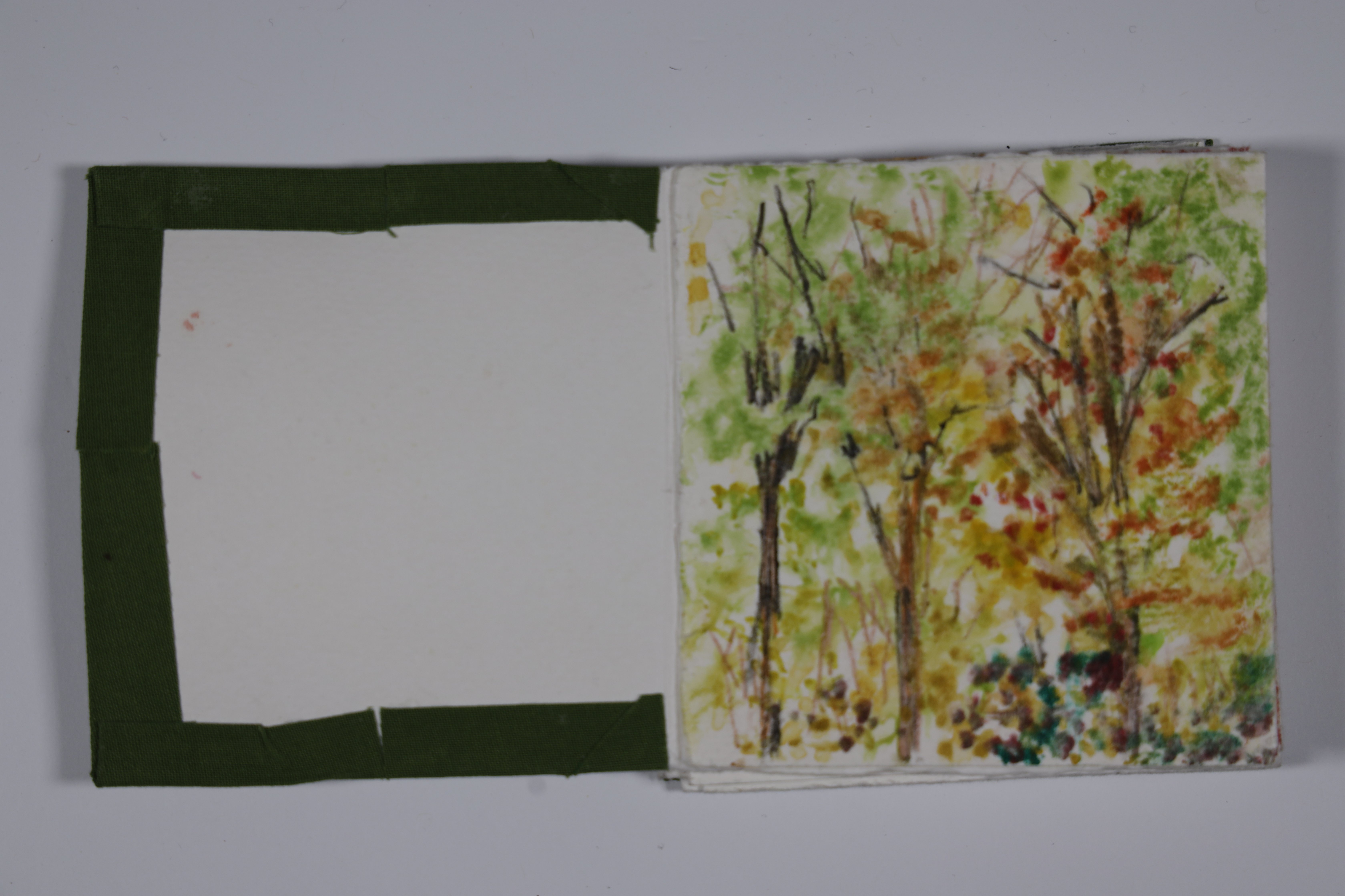
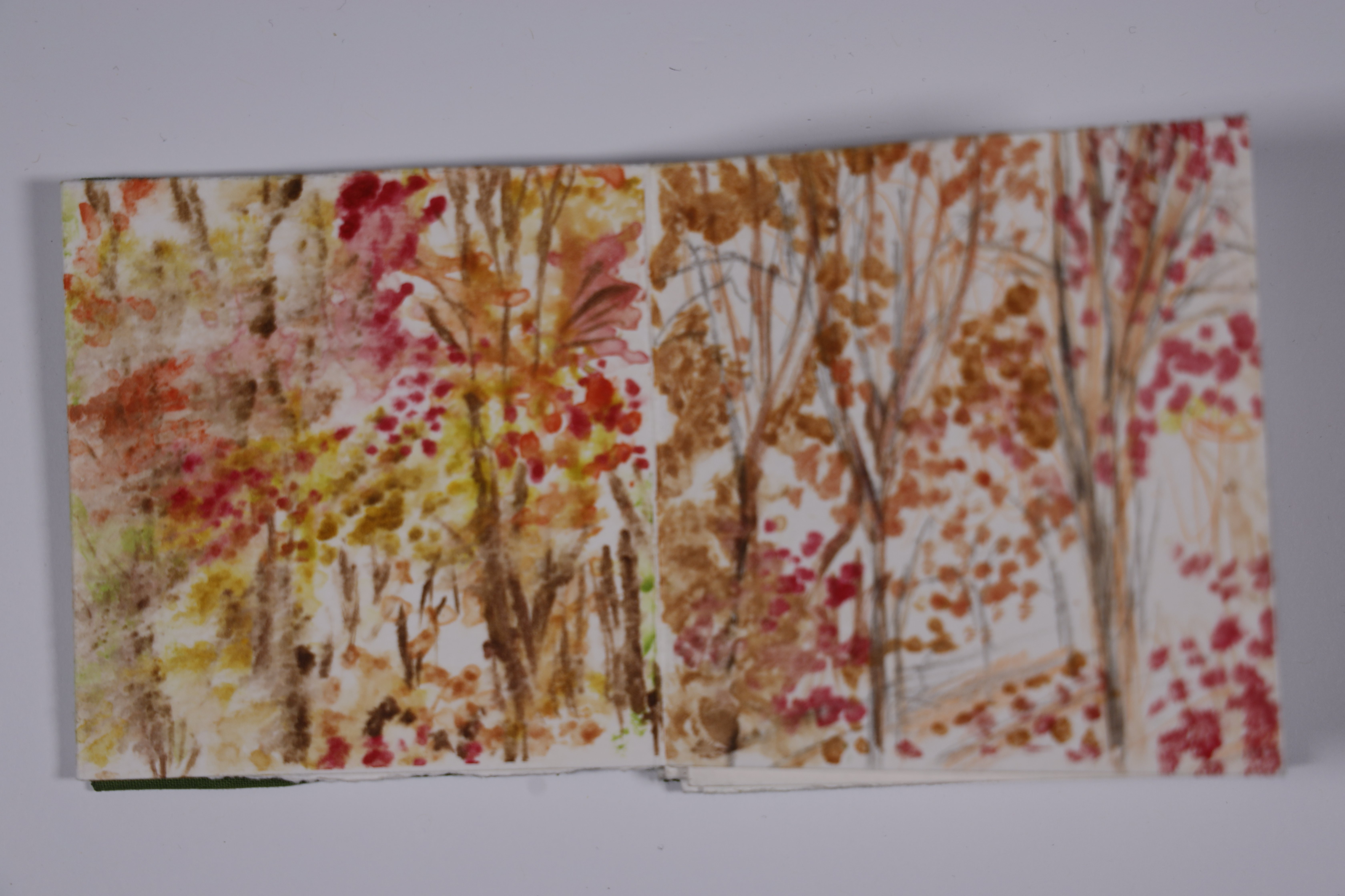
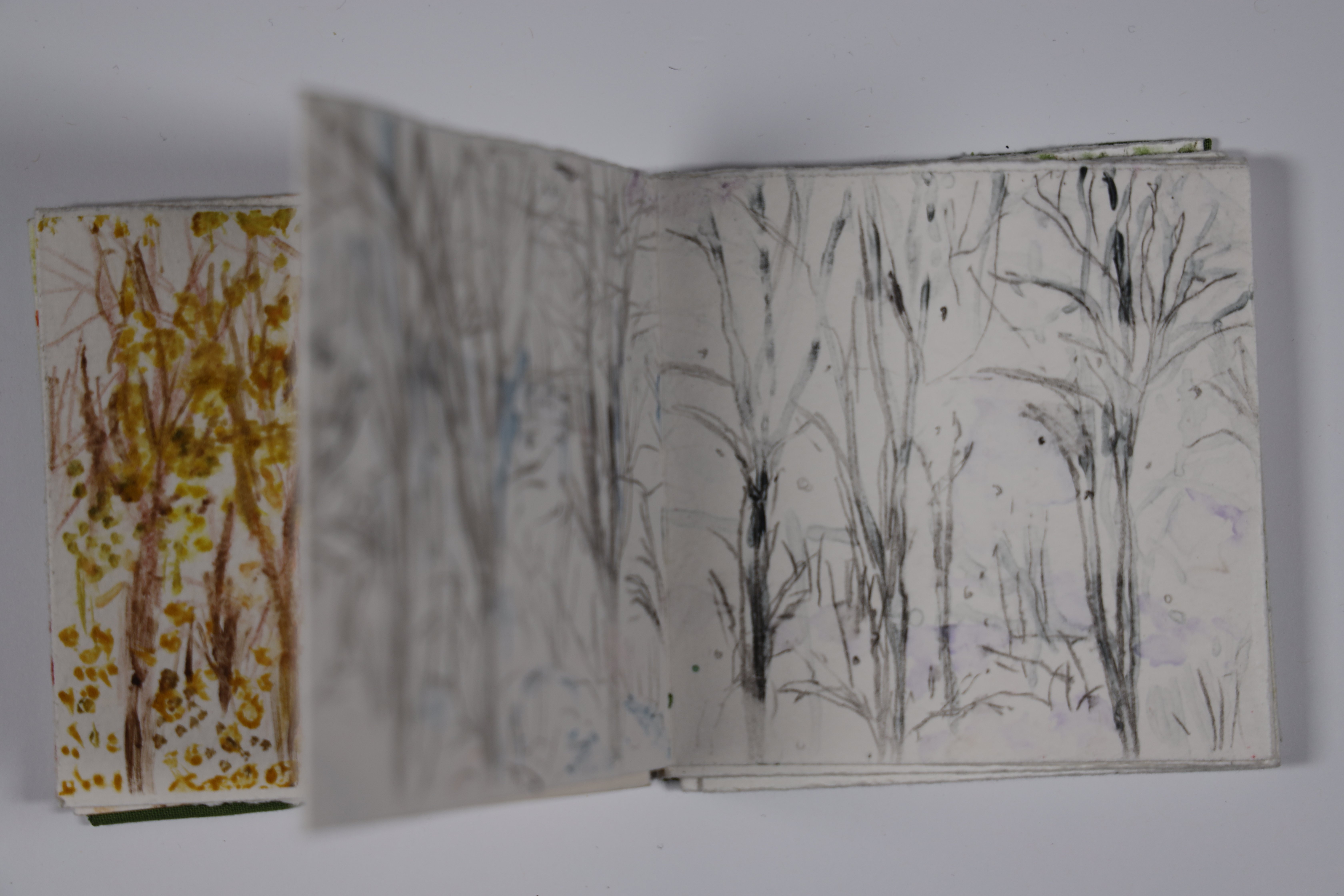
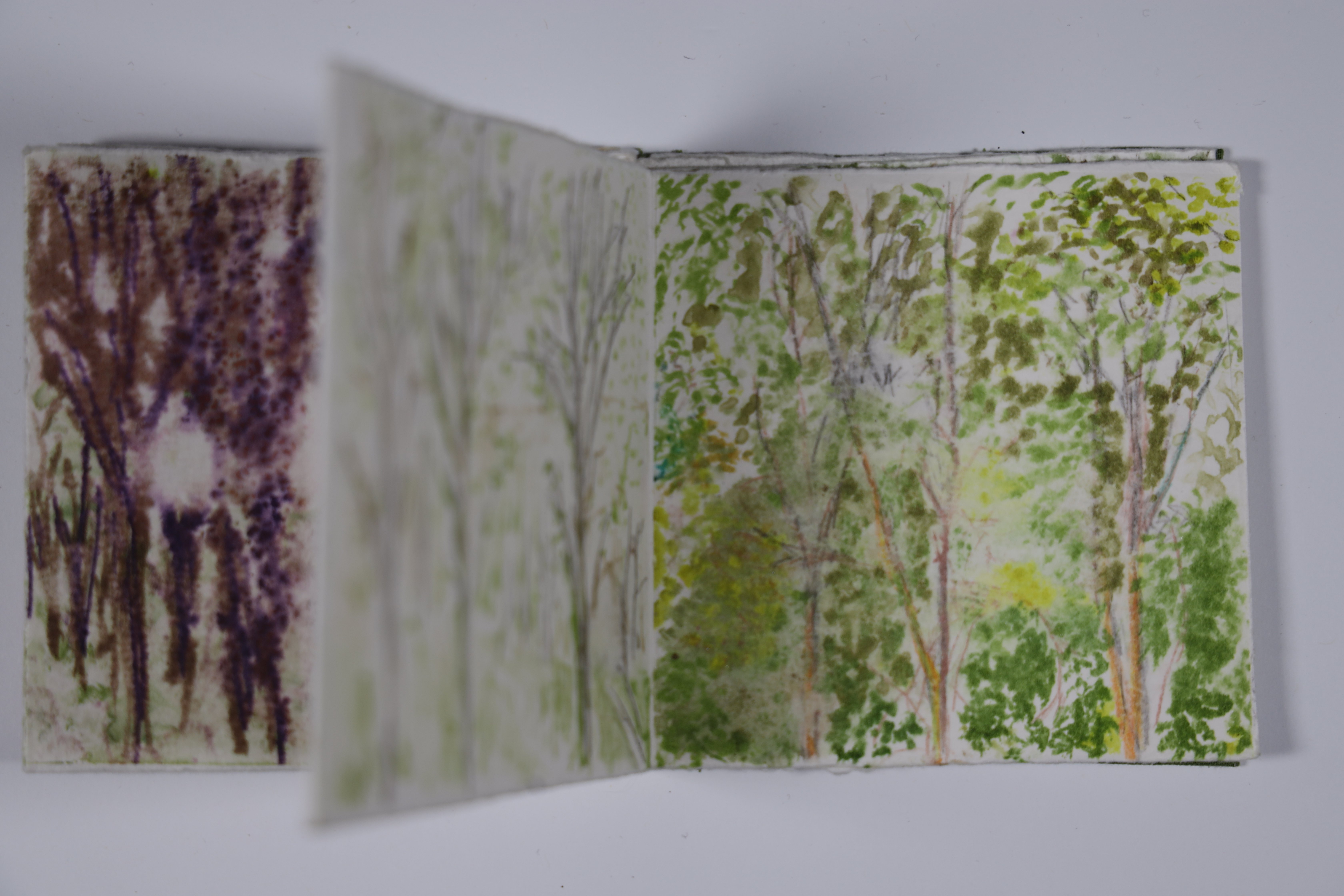
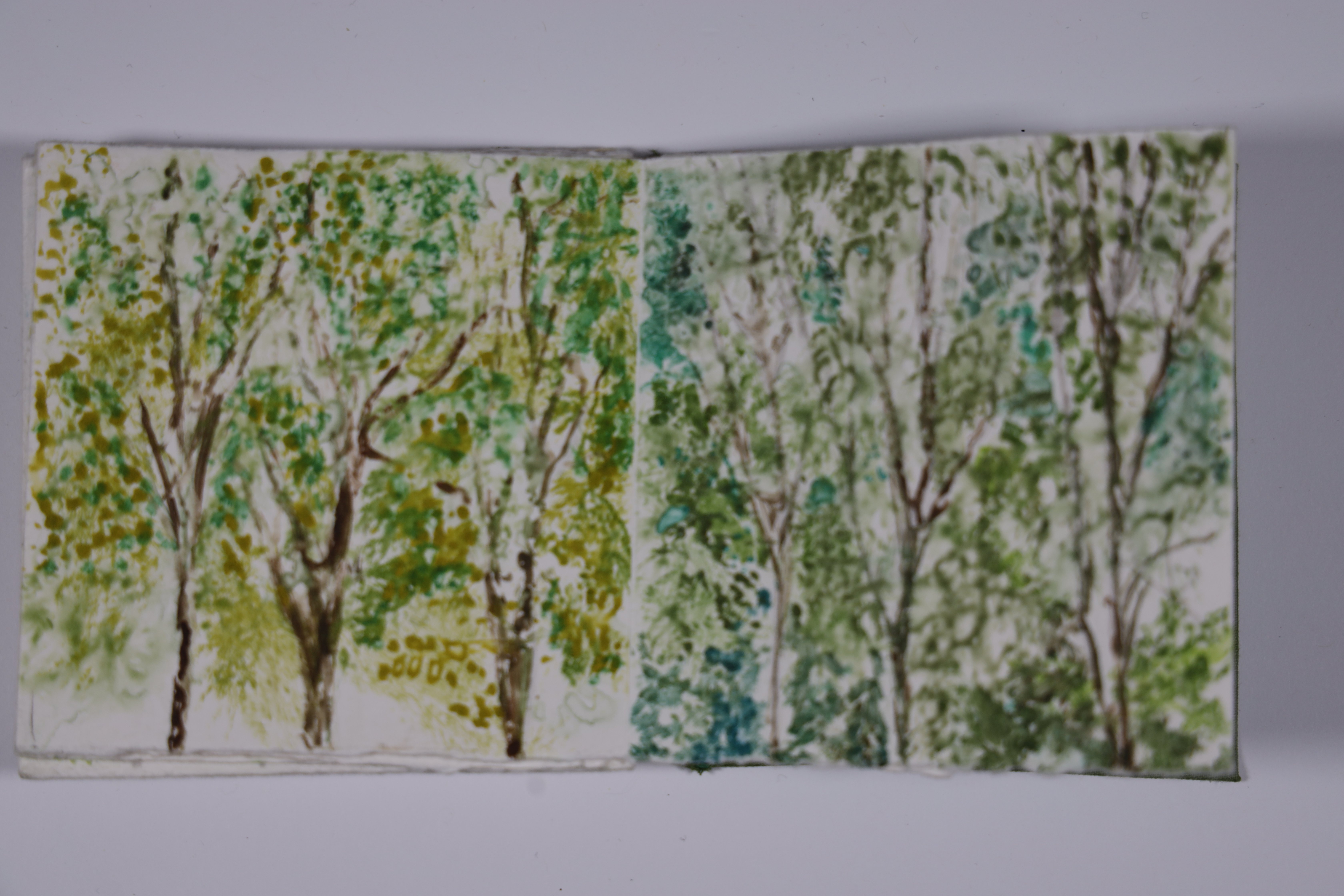
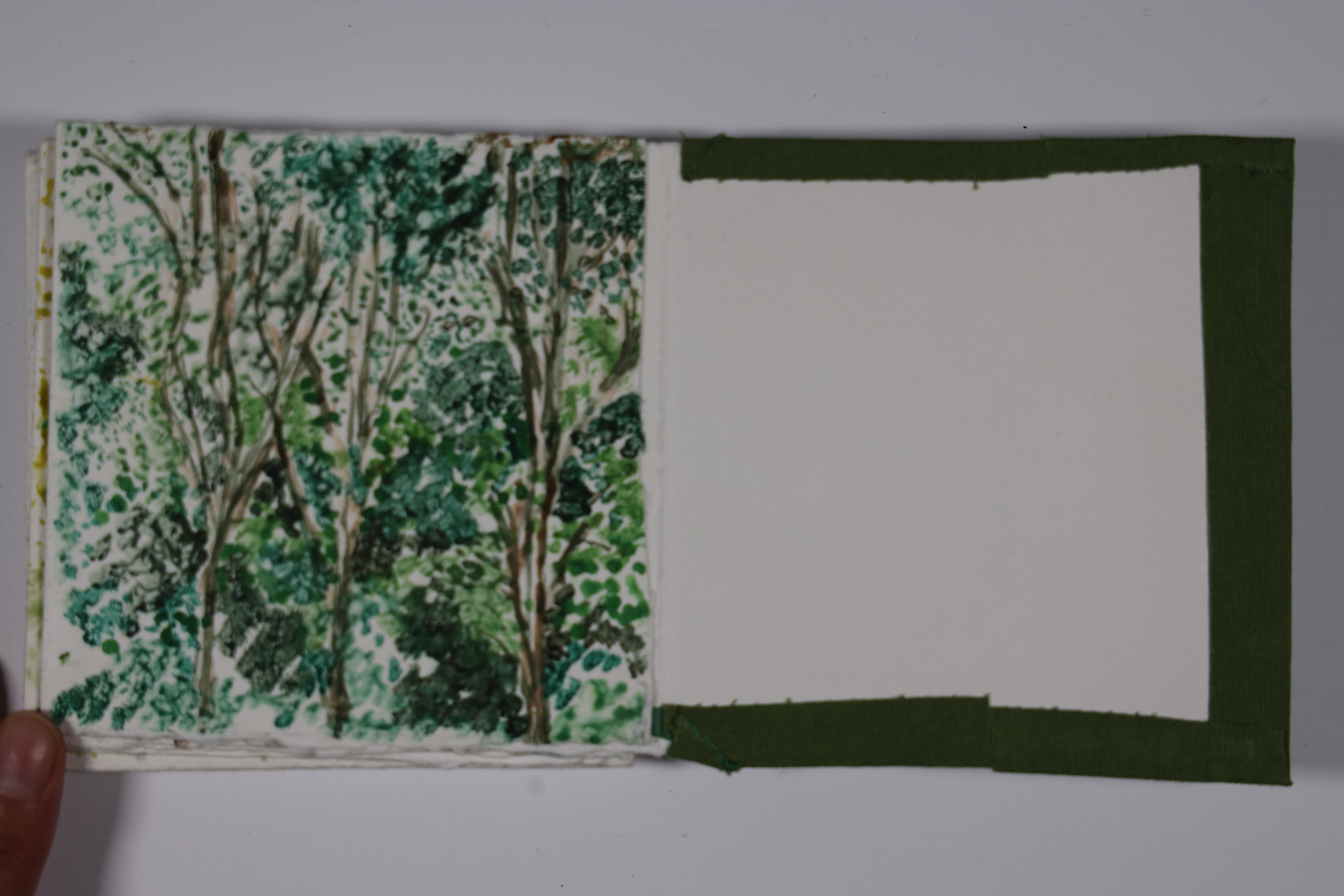
Print Publication · Monoprint · March 2025 · 2 Weeks
An accordion-folded book of monoprints depicting oak trees across all four seasons. Created as a companion to the main publication, it uses acetate transfers onto rag paper to render the trees in shifting colour — warm reds and oranges for autumn, bare charcoal for winter, soft purples for late spring, and lush greens for summer. Designed to be held, turned, and unfolded.
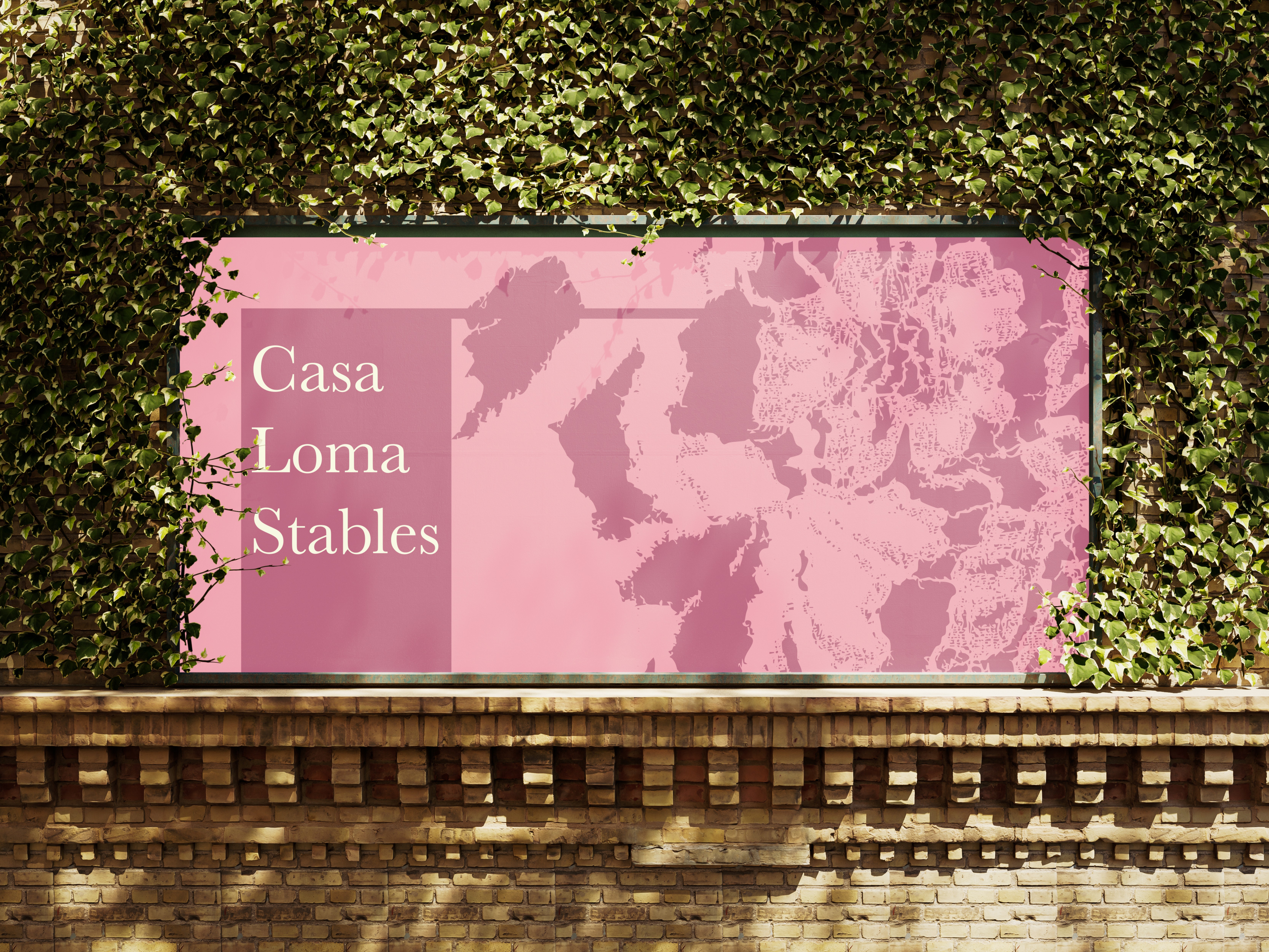
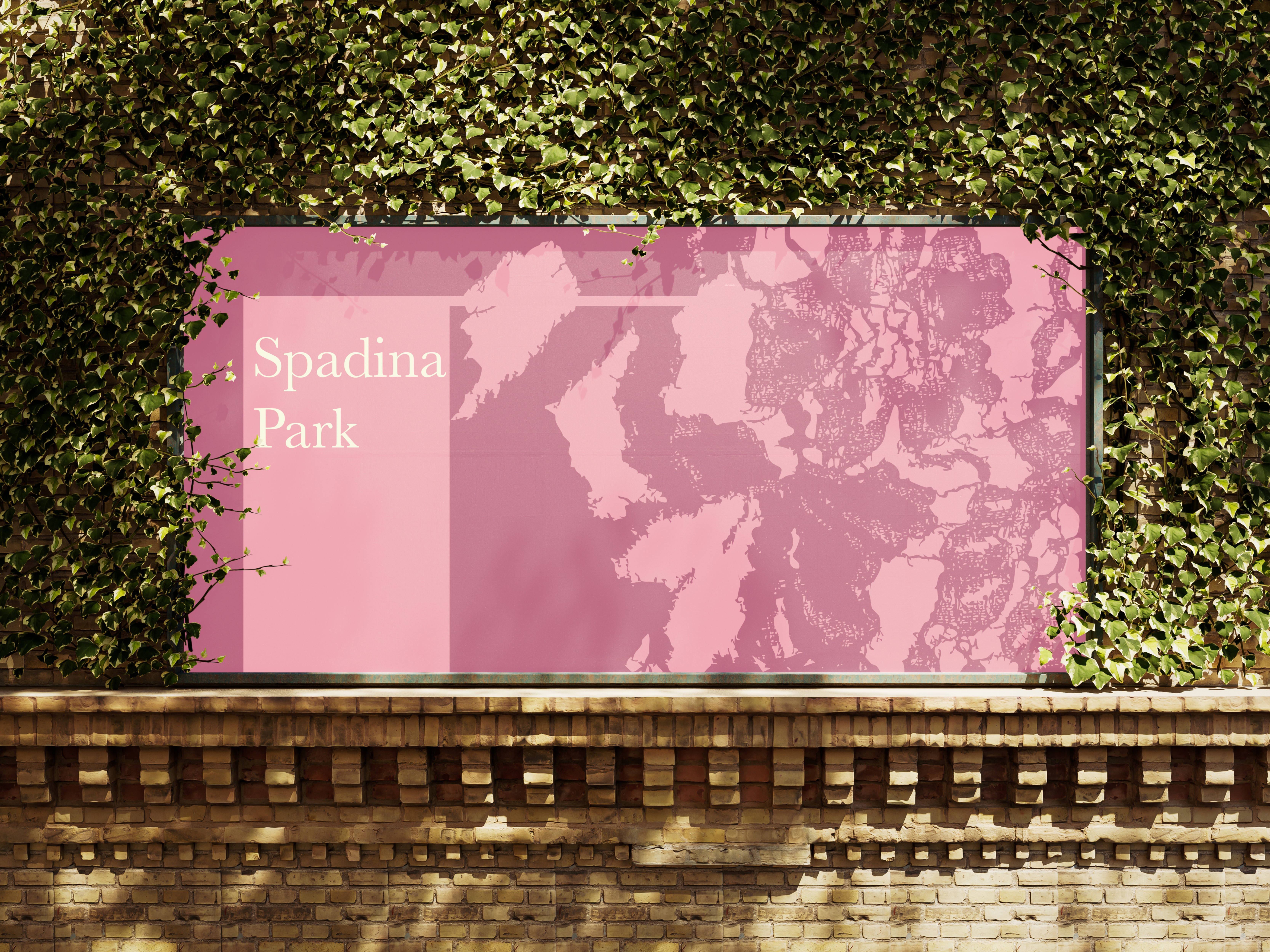
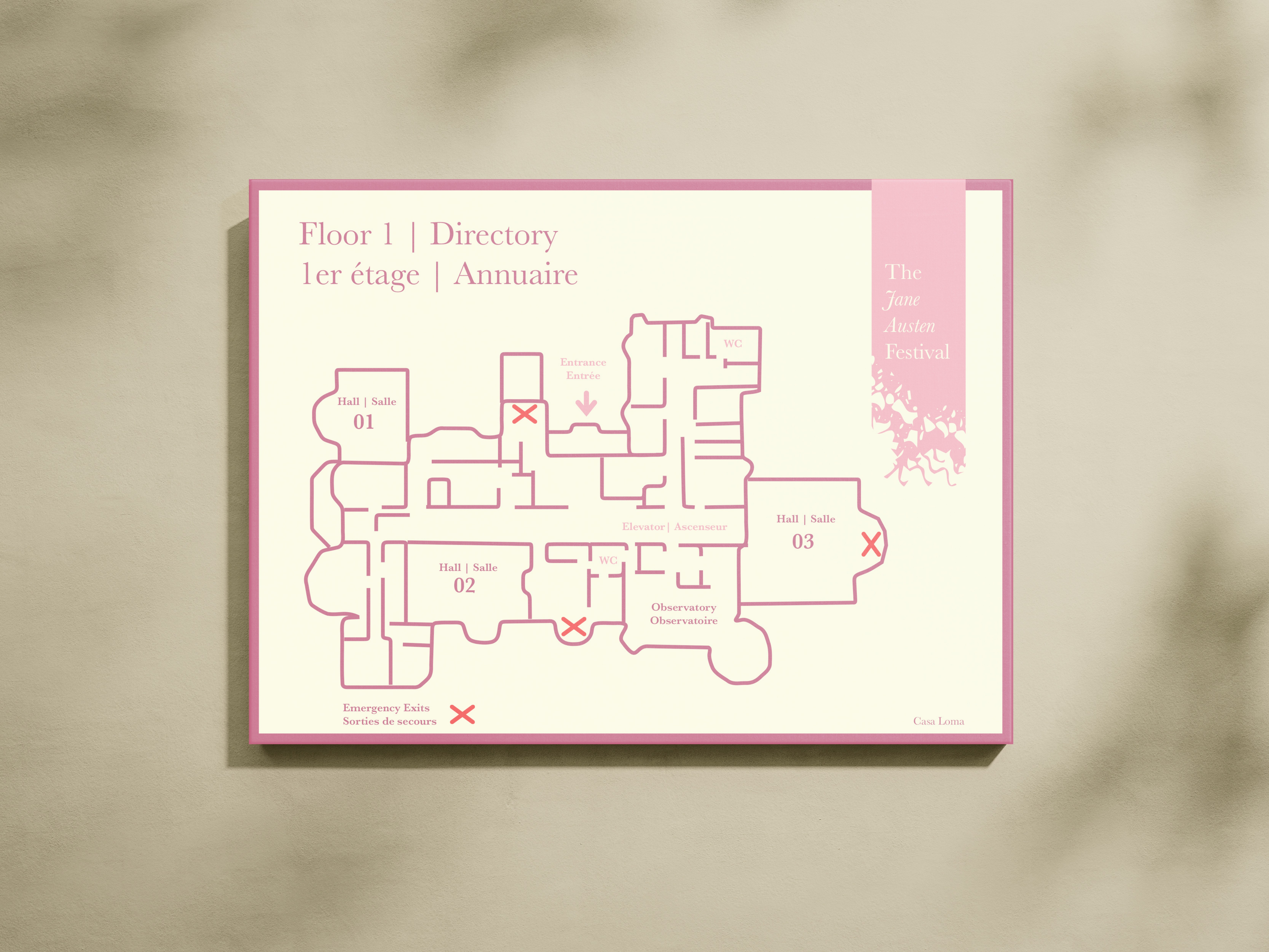
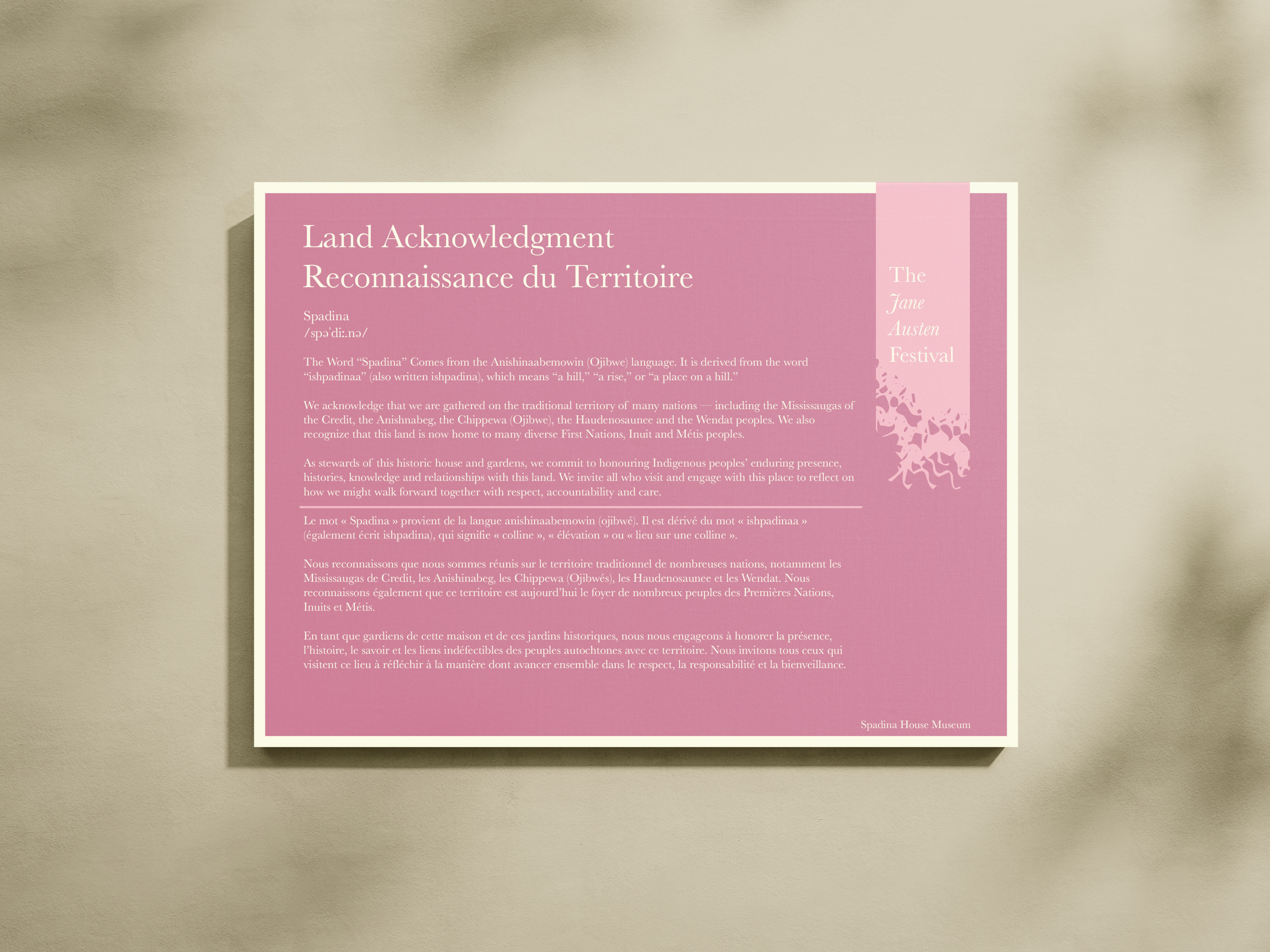
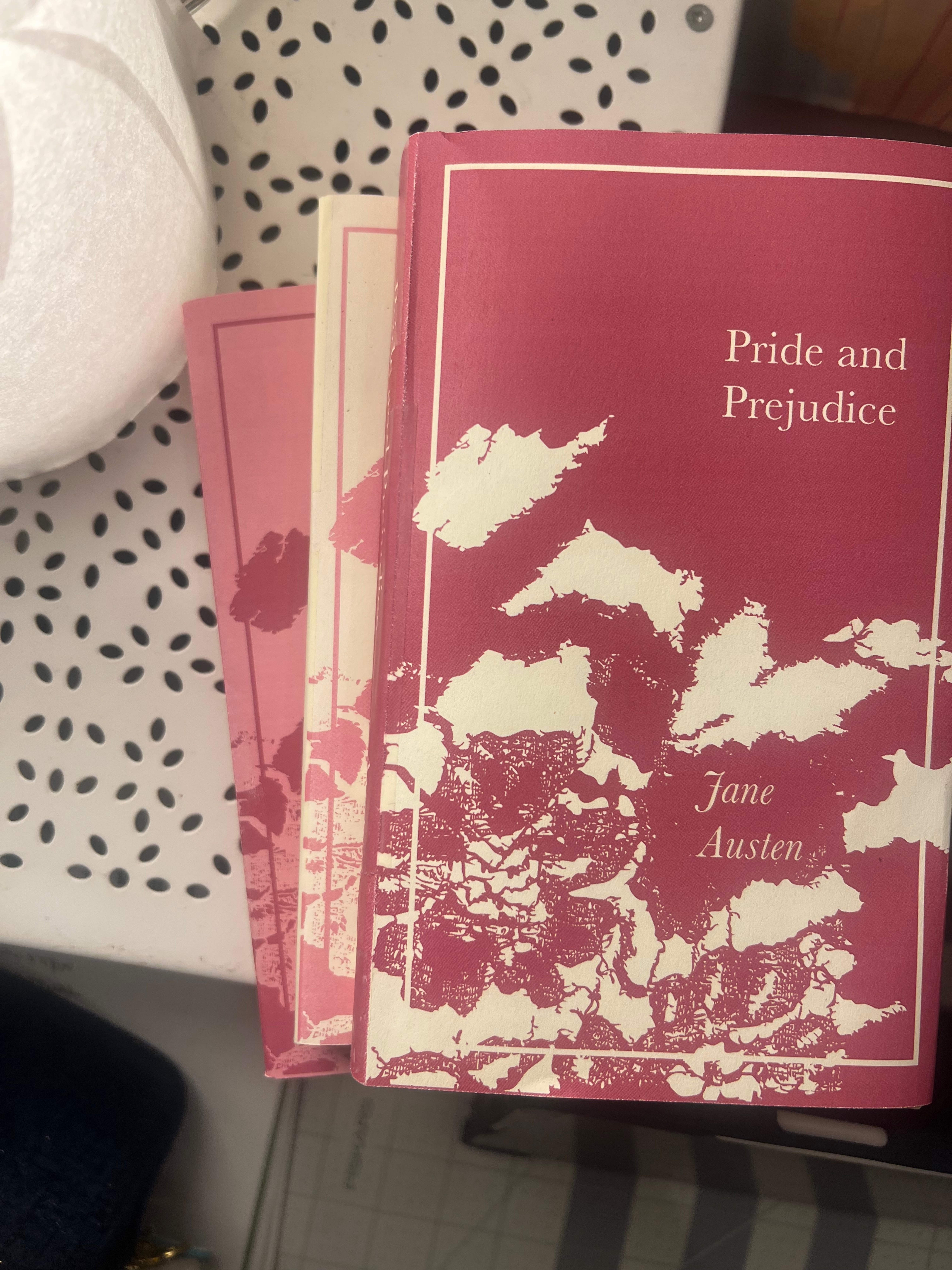
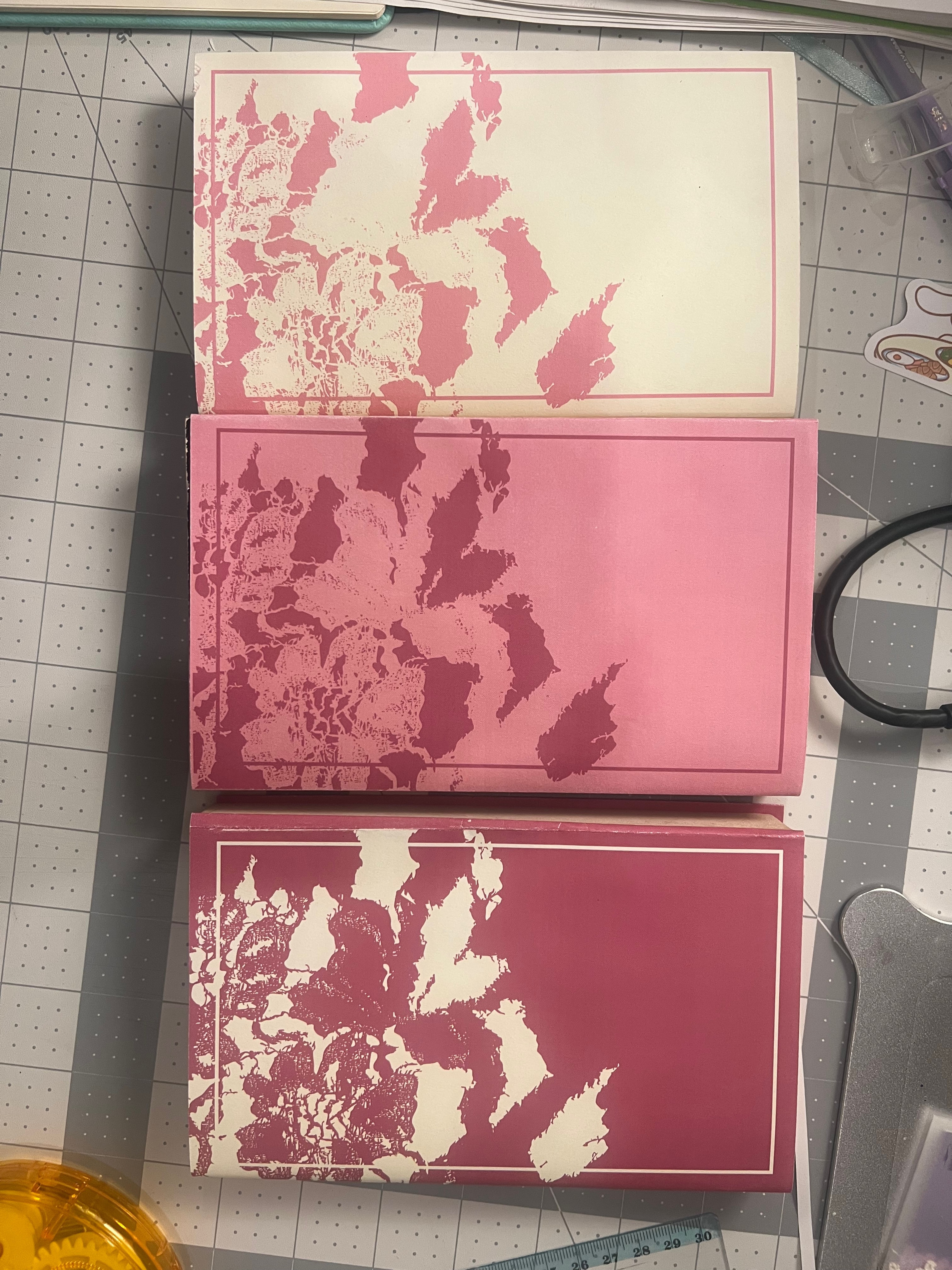
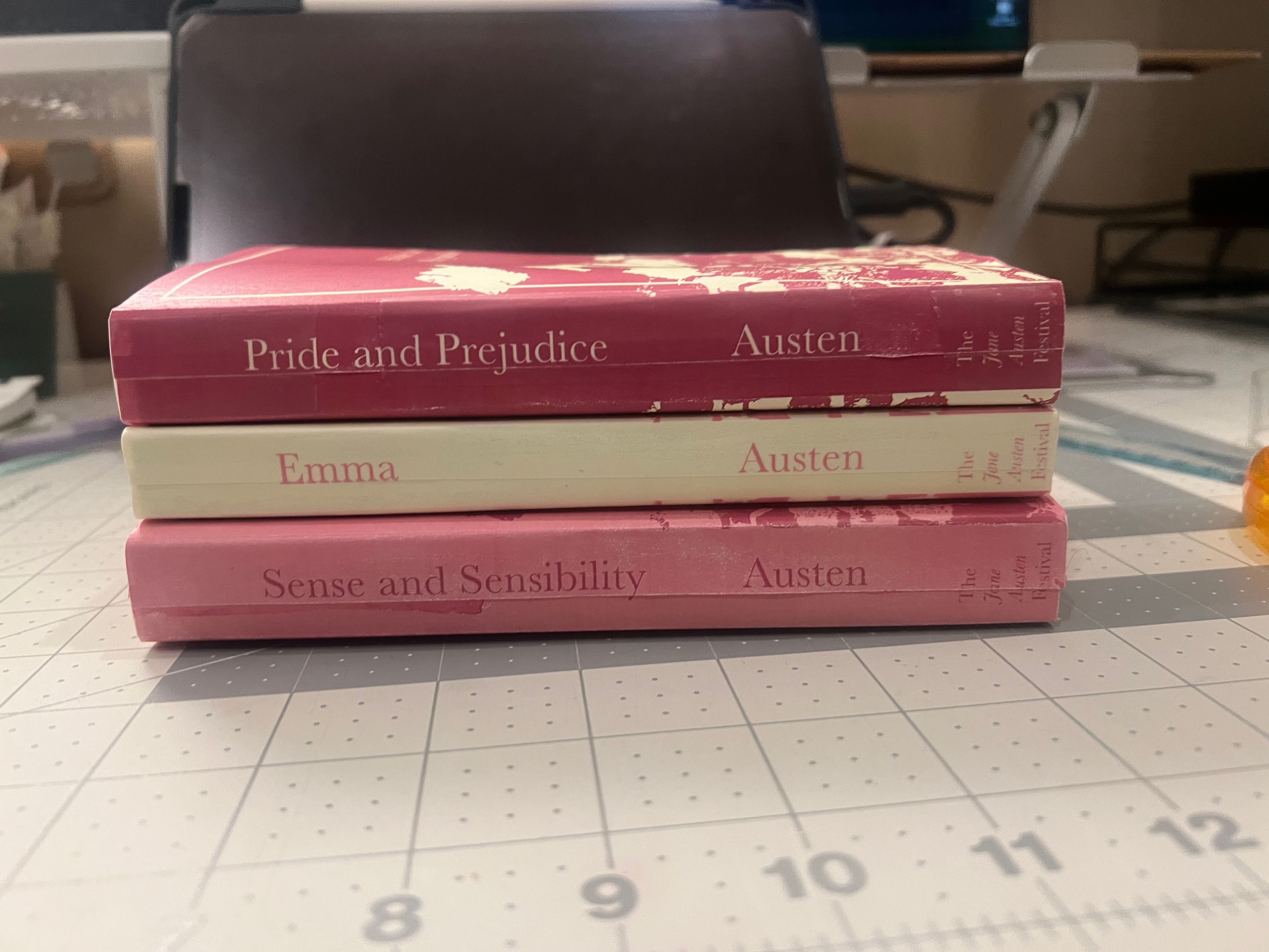
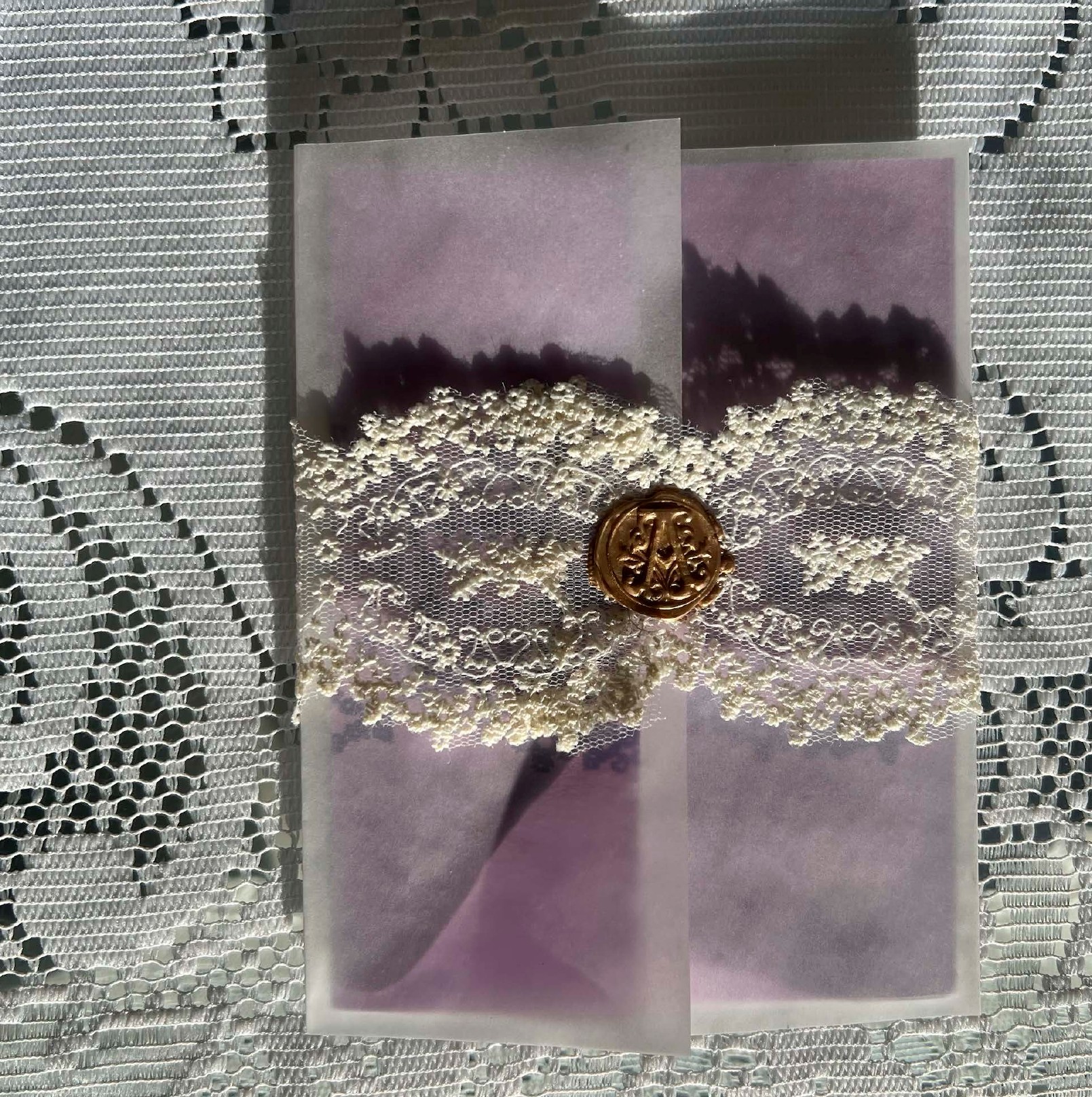
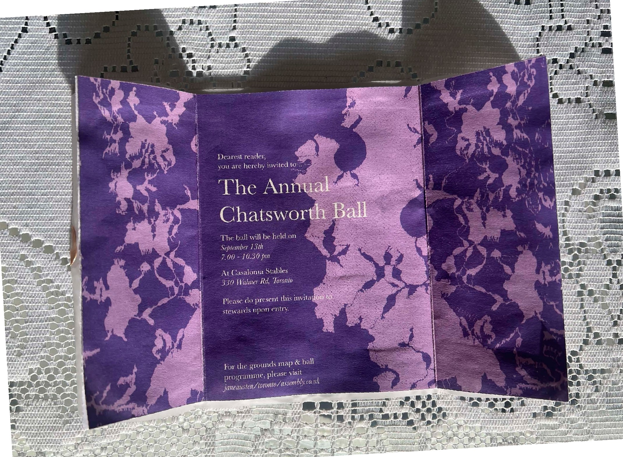
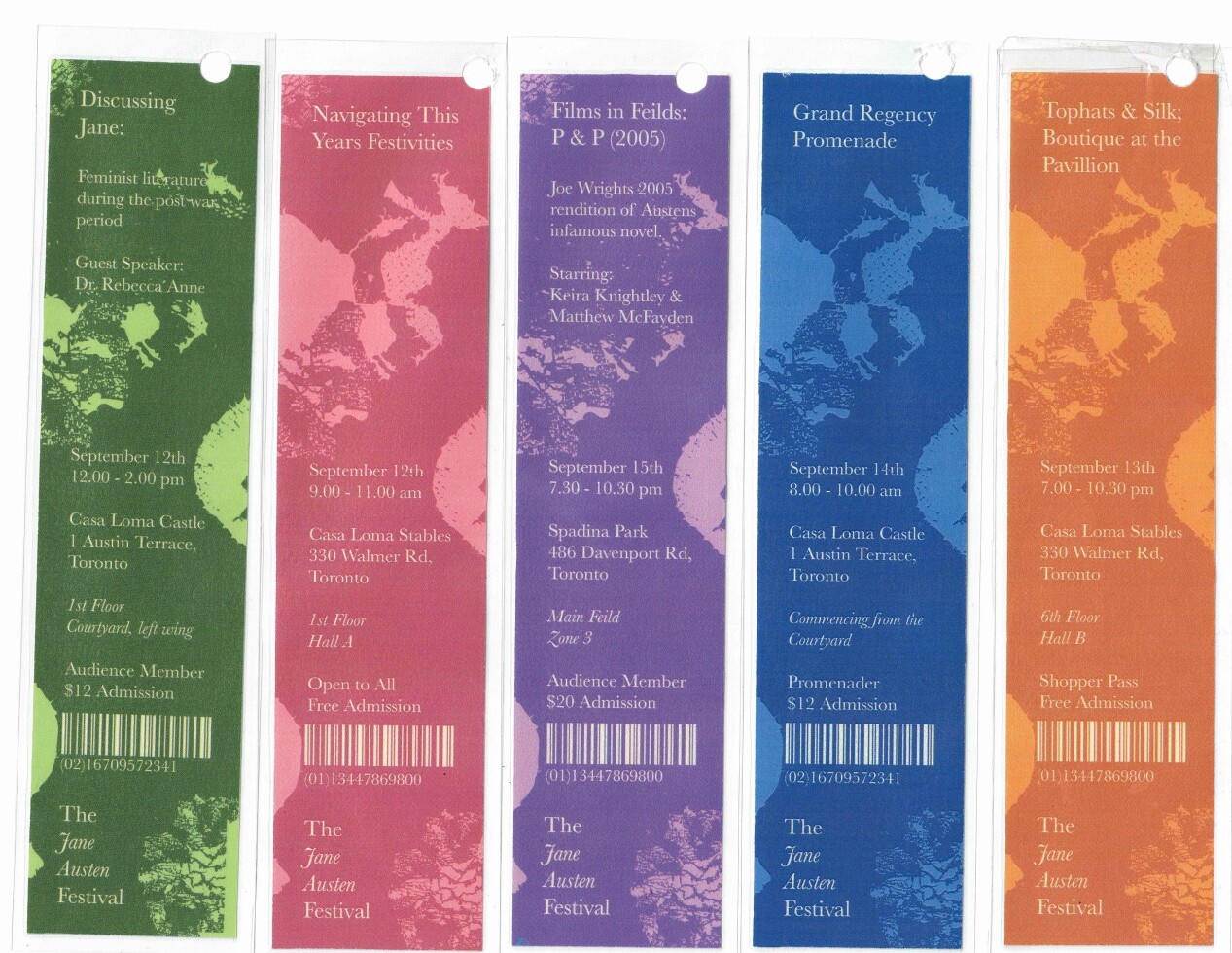
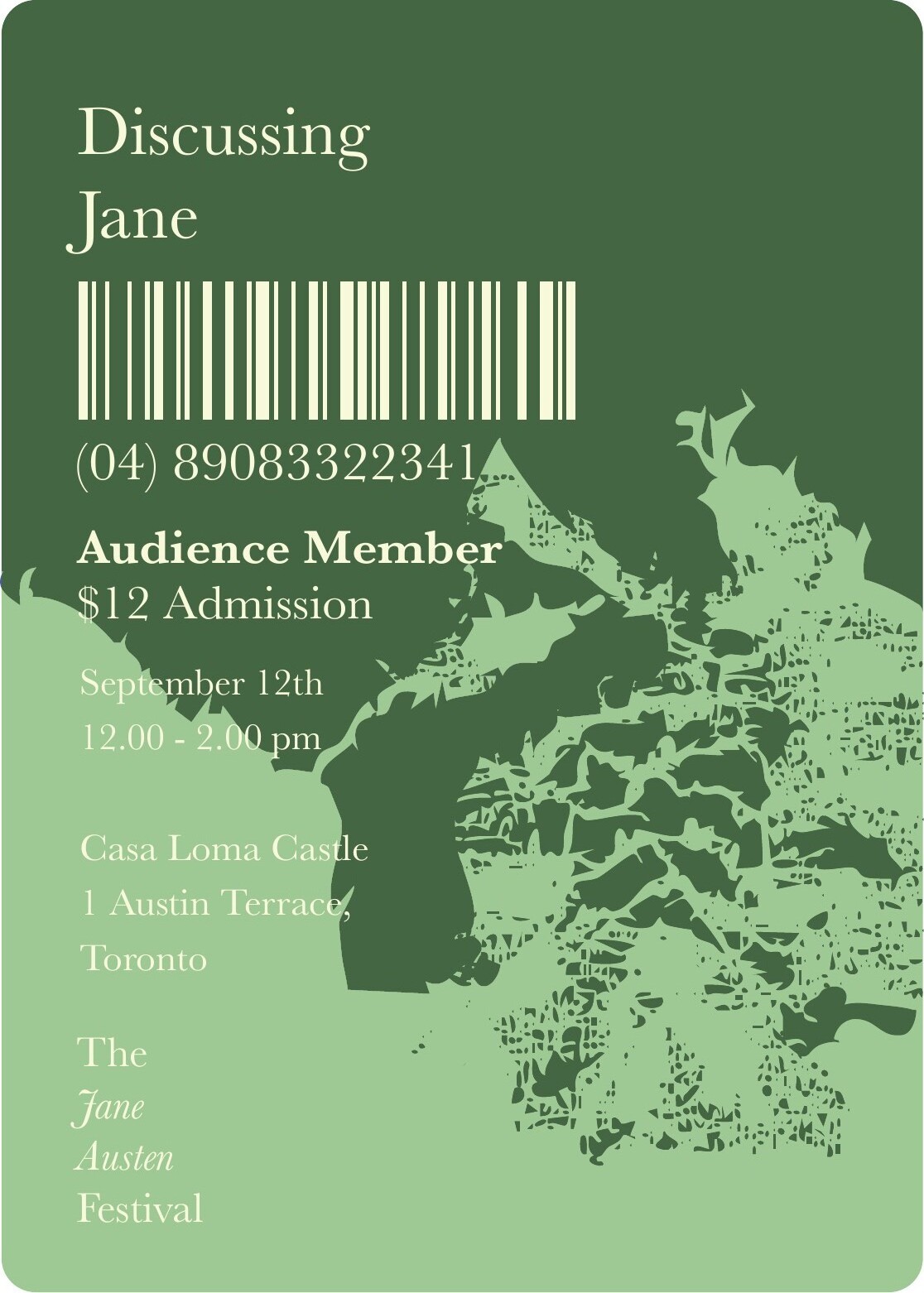
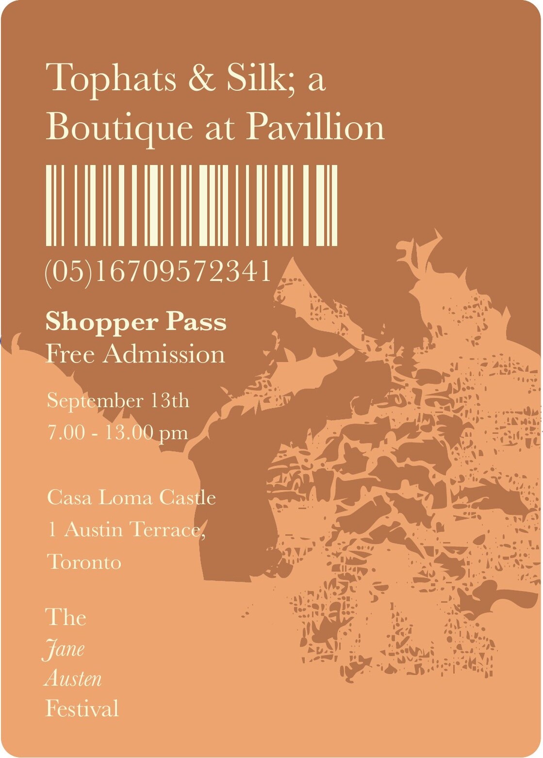
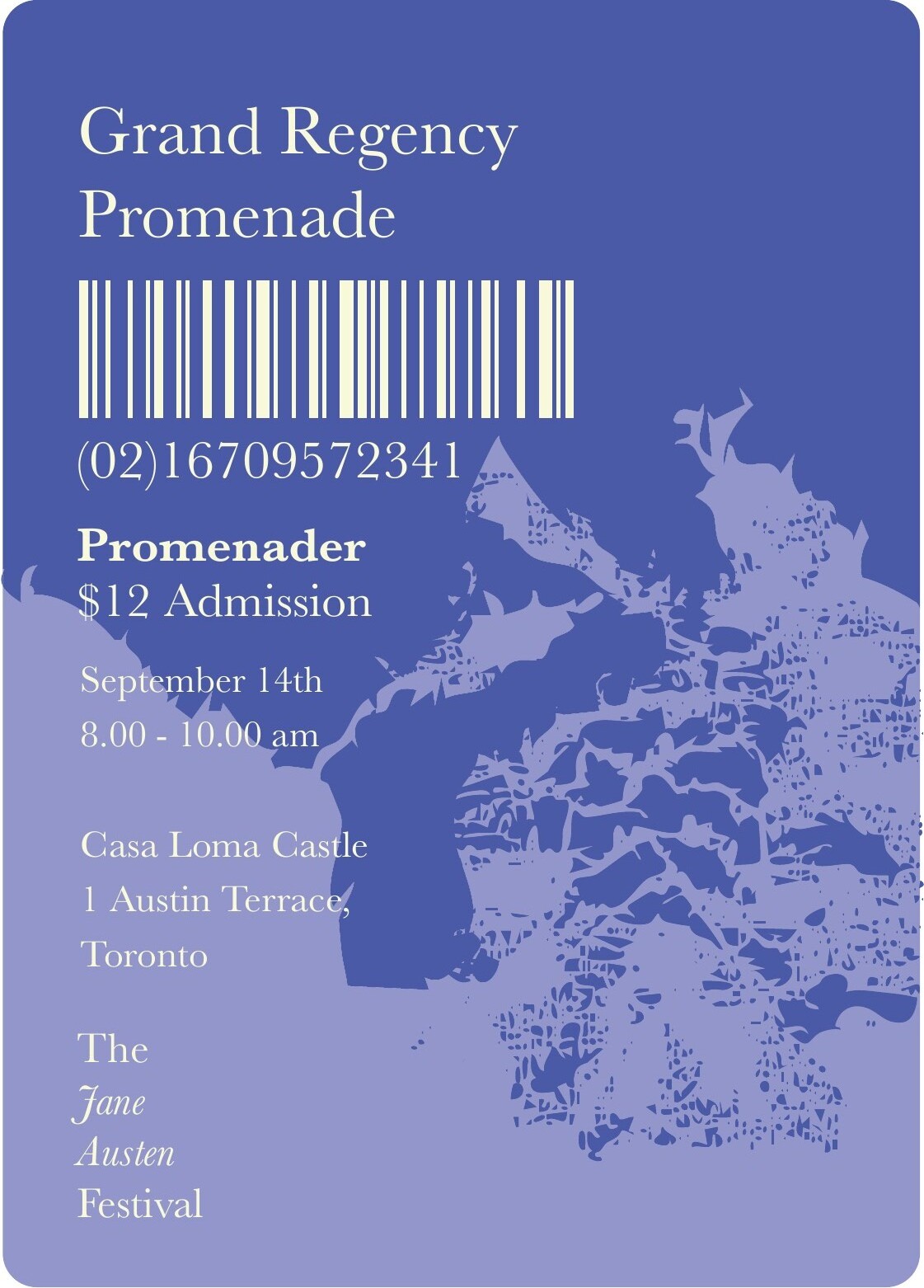
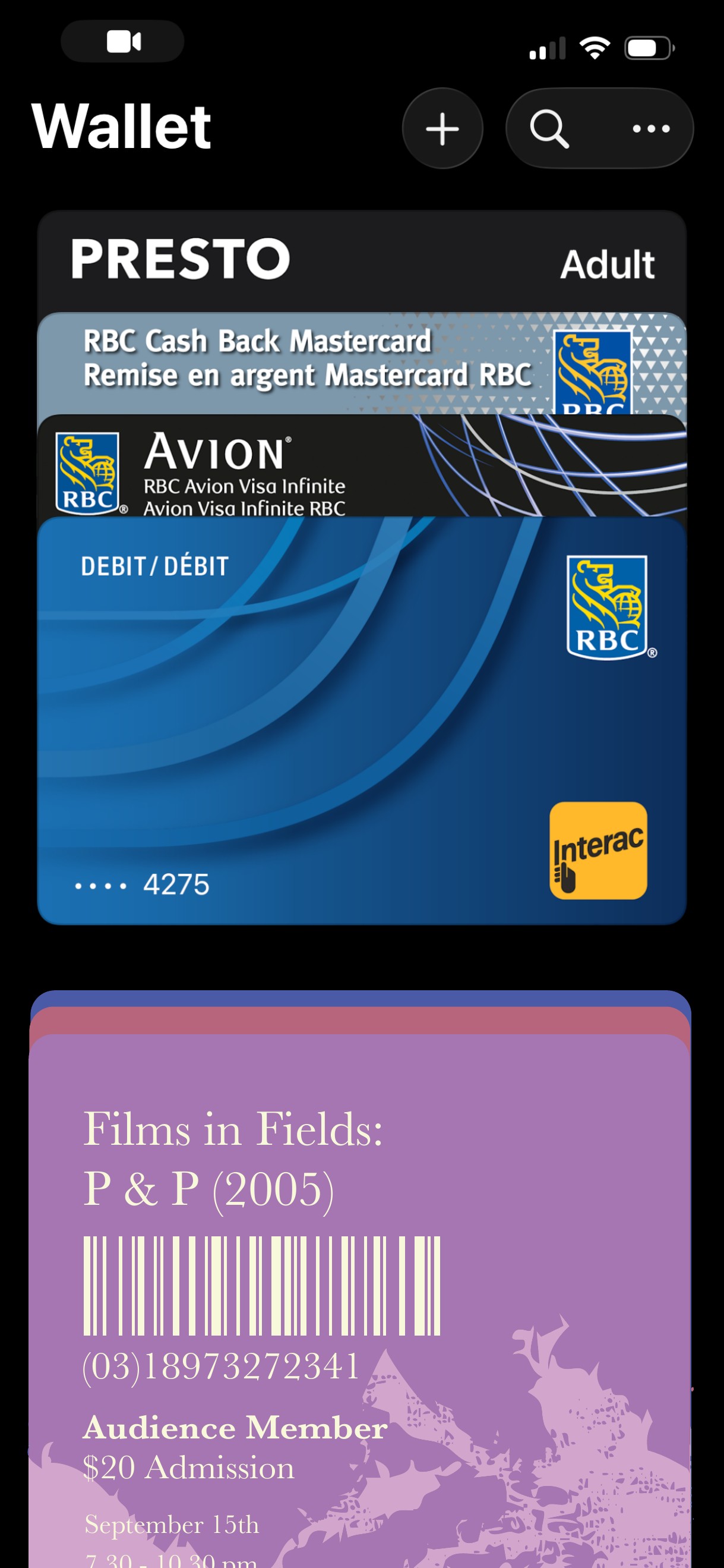
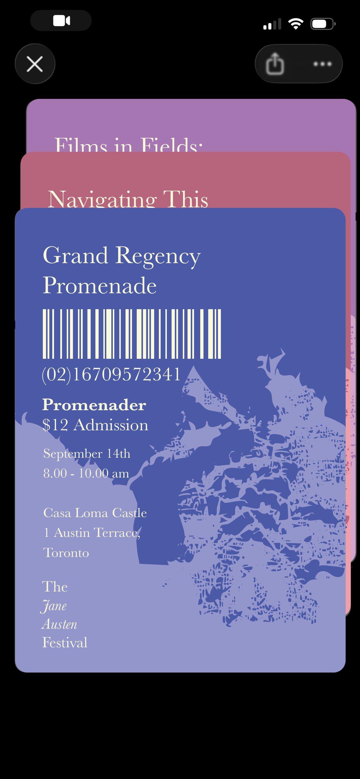
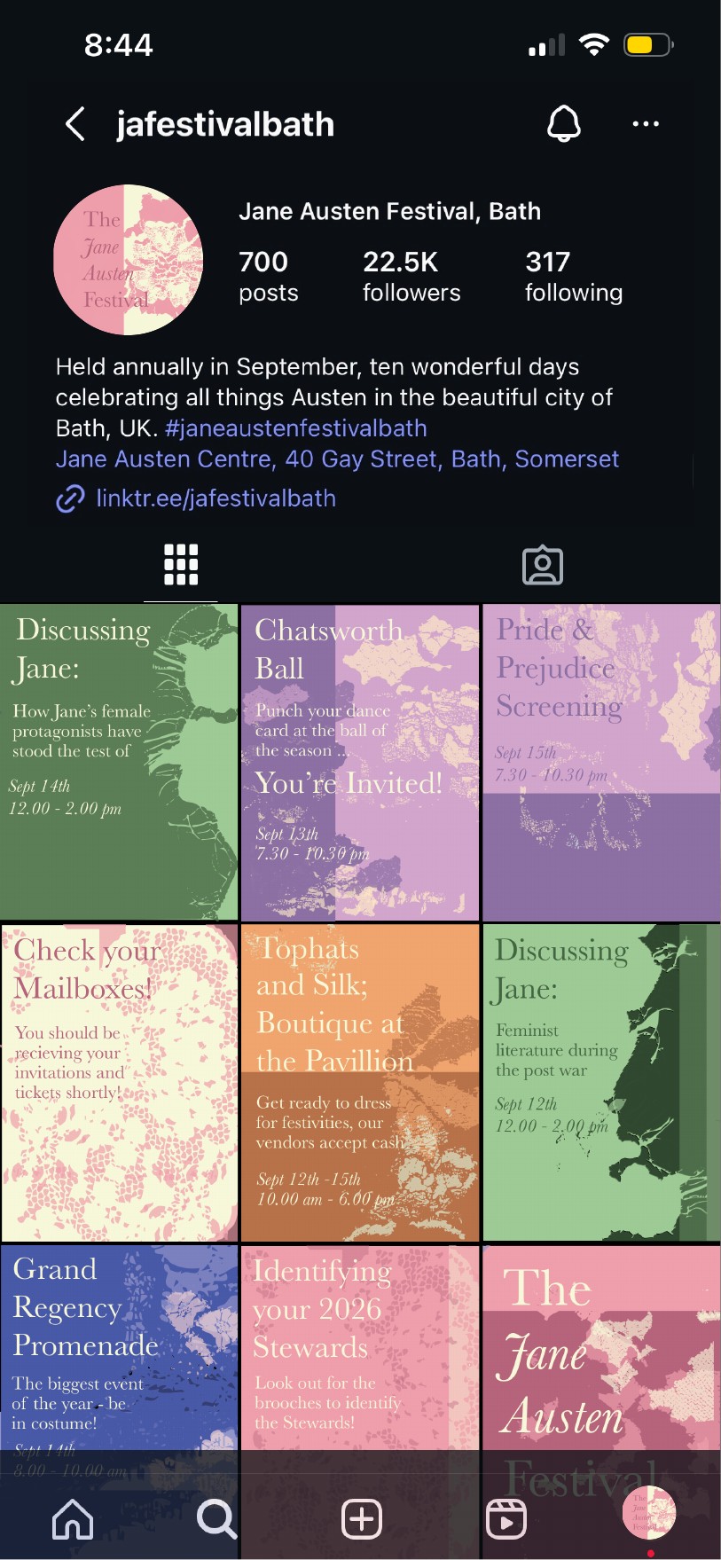
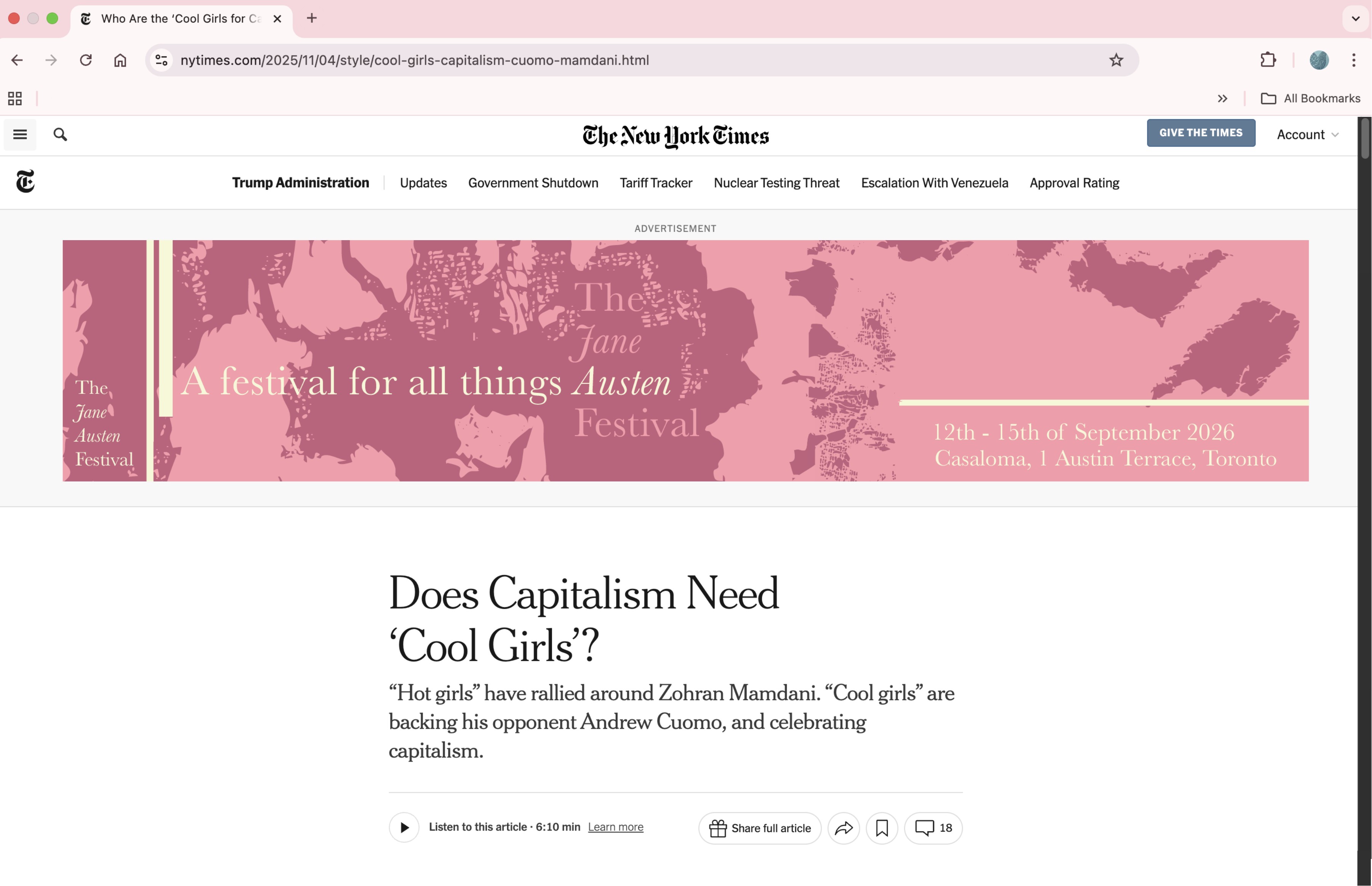
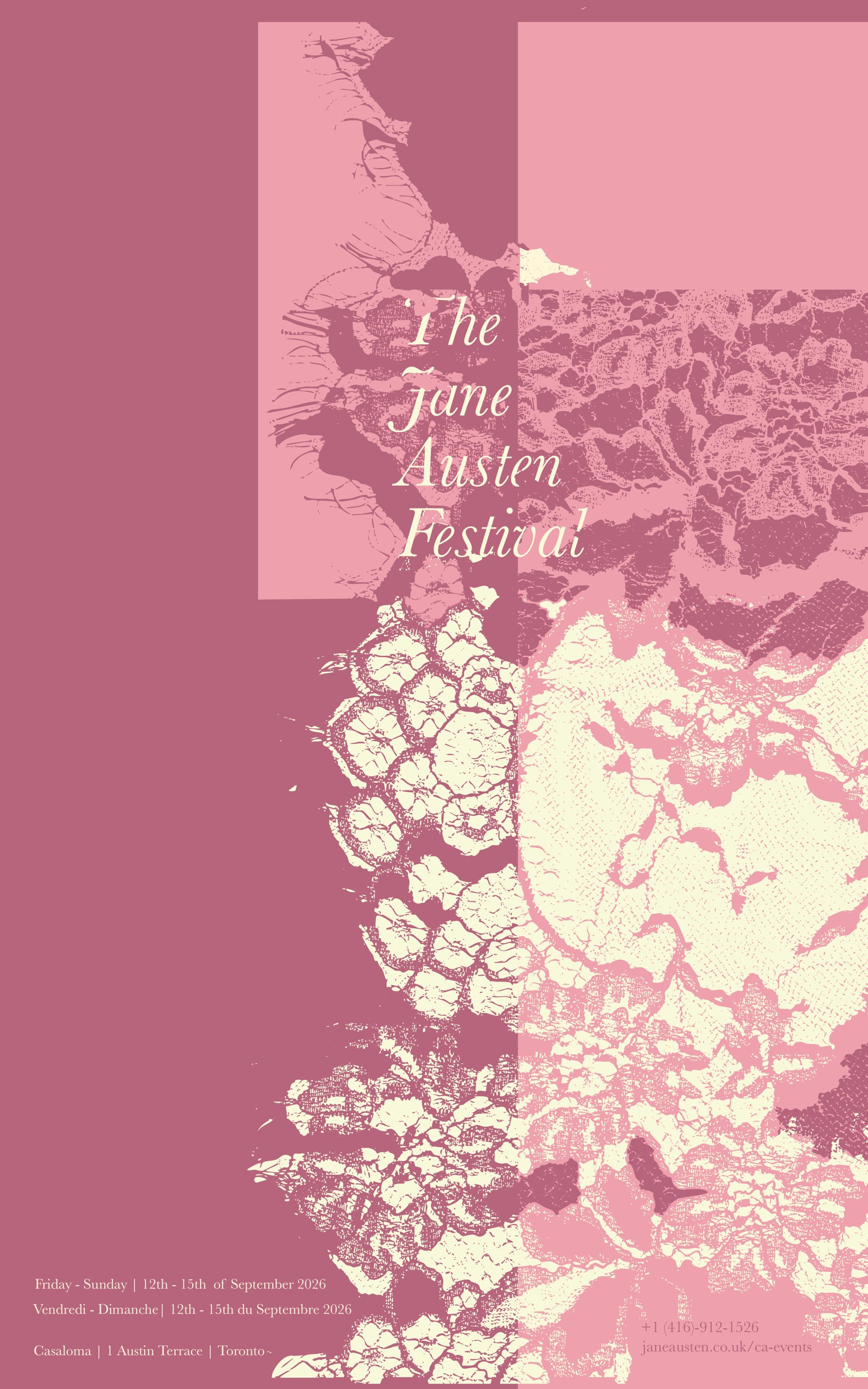
Branding · Print · Publication · Digital · Fall Semester 2025 · 3 Months
A conceptual identity for a special edition of the Jane Austen Festival, reimagined in Toronto. The system spans wayfinding, print collateral, ticketing, book covers, and digital promotion — all unified through a handcrafted lace motif sourced, scanned, and transformed into a repeating graphic language. Printed across two venues — Casa Loma Castle and Spadina House Museum — the identity moves between dusty pinks, deep purples, and forest greens, drawing from period aesthetics while feeling contemporary and considered.